Hello Friends, and welcome back to Book Looks!
I began this blog series in 2021 to highlight some of the interesting volumes here in the St Brigid Press library — from the history of book-making to printing press maintenance, from typography and type design to the biographies of famous (or not) printers, and from paper-making to wood-engraving. You can see links to previous Book Looks installments at the end of this post.
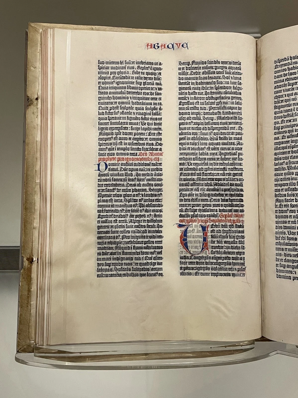
But hey! It’s April, which means it’s National Poetry Month in the U.S.! So I’d like to offer a twist on this newsletter series today and spotlight a few poetry-themed books I’m engaging (and which currently are on top of the leaning-tower-of-language stacked by my chair). I’m always dipping into some volume or another of poetry, and the three I introduce below are hot off the press (not mine, but a few venerable American publishers).
Thanks for reading, friends! And perhaps one of these books might spark your own interest!
Emily
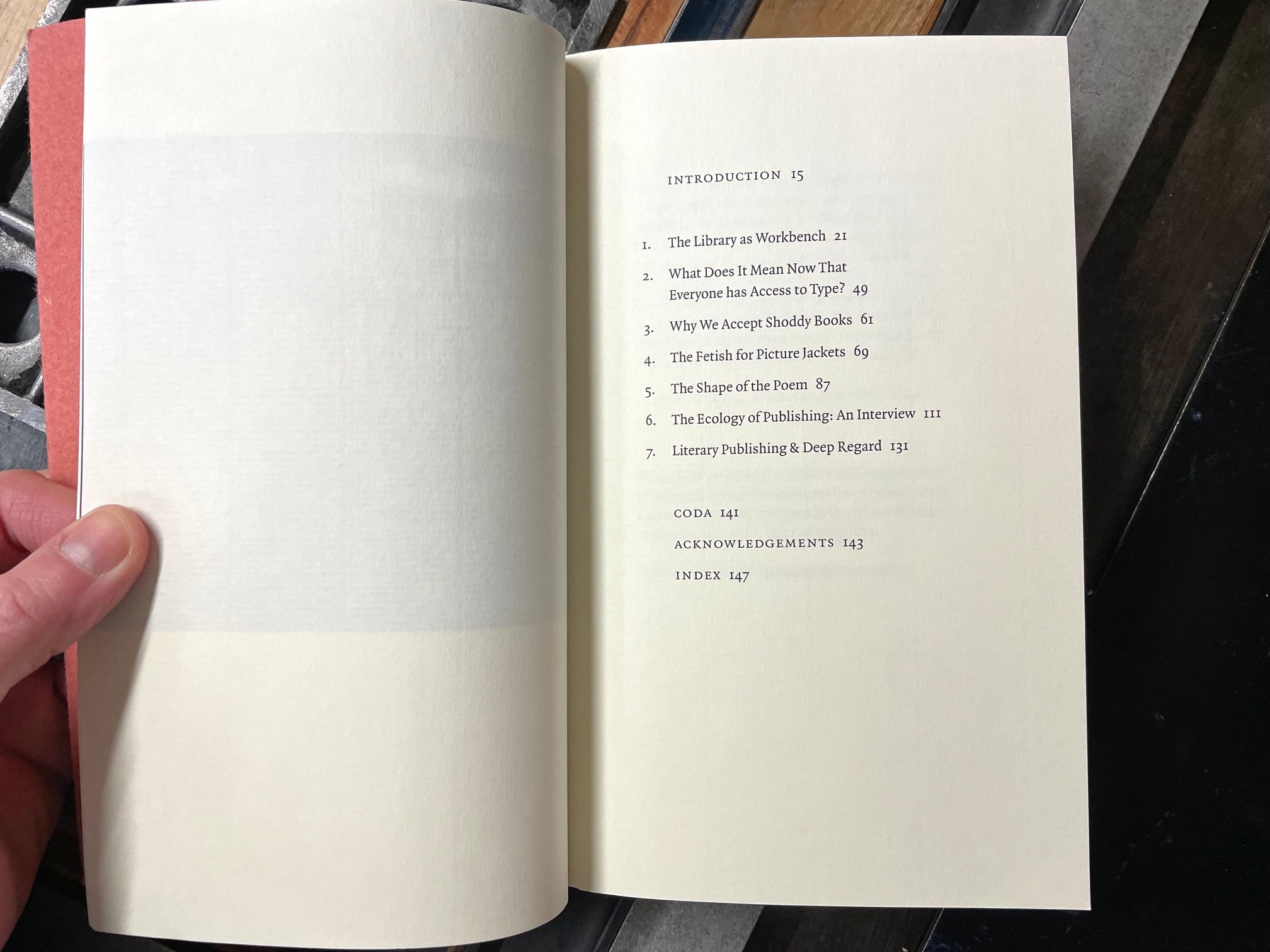
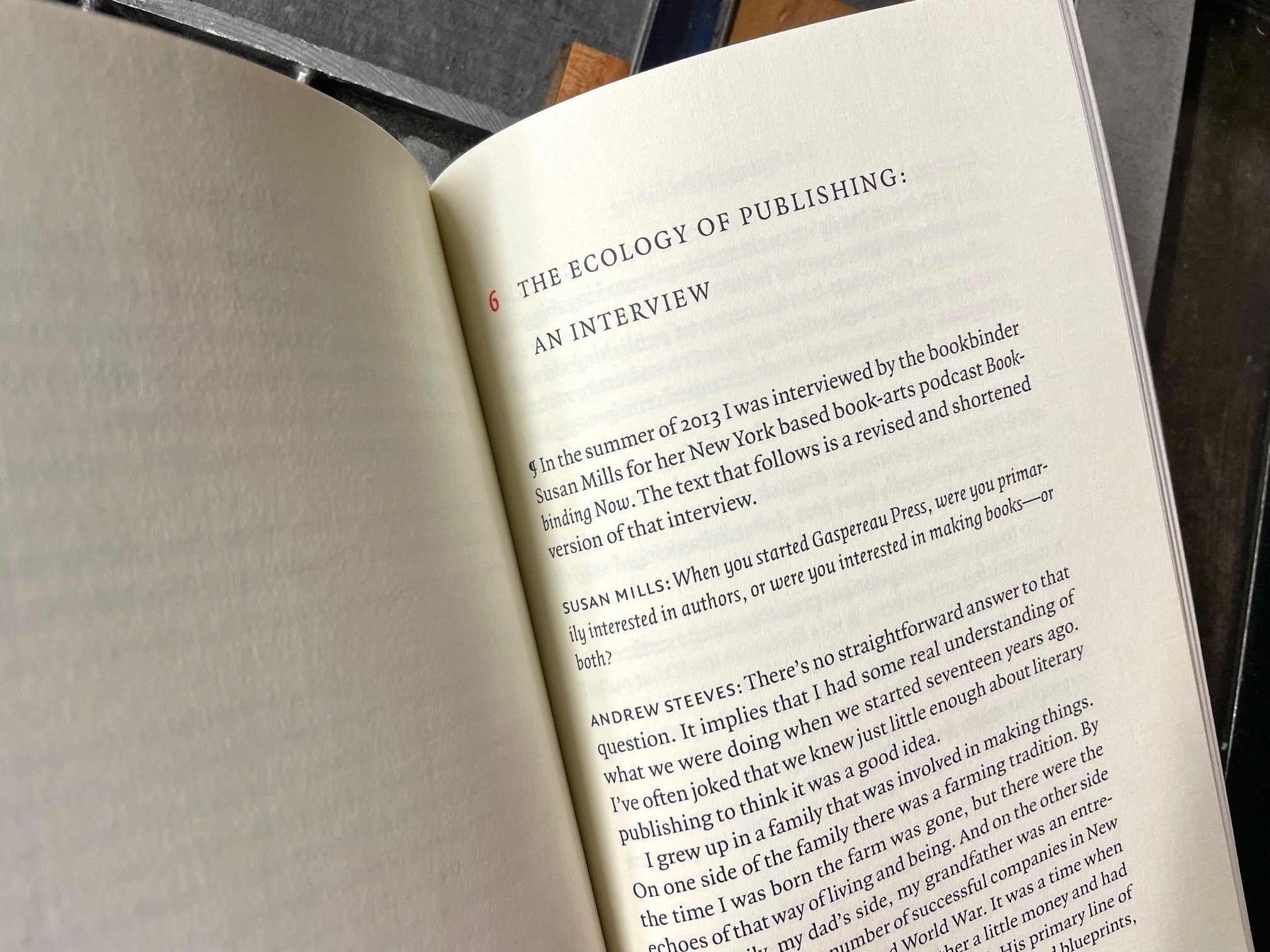
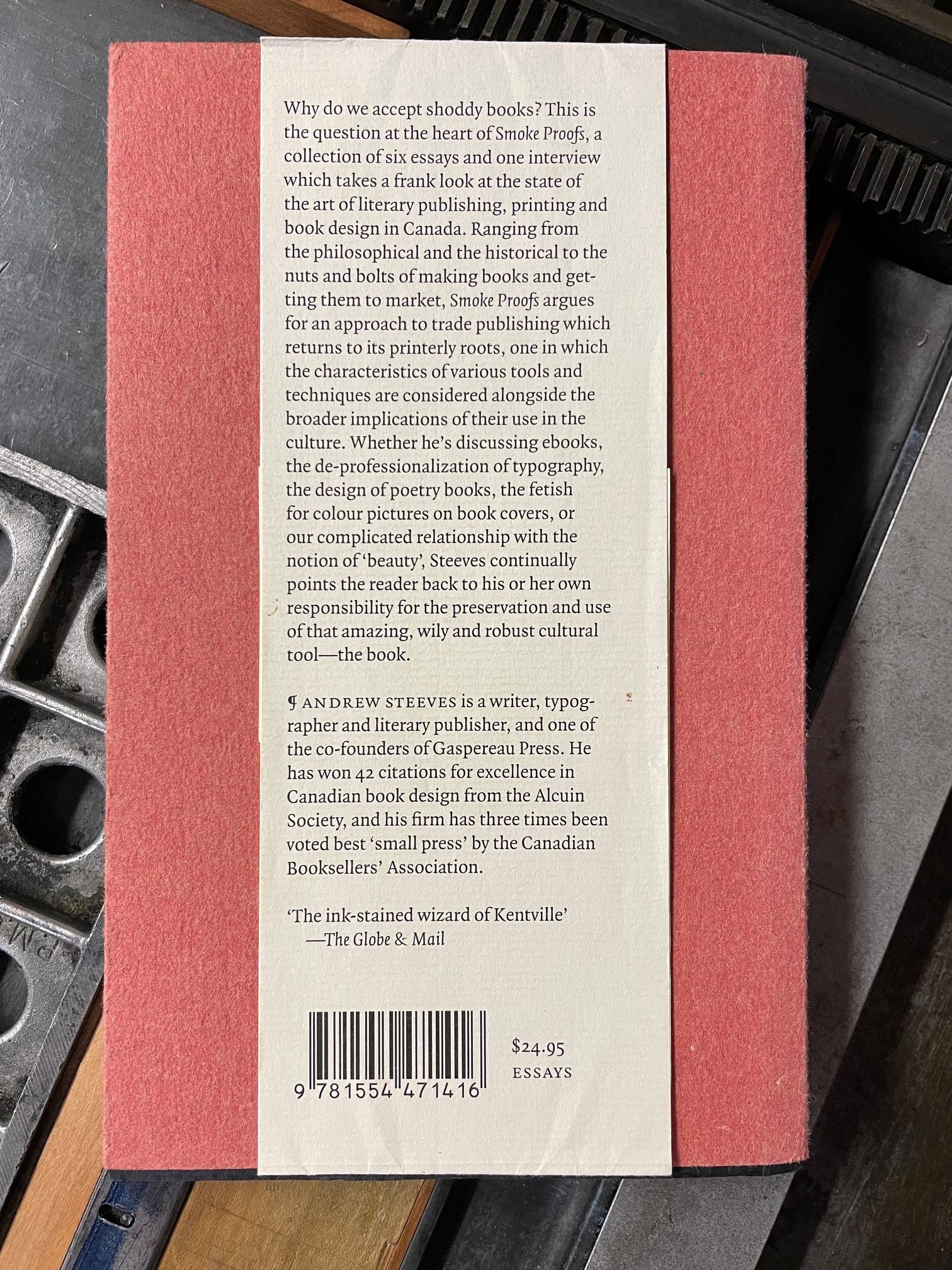
BOOK LOOKS, PART 6: National POETRY Month EDITION
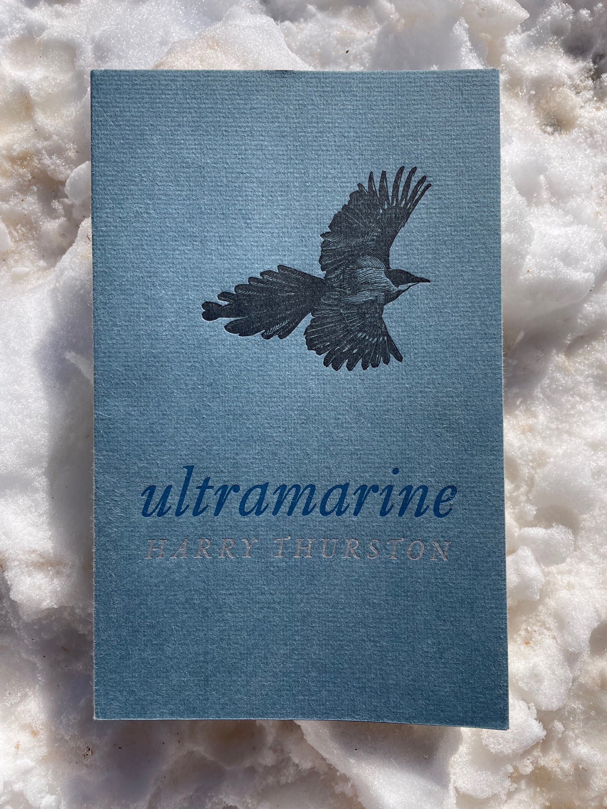
1. Attached to the Living World: A New Ecopoetry Anthology edited by Ann Fisher-Wirth & Laura-Gray Street
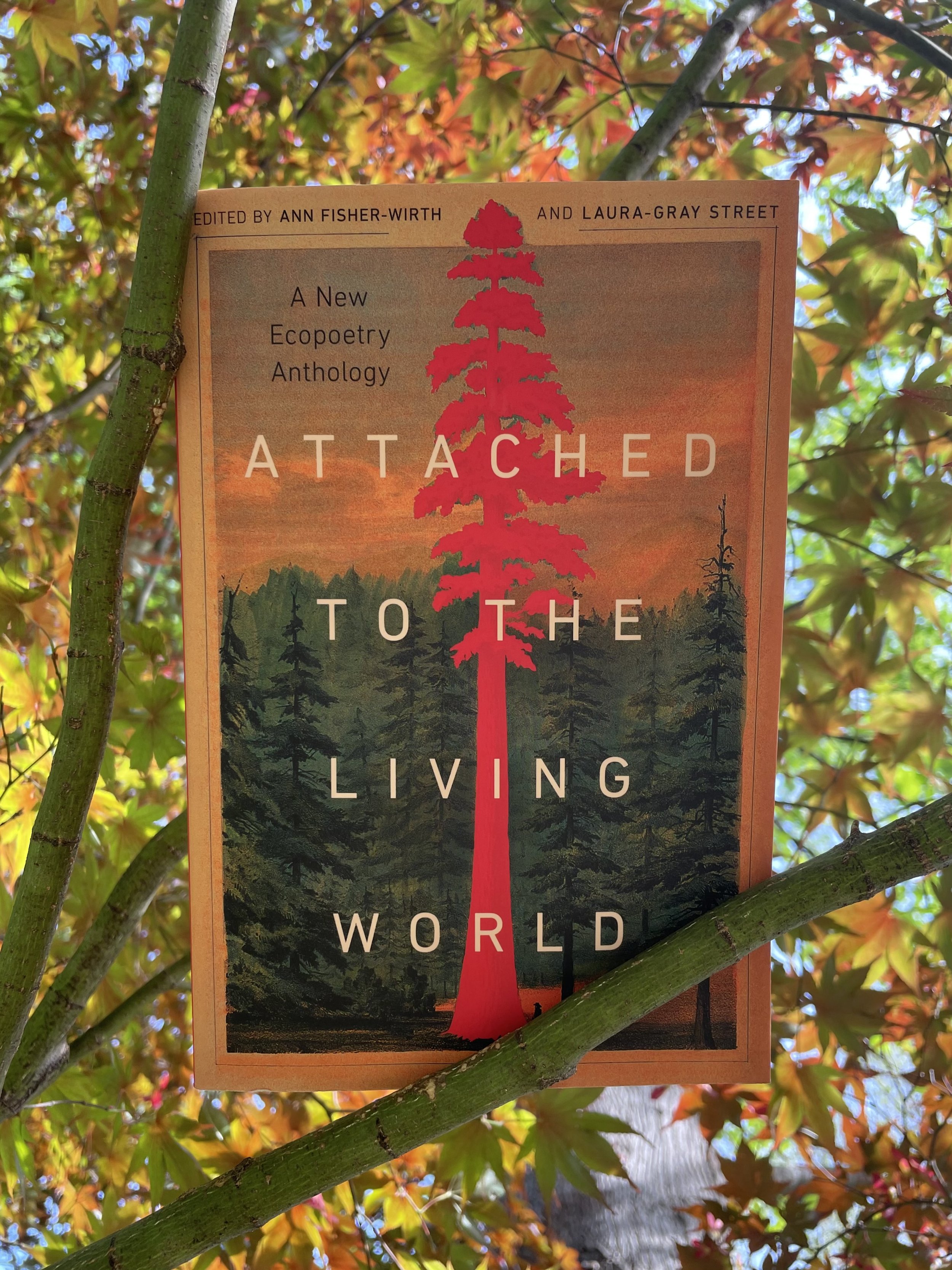
A week ago, this thick-but-approachable tome was placed literally in my hands by one of the owners of my local bookshop, Stone Soup Books. Janie had just met one of the editors at an event, had high praise, and, like the excellent bookseller she is, knew in a flash that I would love this book. And I do — it nimbly updates the poetic conversations around nature and the environment that editors Fisher-Wirth and Street began with their first volume, The Ecopoetry Anthology, almost 15 years ago. This new collection is packed with 150+ emerging and established poets, most of which are completely new to me. And that is a valuable thing — as much as we will always need and read the likes of Mary Oliver, Wendell Berry, and Gary Snyder, it’s the new(er) poets who now are wrestling with and writing from the live edges of climate change, extinctions and migrations, and our own actions and emotions in the midst — the happenings, heartbreaks, and hopes of right here, right now. I am very grateful to have my own engagement deepened and broadened by this collection.
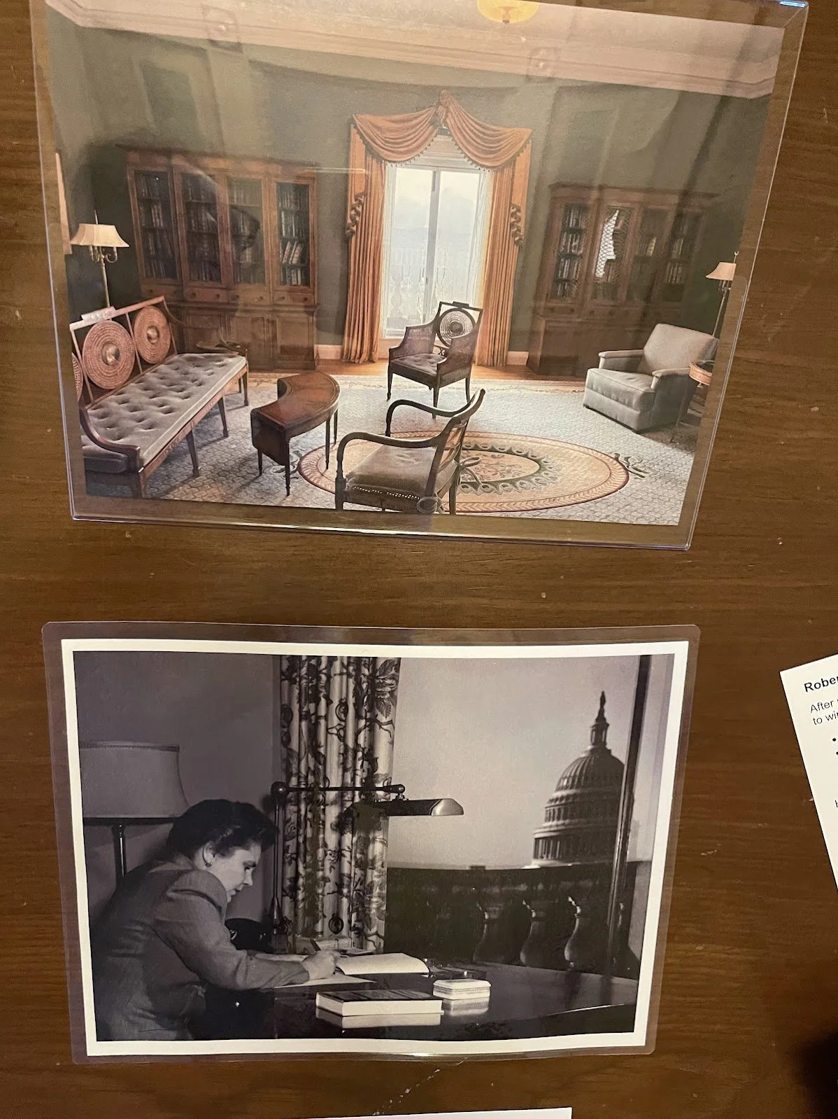
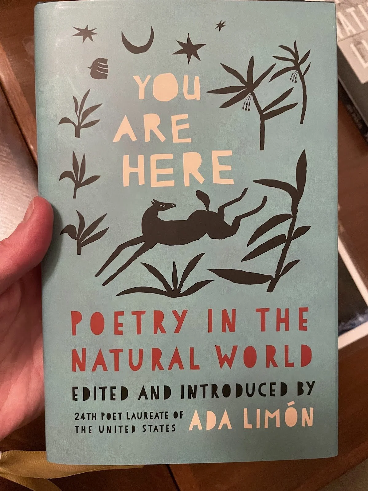
2. Against Breaking: On the Power of Poetry by Ada Limón
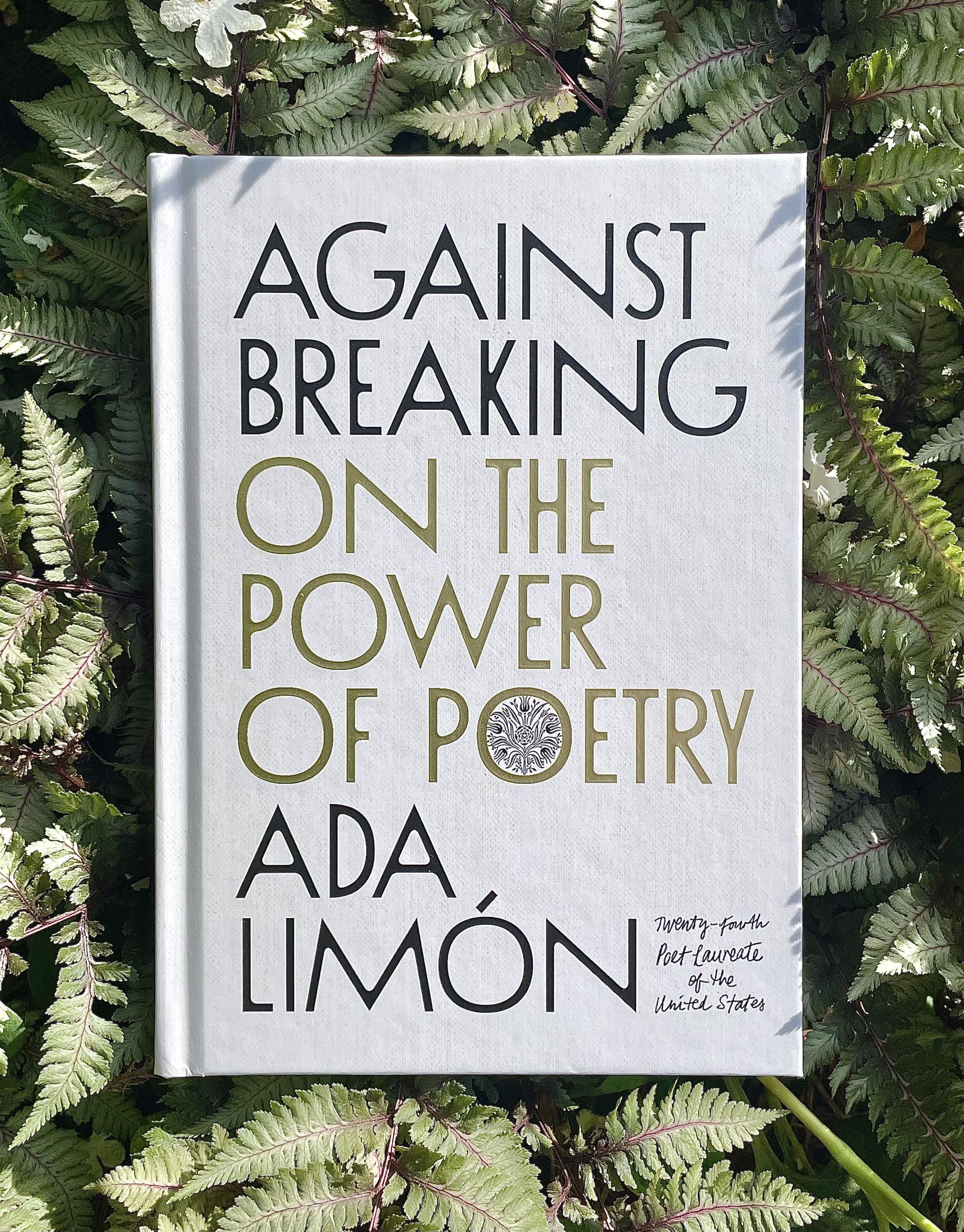
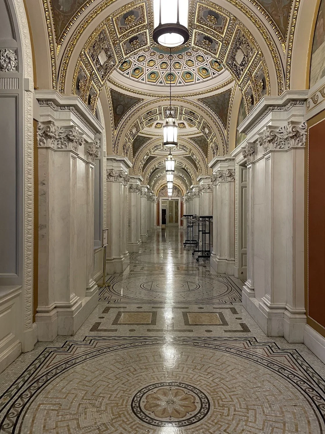
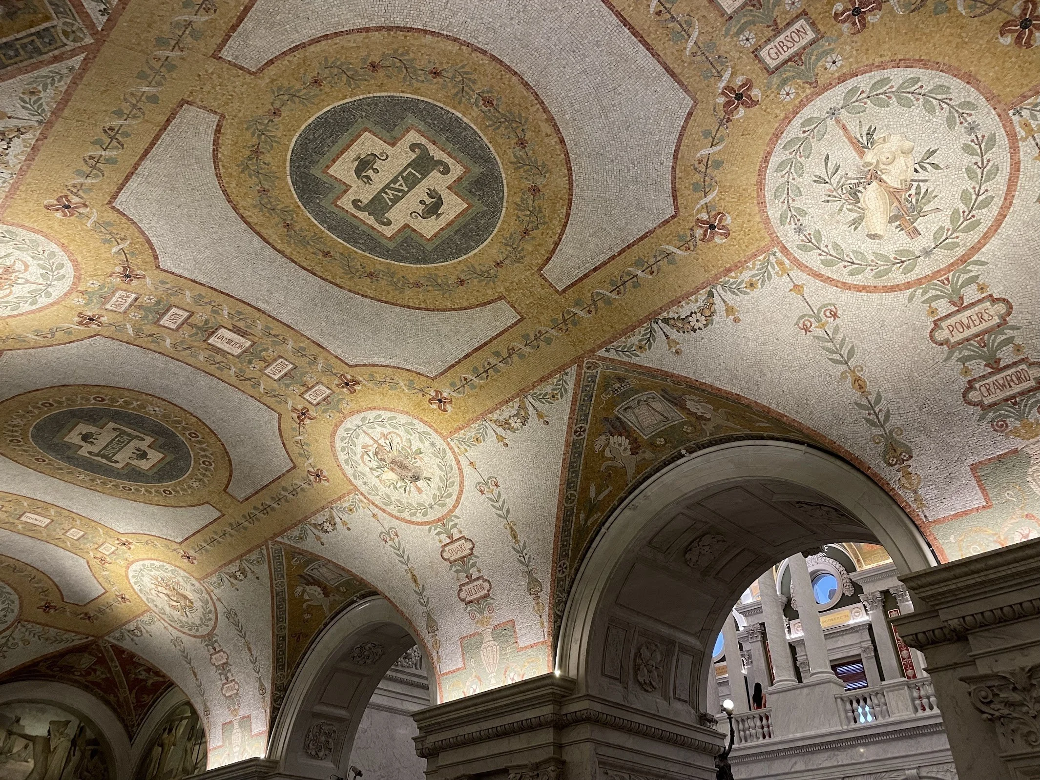
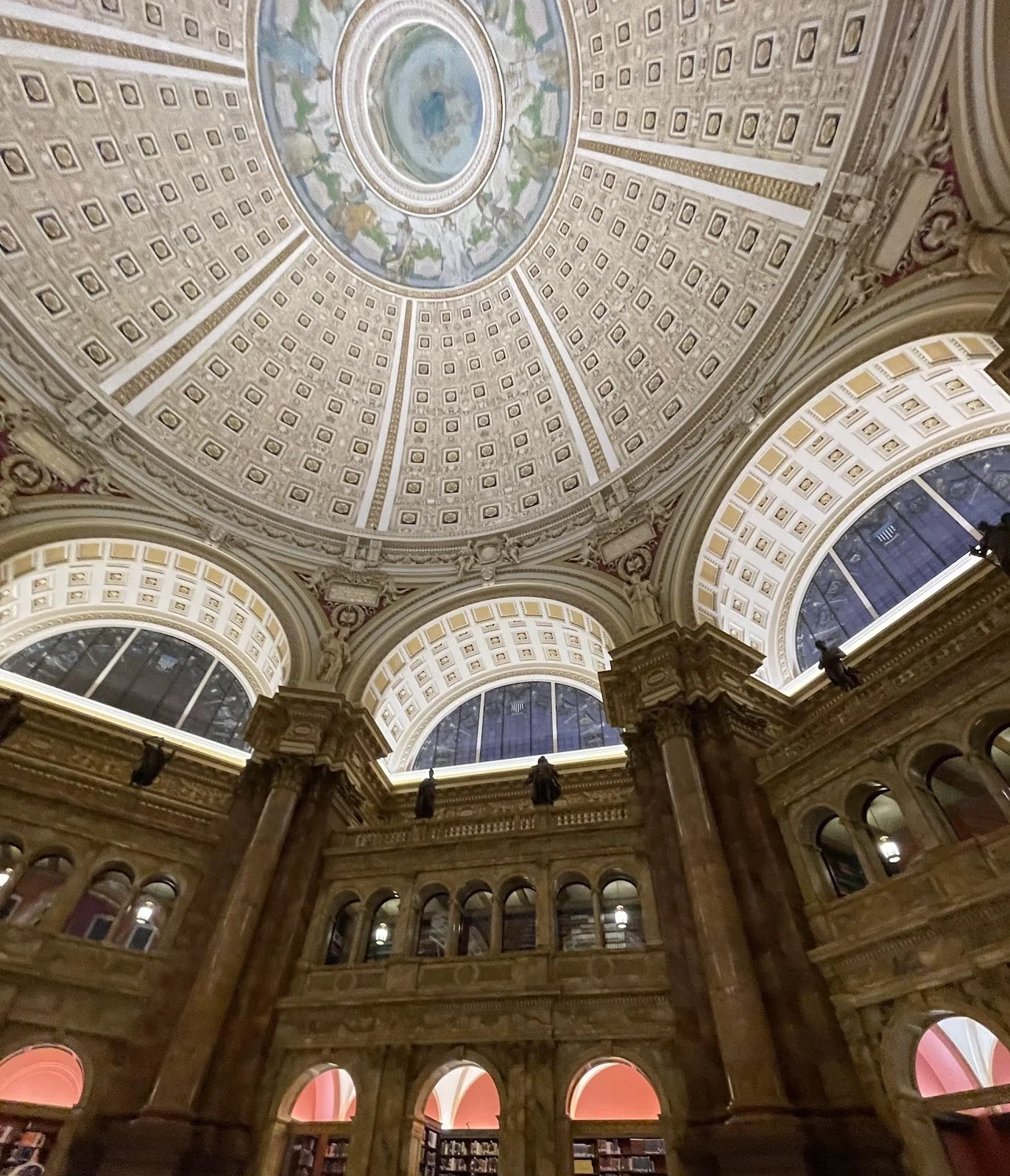
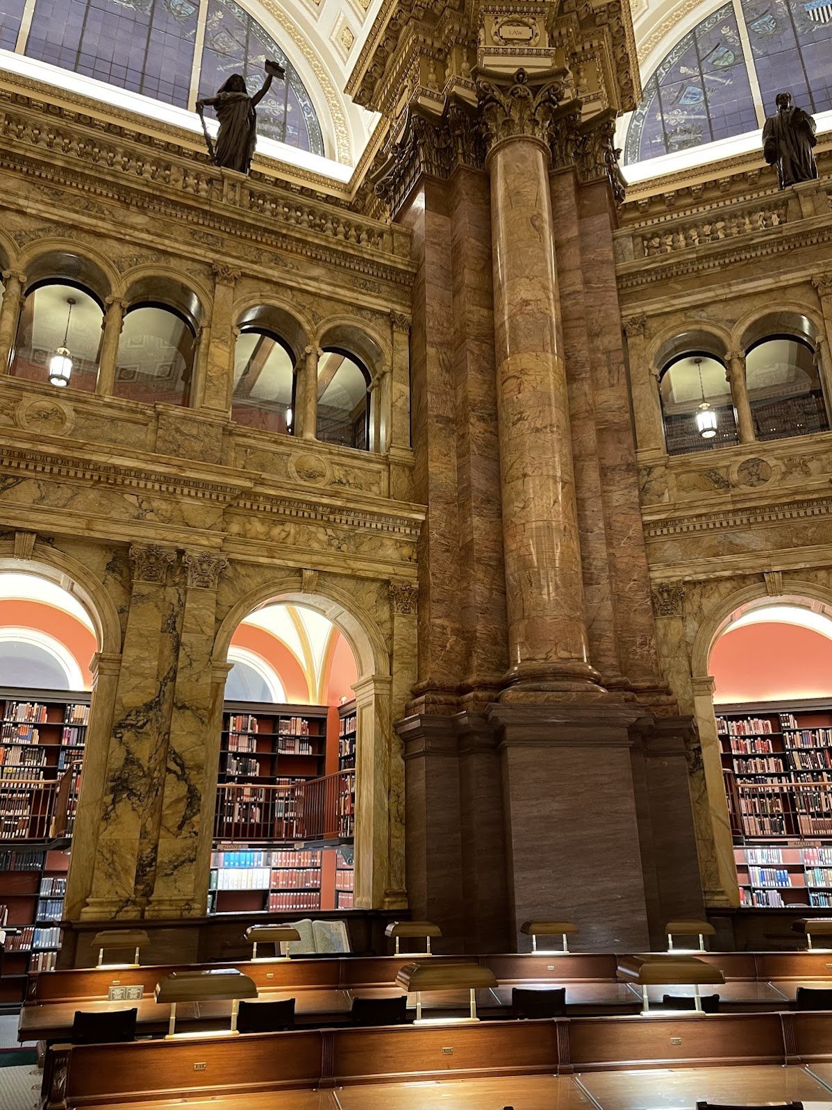
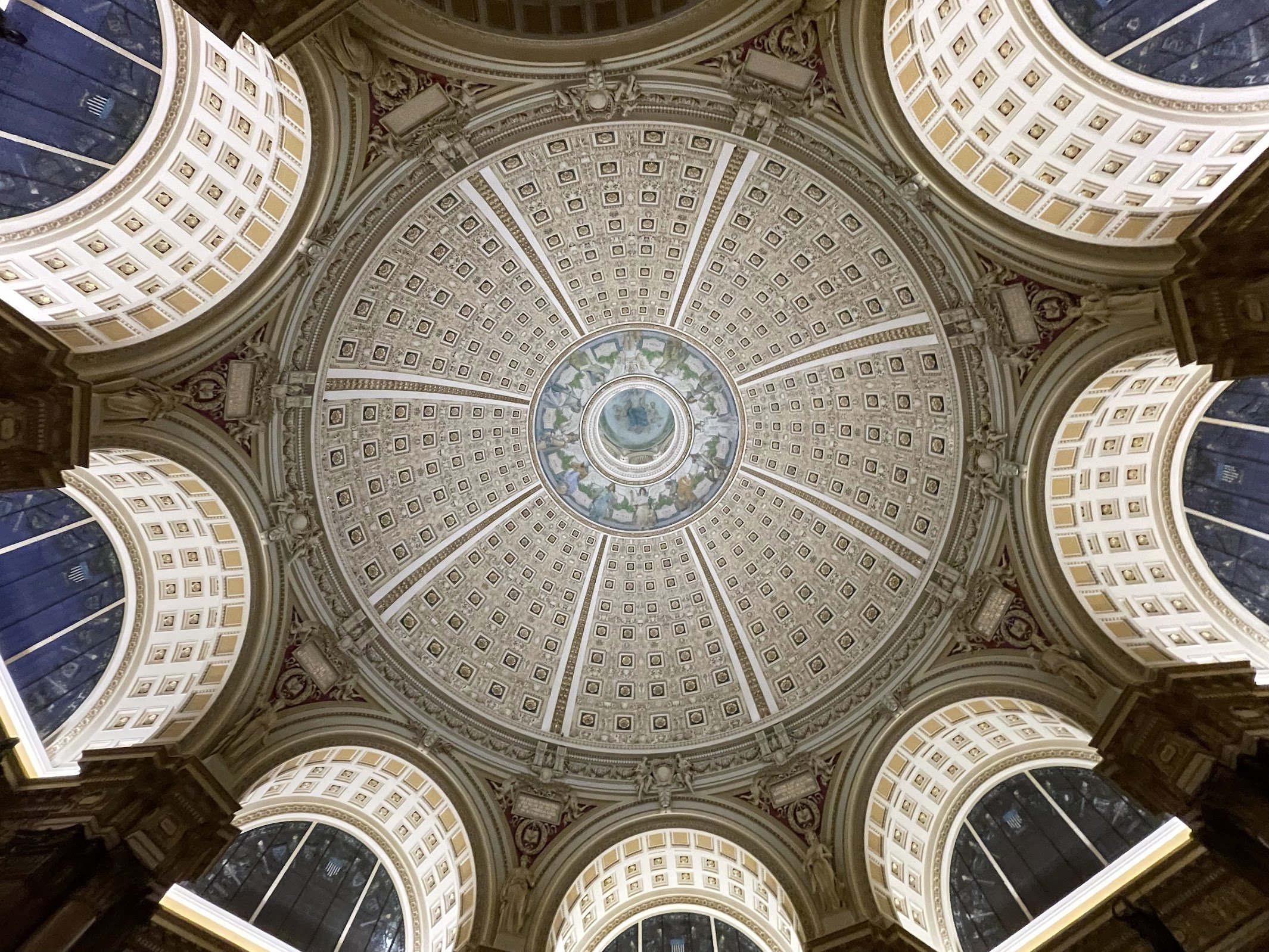
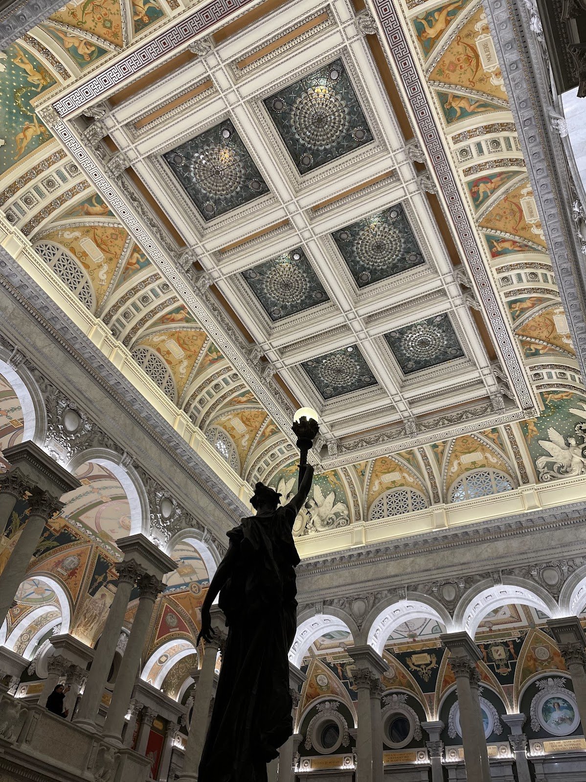
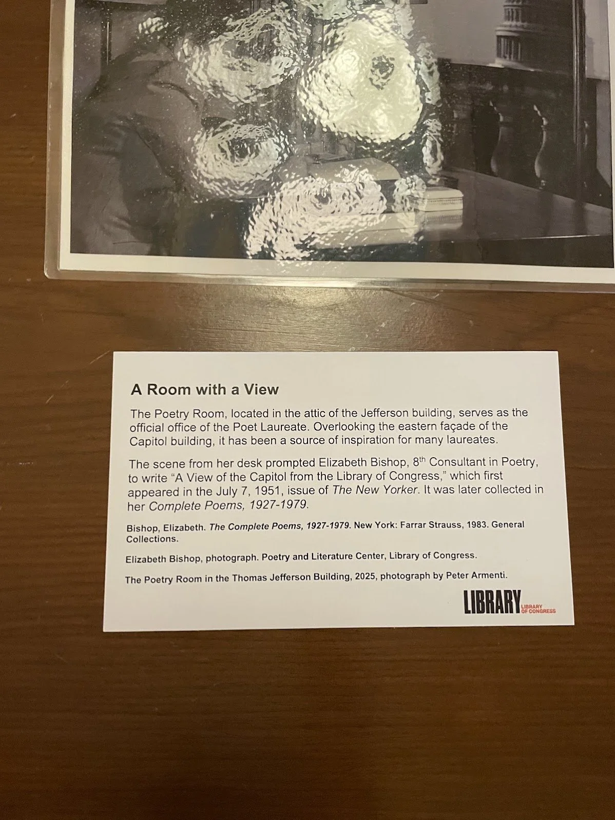
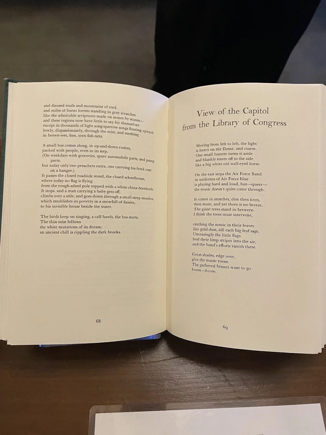
Visiting your local bookshop is such a delightful peril. Two days ago I walked into Stone Soup Books again and this time the other owner, Mary Katharine, met me at the door saying, “Have you heard of this book?!? I just finished listening to the audio edition and it’s wonderful — I know you will love it!” …*sigh*… She waved a small, slim book in the air. It had a title I immediately loved, in addition to MK’s irresistible pitch. Against Breaking is the text of Ada Limón’s speech given at the Library of Congress on April 17th, 2025, at the close of her tenure as the 24th United States Poet Laureate (a tenure in which, among many other things, she helped bring installations of poetry into picnic areas of National Parks). In the book’s foreword, she is unabashed about her intention that evening: “I was given a fifty-minute time limit, and I knew, despite wanting to say so much about the current state of the world, I wanted to do at least one thing: make a case for poetry... I hope you feel invited into the room, the large room we all must create together, the room where we all must work hard to save what matters.” Truth be told, that’s as far as I’ve read in the past 48 hours, friends; and yet I’m hooked. Well, you could say, she’s preaching to the choir. Yes. But. Whether we’re in that choir already or just humming a tuneless tune down the street outside, we all need “the daily bread of language” (as I’ve written elsewhere), and we need reminding of the ever-present and catalytic power of that language. Especially (for this aging second-soprano) poetry. I think Limón’s text will be one that both invites and revivifies.
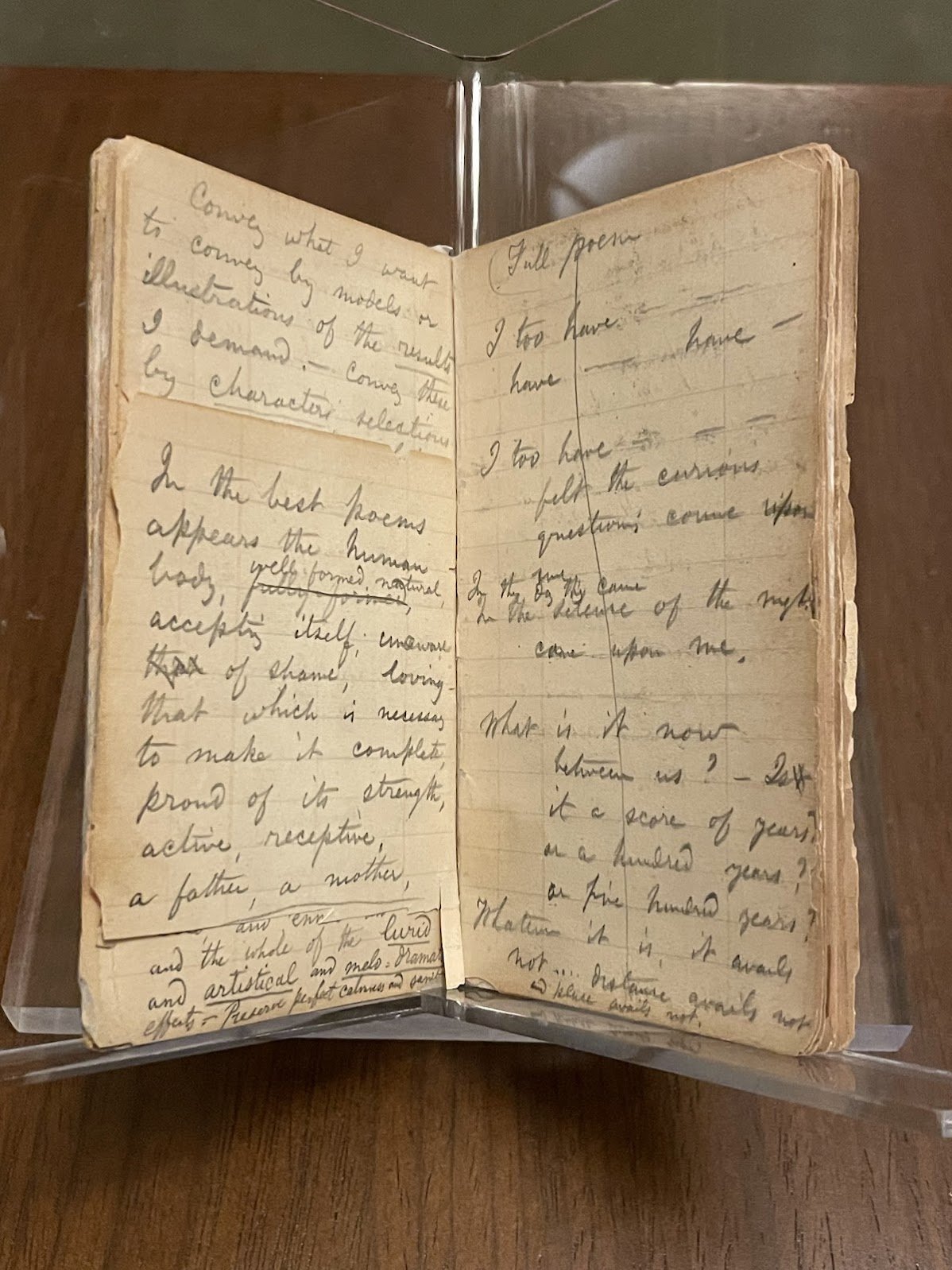
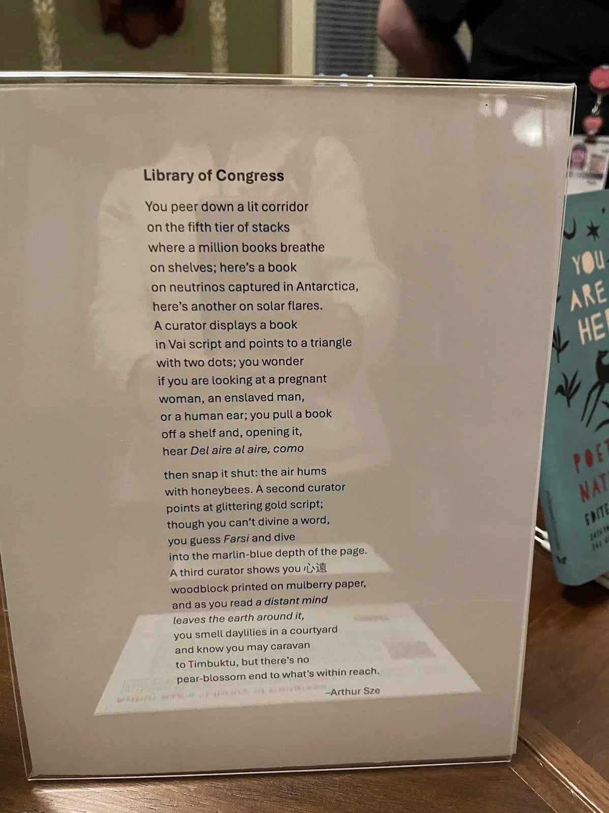
3. Transient Worlds: On Translating Poetry by Arthur Sze
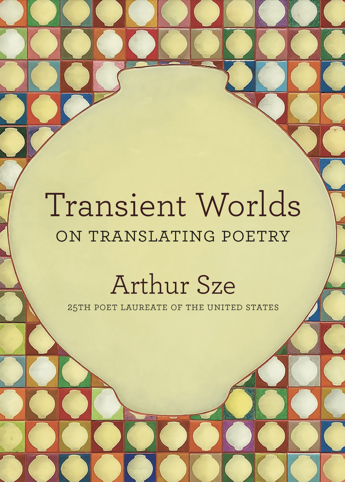
This book is so new I haven’t even received my copy yet (I preordered it last year through the publisher, Copper Canyon Press). How can you recommend a book you haven’t even seen? you ask. Because of the name that’s on the front: Arthur Sze. Most of you all know by now that my friend and sometimes collaborator Arthur is the current United States Poet Laureate (and just signed up for a second term!). His signature laureateship project, “Words Bridging Worlds,” revolves around highlighting poetry in translation — that is, work originally written in languages other than English. An accomplished translator himself, Sze’s new book is “a personal guide to poetry in translation… focusing on an accessible selection of key works [taking] readers through nearly two millennia of poetry from every part of the world.” I’ve been drawn to poetry-in-translation for several decades, with deep dives into ancient Chinese and Japanese verse as well as modern Swedish work in particular. Every encounter with poetry from a culture other than my own has opened my mind and heart, and has cultivated new creative connections across time and space. Arthur’s latest book is poised to contribute even more understanding, conversation, and inspiration in this vein. (Ok, now I must go check the mailbox again…)
* SPECIAL NOTE: This Monday, April 20th at 8:15pm (Eastern), Arthur Sze and Michael Wiegers will be hosting a virtual celebration of and behind-the-scenes look at this book! The show’s description sounds fascinating — read about and sign up for the digital event here: “A Celebration of Transient Worlds”
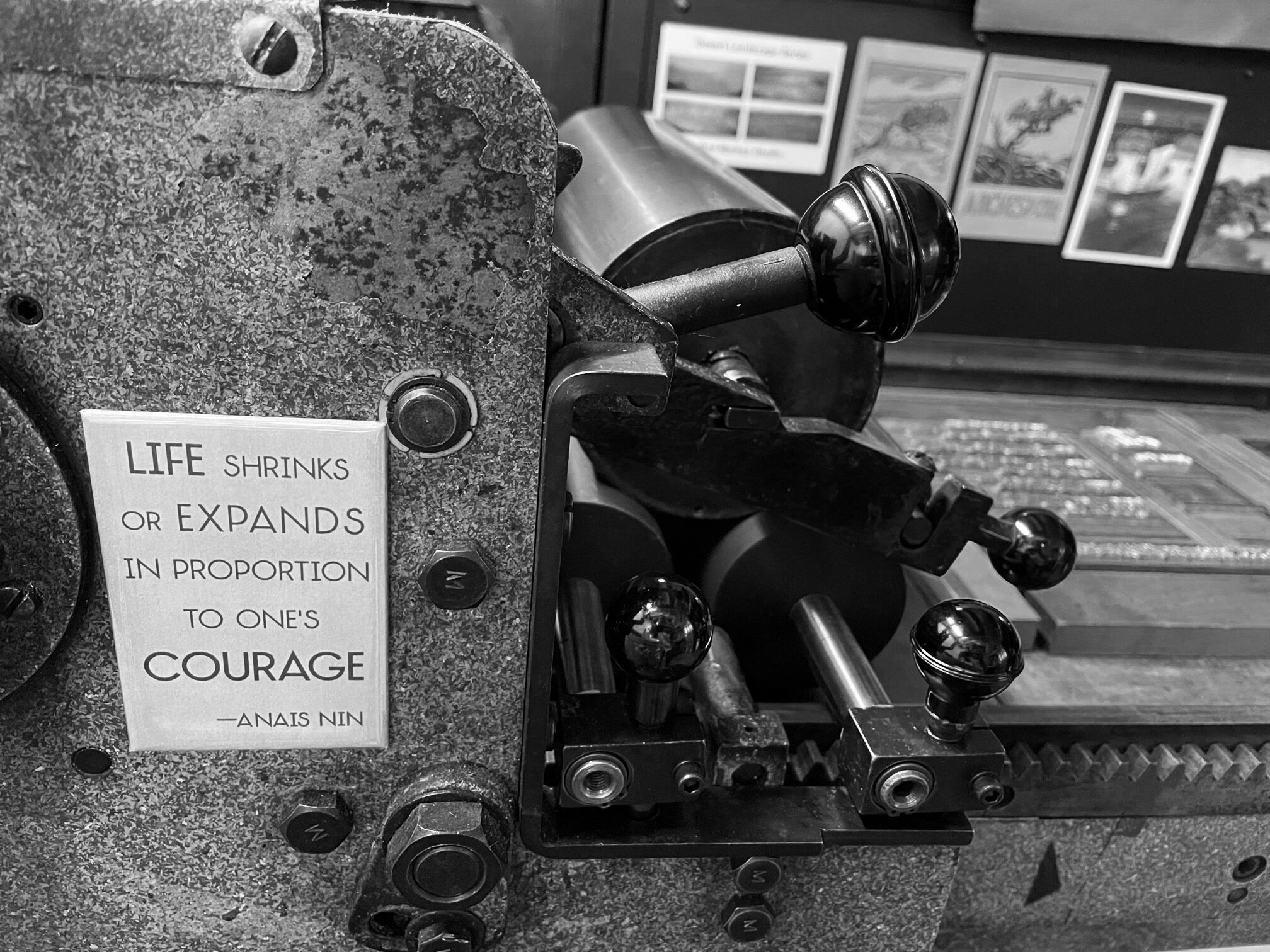
Ok, friends, I am headed back to the print shop for now. Thanks for coming along today as we looked at some fabulous new poetry books! Next time, it’ll be back to type and ink and presses ;-)
All best,
Emily
Previous Book Looks editions: