
Traditional letterpress printing requires physical letters, cast from metal or carved from wood, which get inked and pressed into paper to make a print. In the next two blog posts, we’ll take an introductory look into how these letters get made.
First up, metal type!
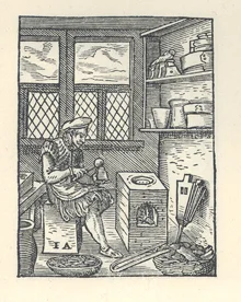
A typecaster of centuries past, pouring molten metal into a mould to cast new letters. (Courtesy of the The University of Manchester Library.)
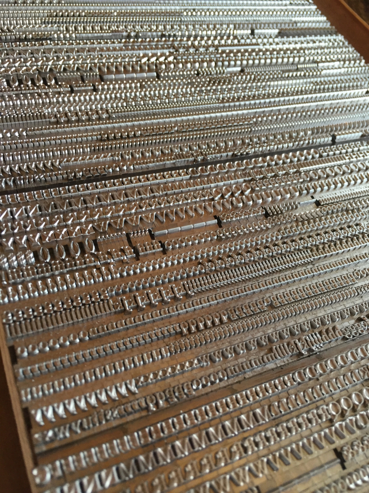
Johann Gutenberg’s big Ah-HA! moment in the 15th century was figuring out how to create multiple letters with which to print, and print again and again — a system of “movable type,” where each piece is cast in a mould from an alloy of metals (lead, tin, and antimony). These pieces, all the letters and numbers and punctuation, etc., of the alphabet, could be used and reused — a huge savings of time, effort, and expense compared to the work of scribes!
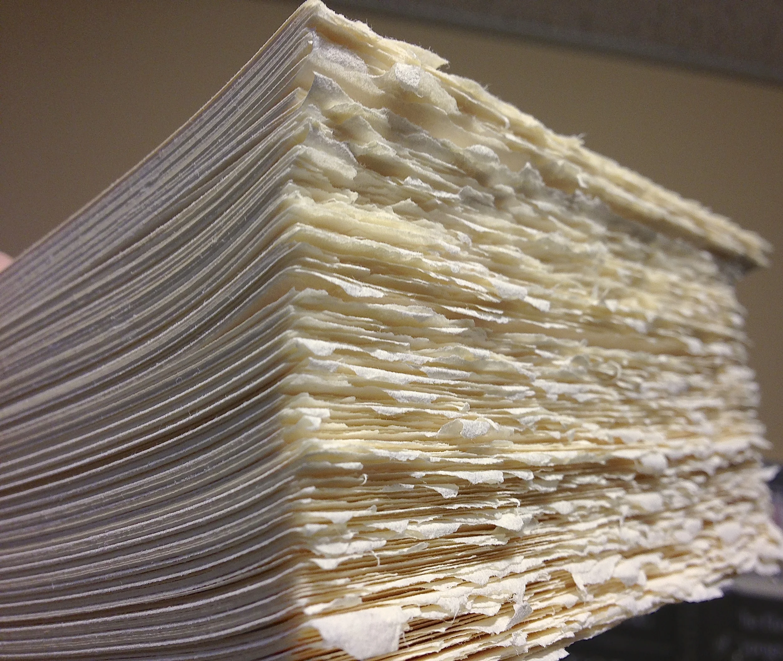
Metal type wears down over time, because it is relatively soft, and gets scratched or dinged easily. Thankfully for us 21st century printers, some hardy folks are still casting brand new metal type!


Here's a short (1:58), awesome little video by Dave Keyes of Michael Curry casting 48pt Garamond ampersands on his caster in New Zealand:
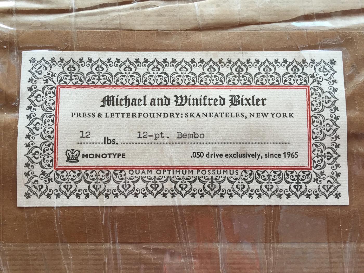
And here’s another little window into the world of typecasting, courtesy of Michael and Winifred Bixler, who operate their Bixler Letterfoundry in upstate New York, and who have cast much of the new type we have here at St Brigid Press. This beautiful 2-minute video was done by Mary M Jones:
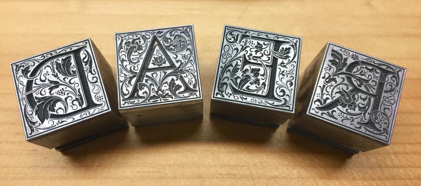
Some of our type comes from a wonderful foundry in Germany, run by the renowned Herr Rainer Gerstenberg. Click the photo below to see an excellent photo-tour of Gerstenberg's foundry, taken by letterpress printer and teacher Thomas Gravemaker.
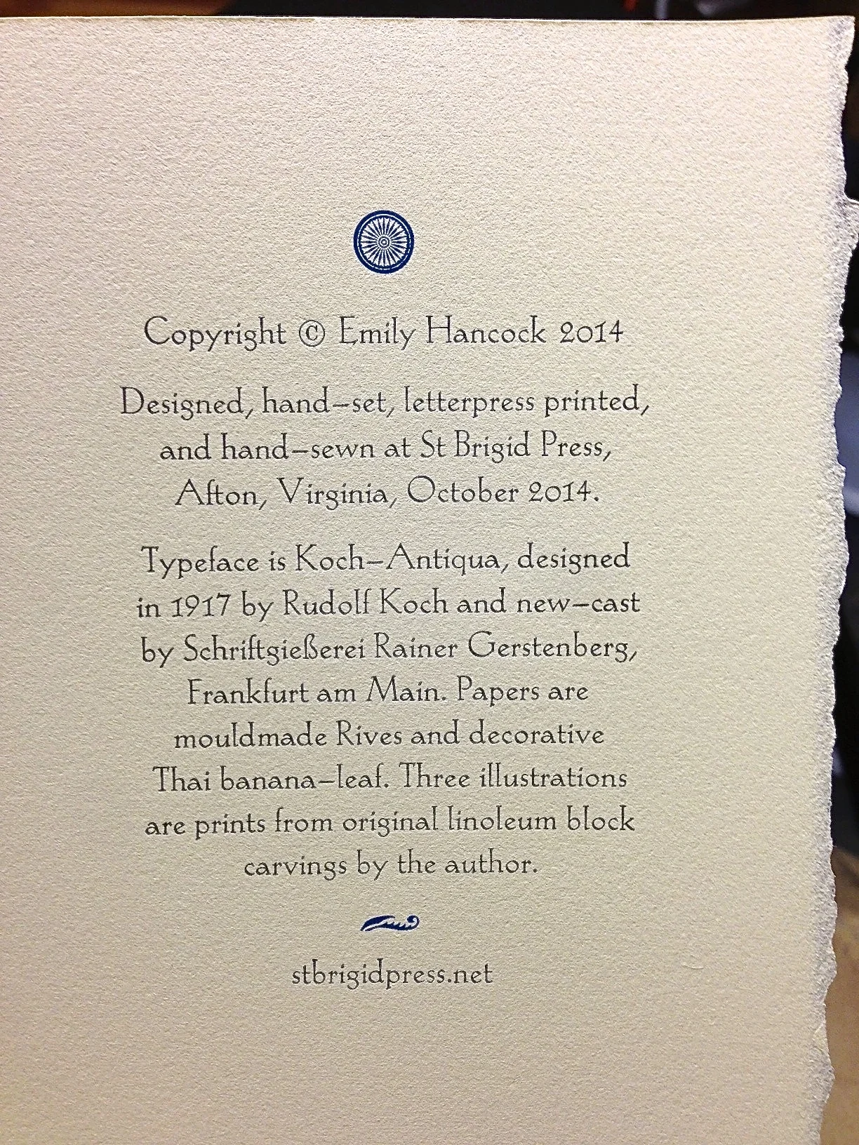
The beautiful Koch-Antiqua typeface, cast for us by Rainer Gerstenberg in Germany, here printed for the colophon of our limited edition book of poems, Soundings. Click the photo for more about Gerstenberg's foundry.
So, would YOU like to order some shiny new type?? Here's a list of foundries ready to take your order!
List of Type Foundries in the US and Abroad
Thanks for joining us, friends! We'll see you again soon,
St Brigid Press