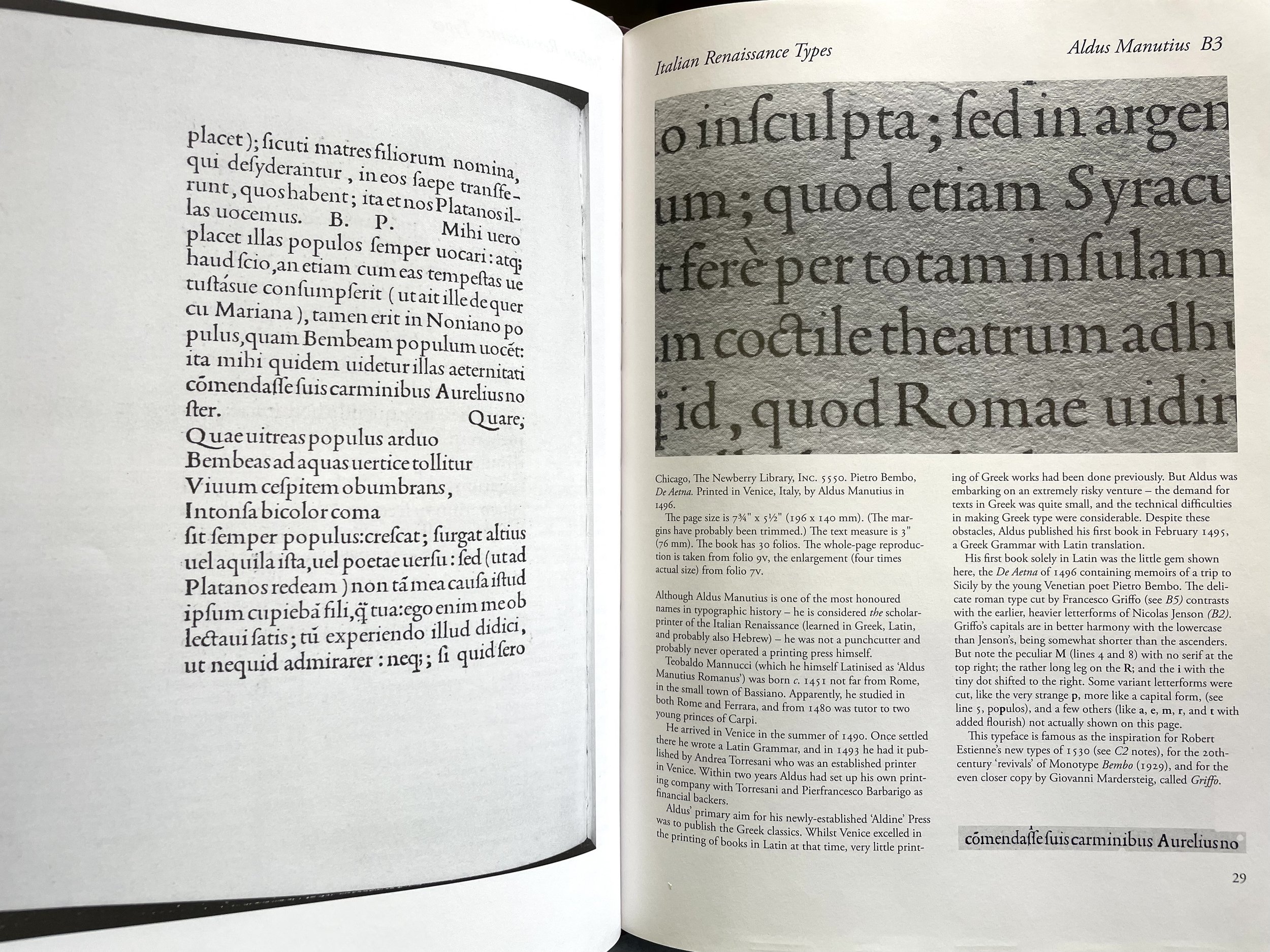
What do books and quilts have in common?
Quite a lot, it seems to me, and I've spent some time reflecting upon that recently.
Growing up in North Carolina, I was lucky to know many of my familial elders. Generations of forebears on both sides of my family-of-origin were born, lived their lives, and were laid to rest again within the central and south-central regions of the state. People visited each other often, sharing stories, food, and a helping hand.
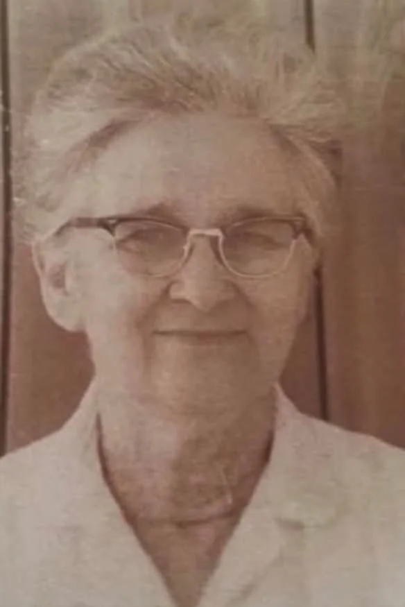
Martha Ann Stutts McCaskill (1910-1997), my maternal great-grandmother.
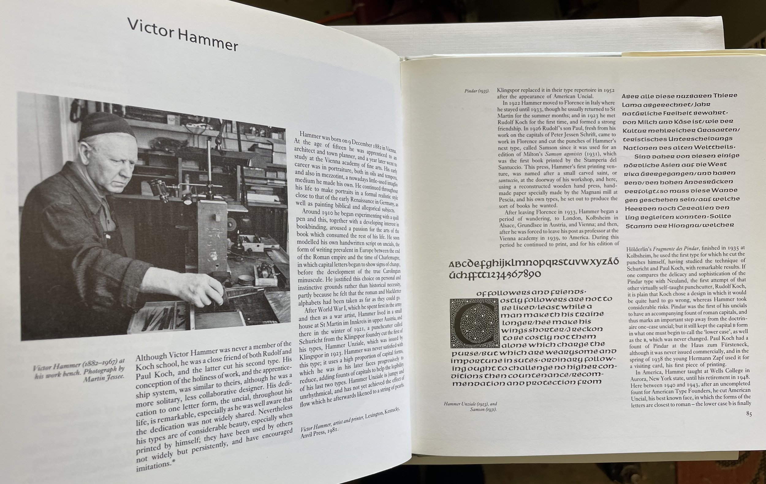
I remember one particular afternoon, when I was a teenager, going to visit at my great-grandmother’s house. “Grandma Mac,” as we called Martha Stutts McCaskill, was in the living room, sitting close to a large wooden quilting frame, her silver hair drawn back in a bun. To her right sat her eldest daughter, my grandmother Hazel McCaskill Clendenin; to her left, my mother, Judy Clendenin Hancock. Someone motioned toward an empty cane-bottom chair, and I took a place on the 4th side of the frame.
I watched and listened for long while. Then, taking another needle from the pin cushion and threading it, my mother began showing me how to sew along an edge of the taut cloth. She spoke in a low voice as the grandmothers talked on about “the doings” of this one or that one in the family and community. Eventually, I grasped the needle in my own fingers and slowly added halting, meandering stitches to the quilt.
Like names and traits, traditions are passed down from one generation to another in sometimes linear, sometimes oblique pathways. A tradition can even go underground for a while, moving like mycelium (the root-like threads of fungi) until the right conditions allow it to surface in a life. That was my experience with sewing — during that afternoon around the quilt frame in my great-grandmother’s house, needlework worked its way into some deep soil within me, a spore or seed biding its time (twenty years, in fact) before it was ready to grow and bear fruit.
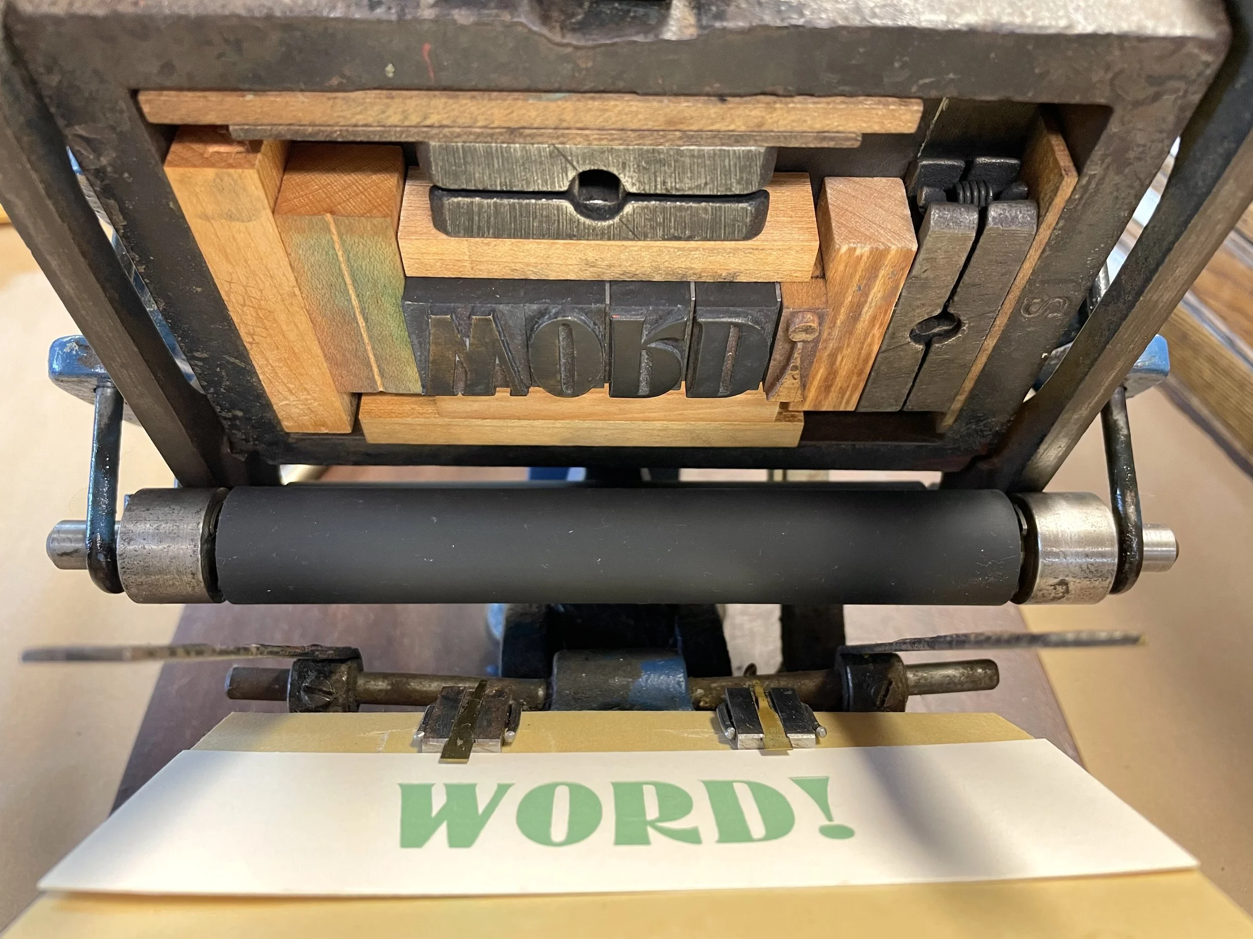
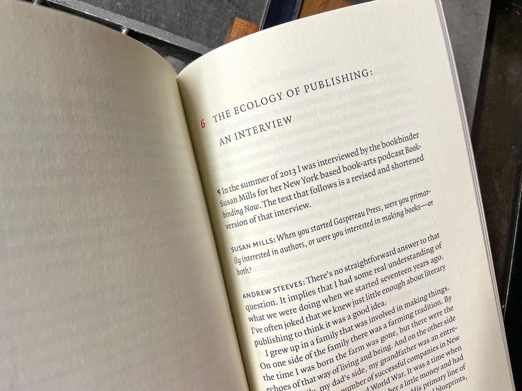
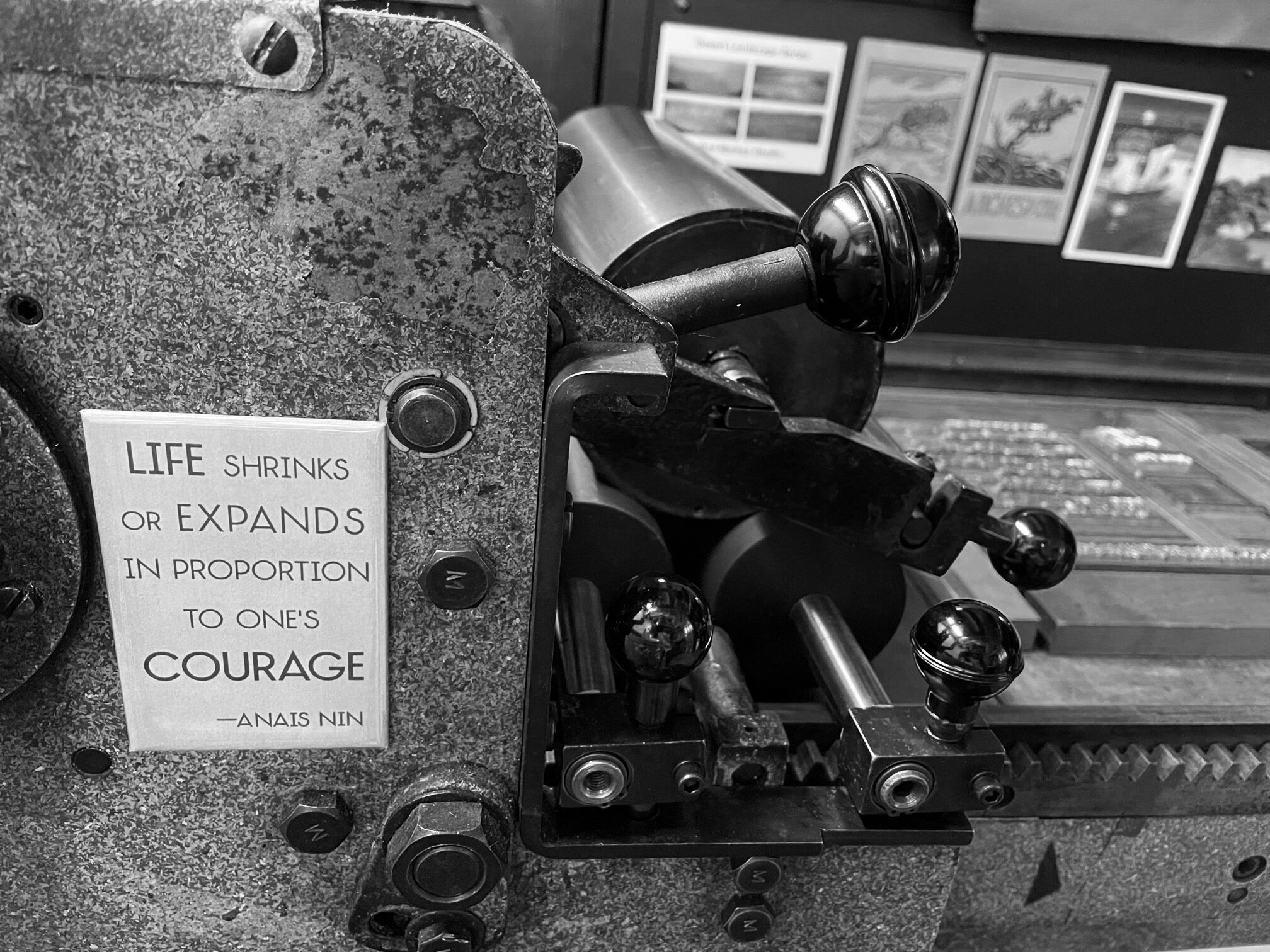
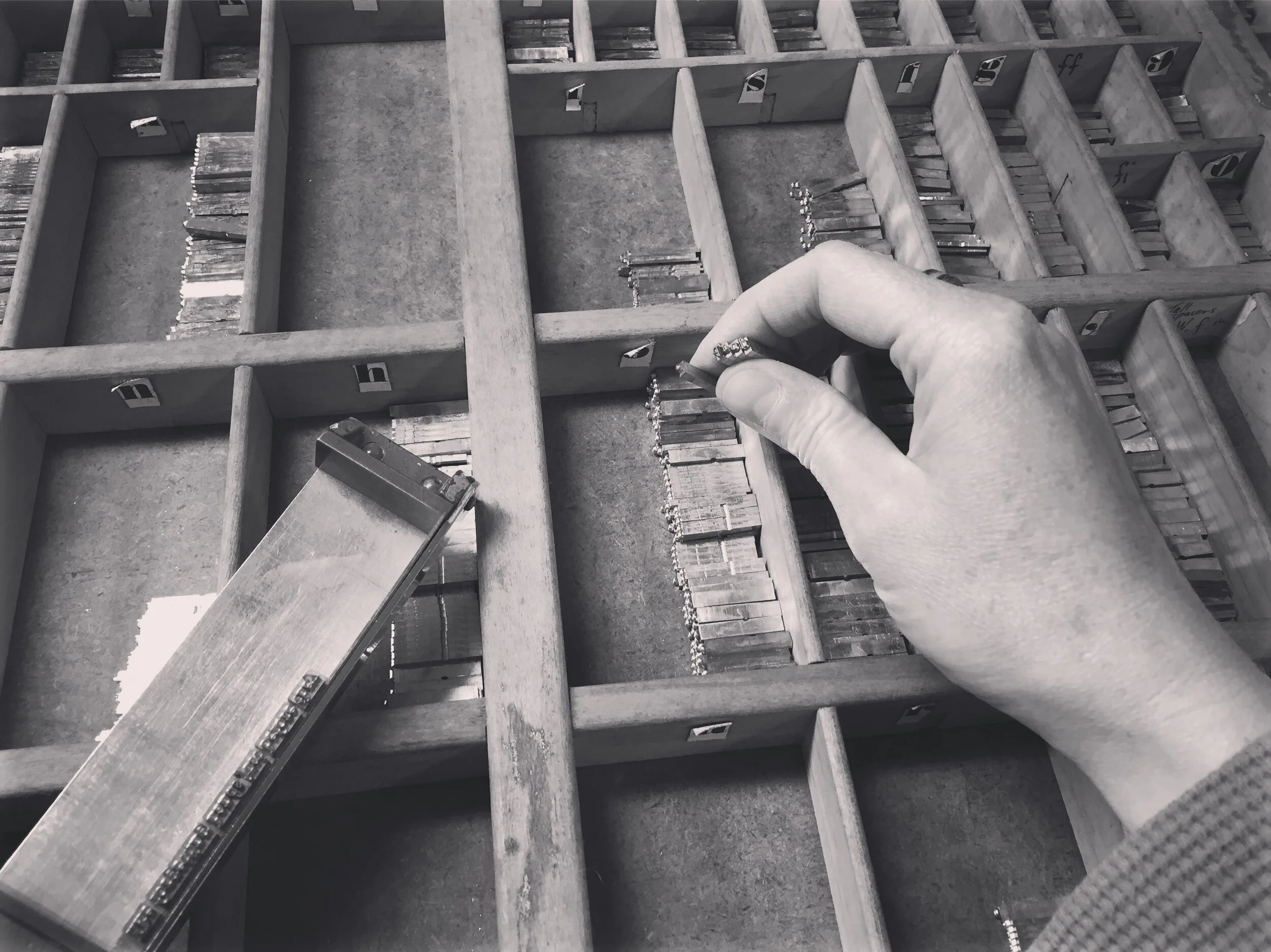
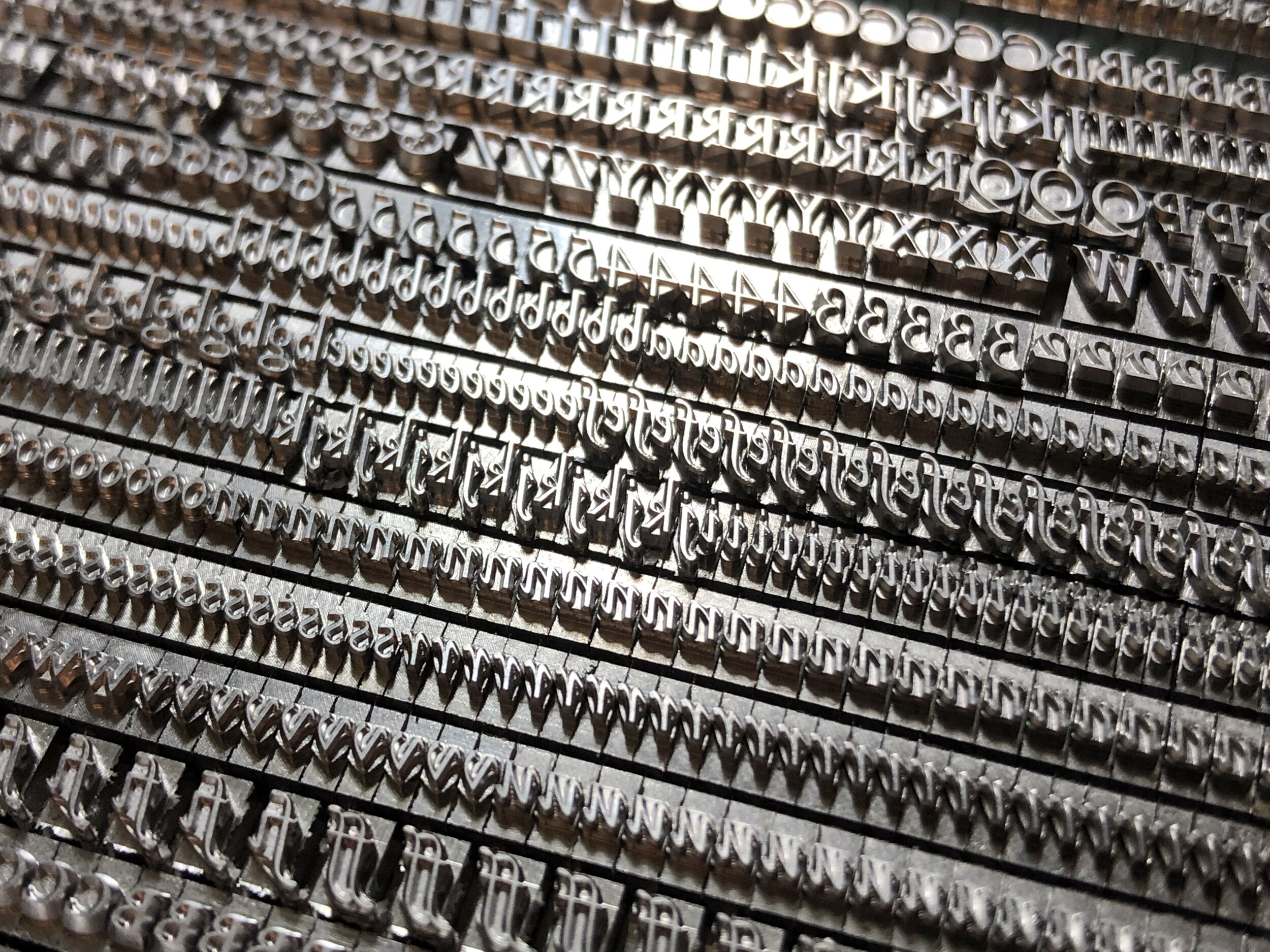
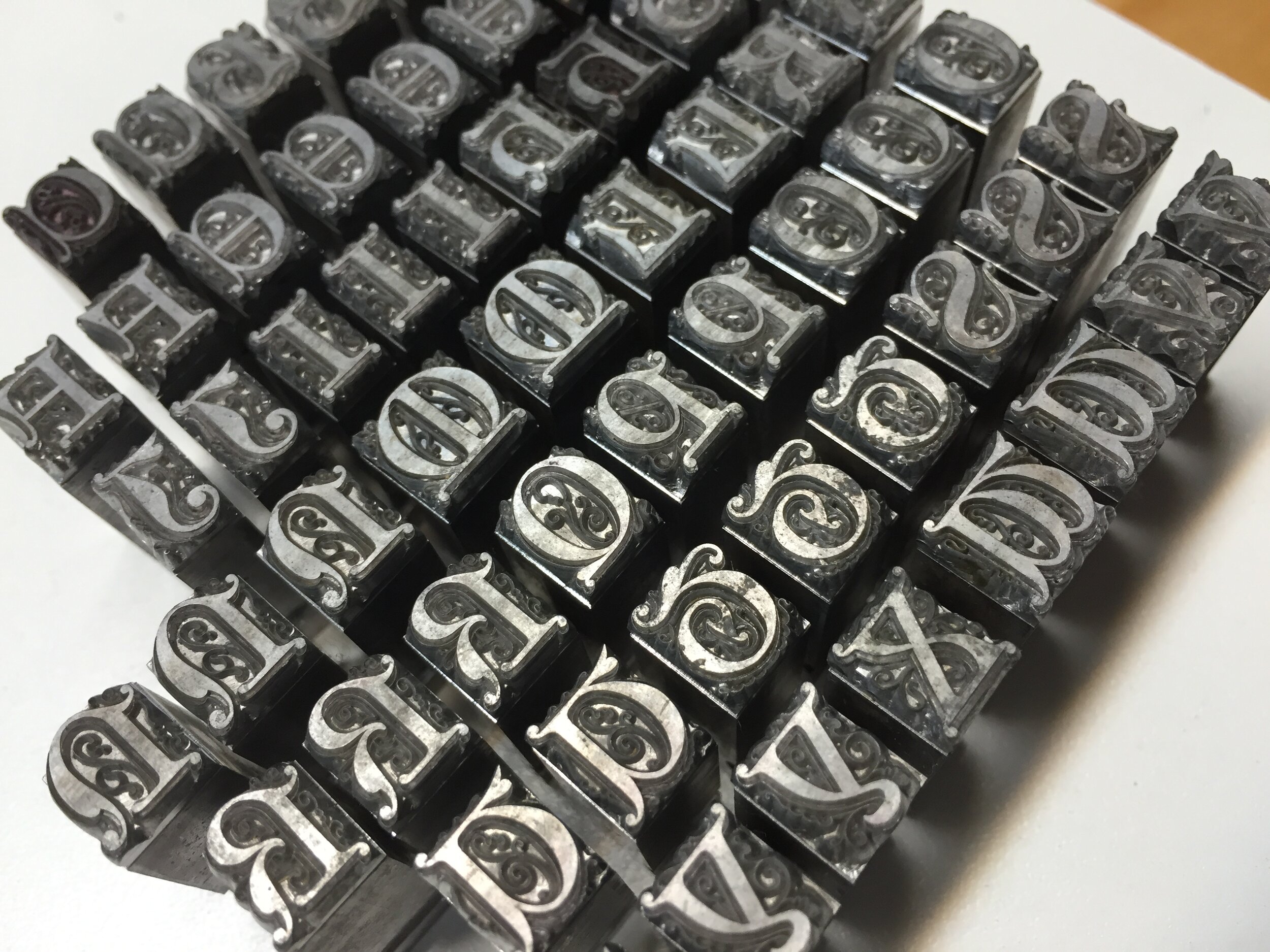
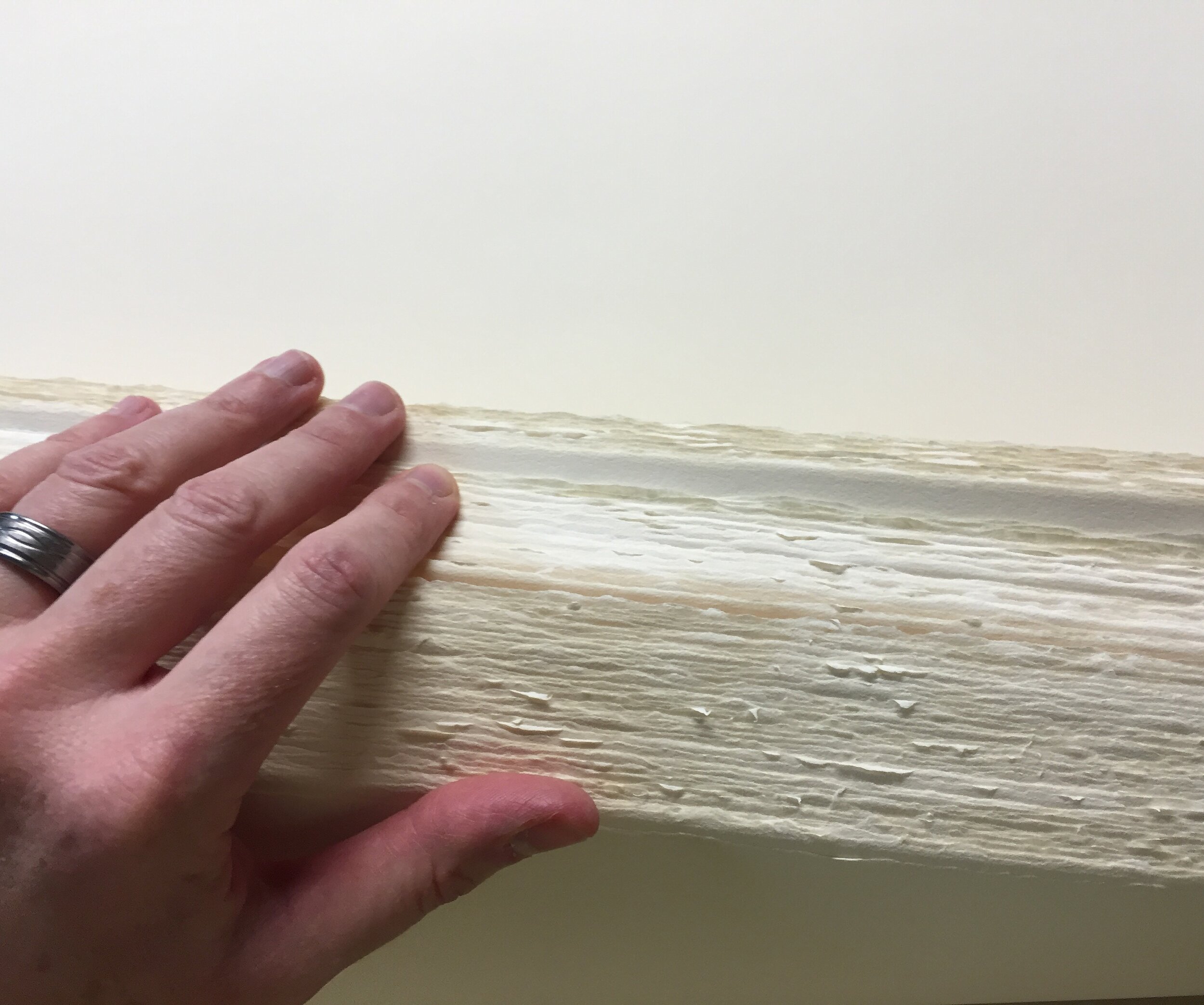
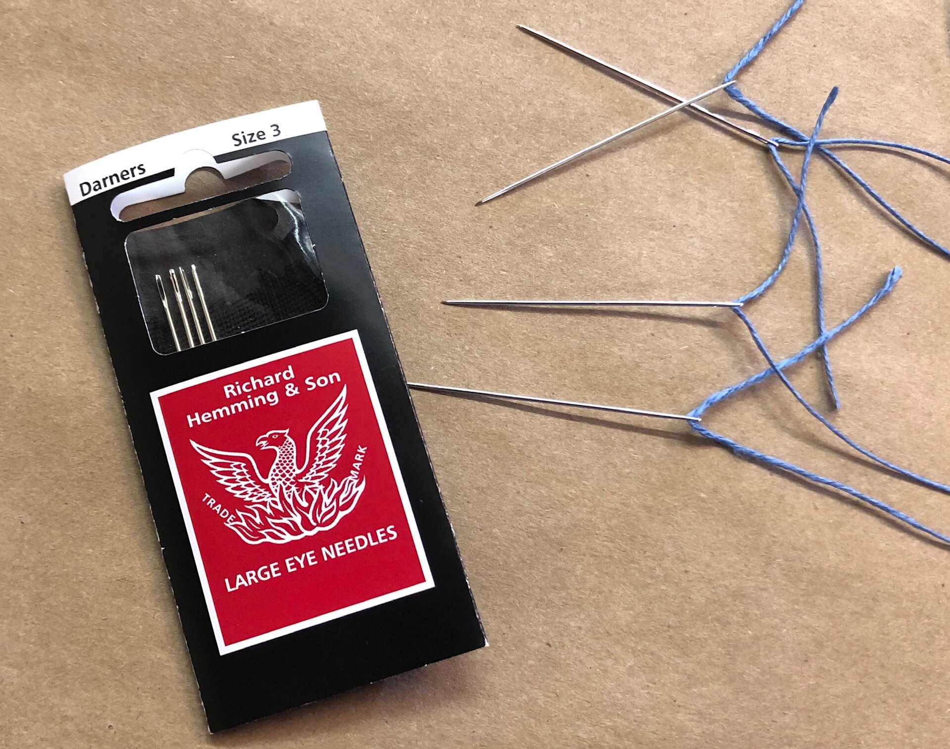
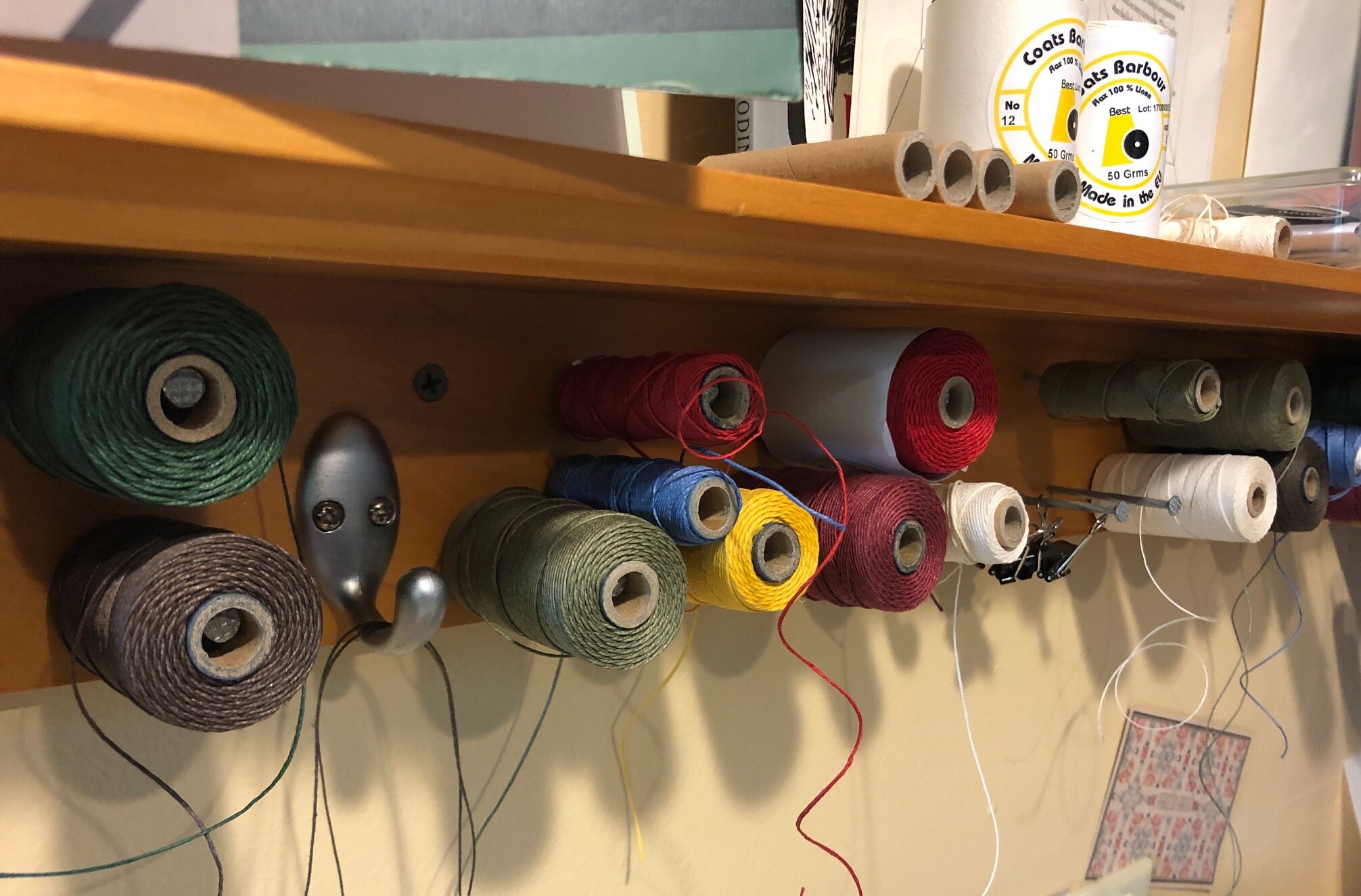
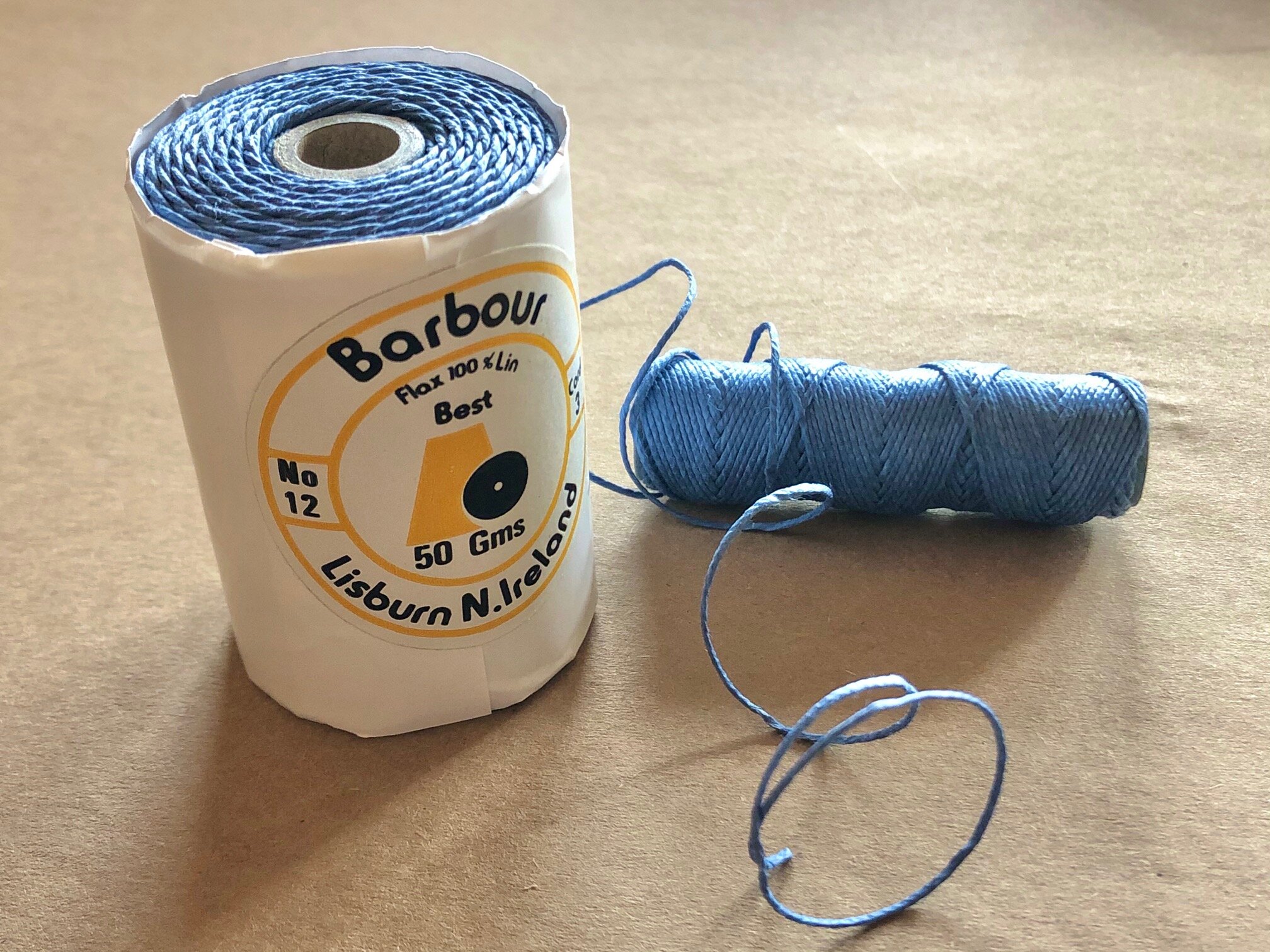
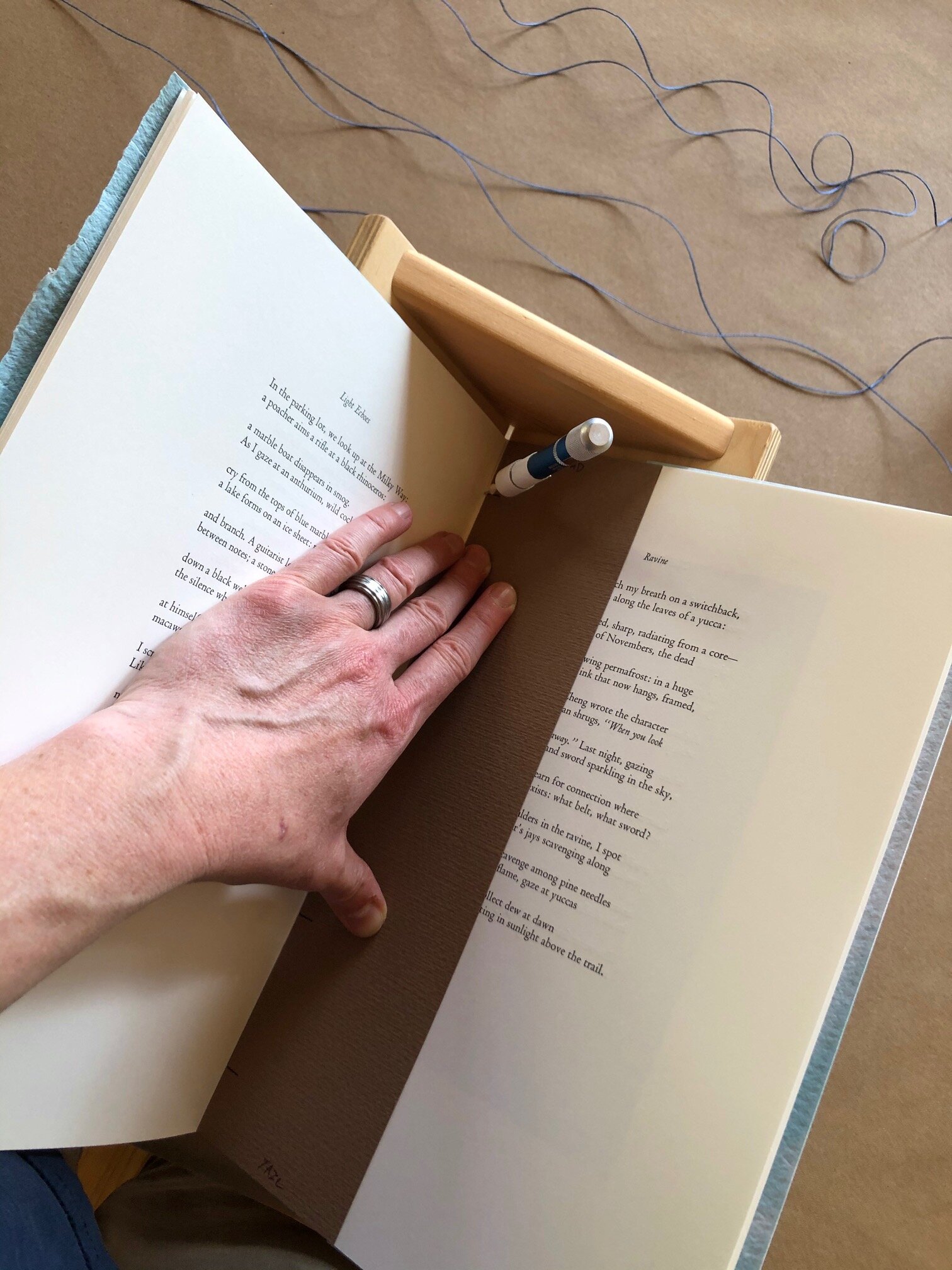
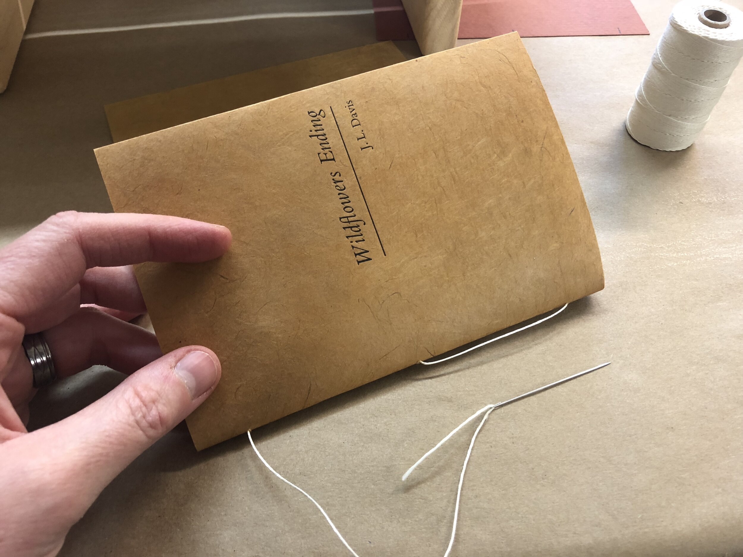
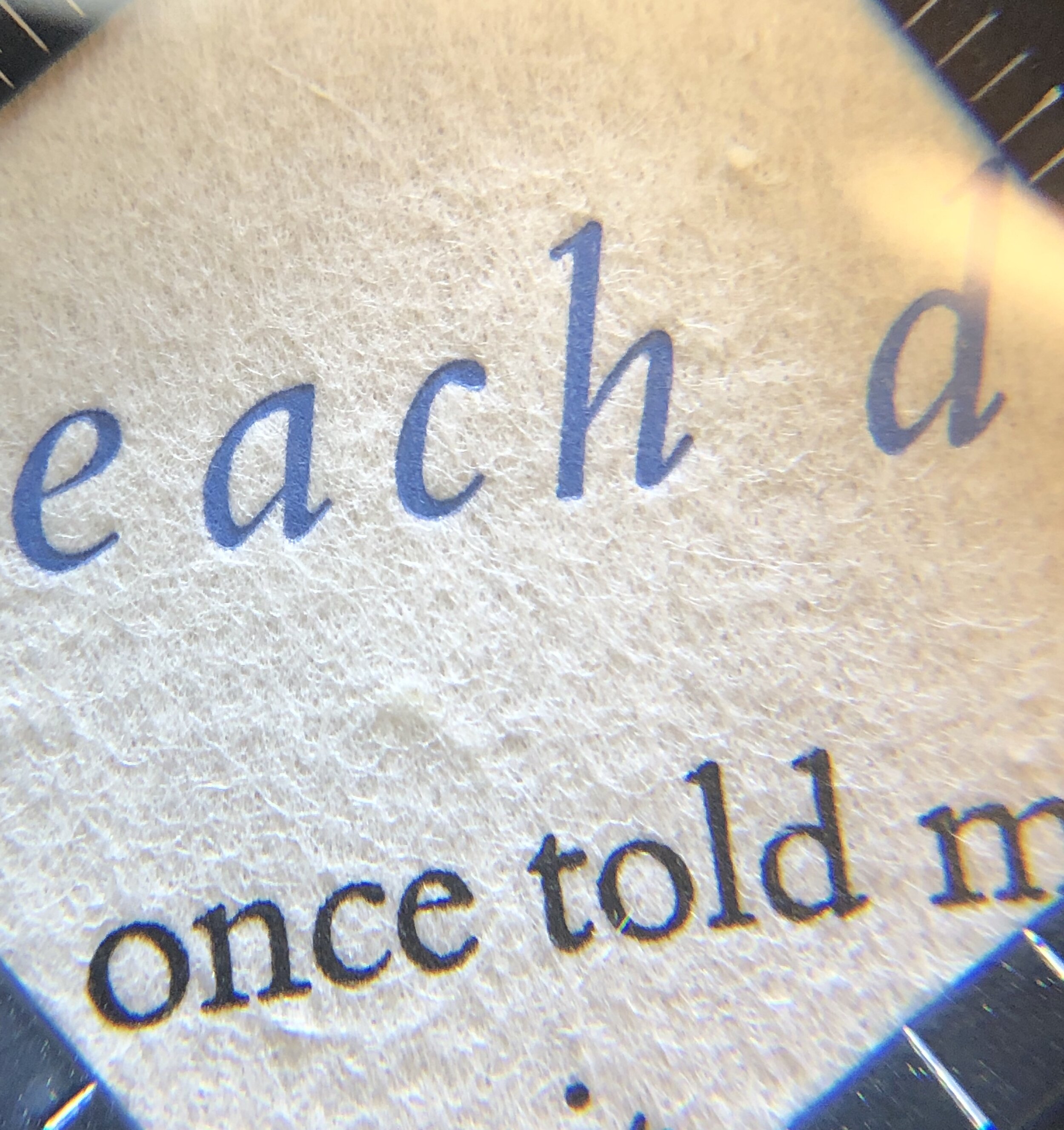
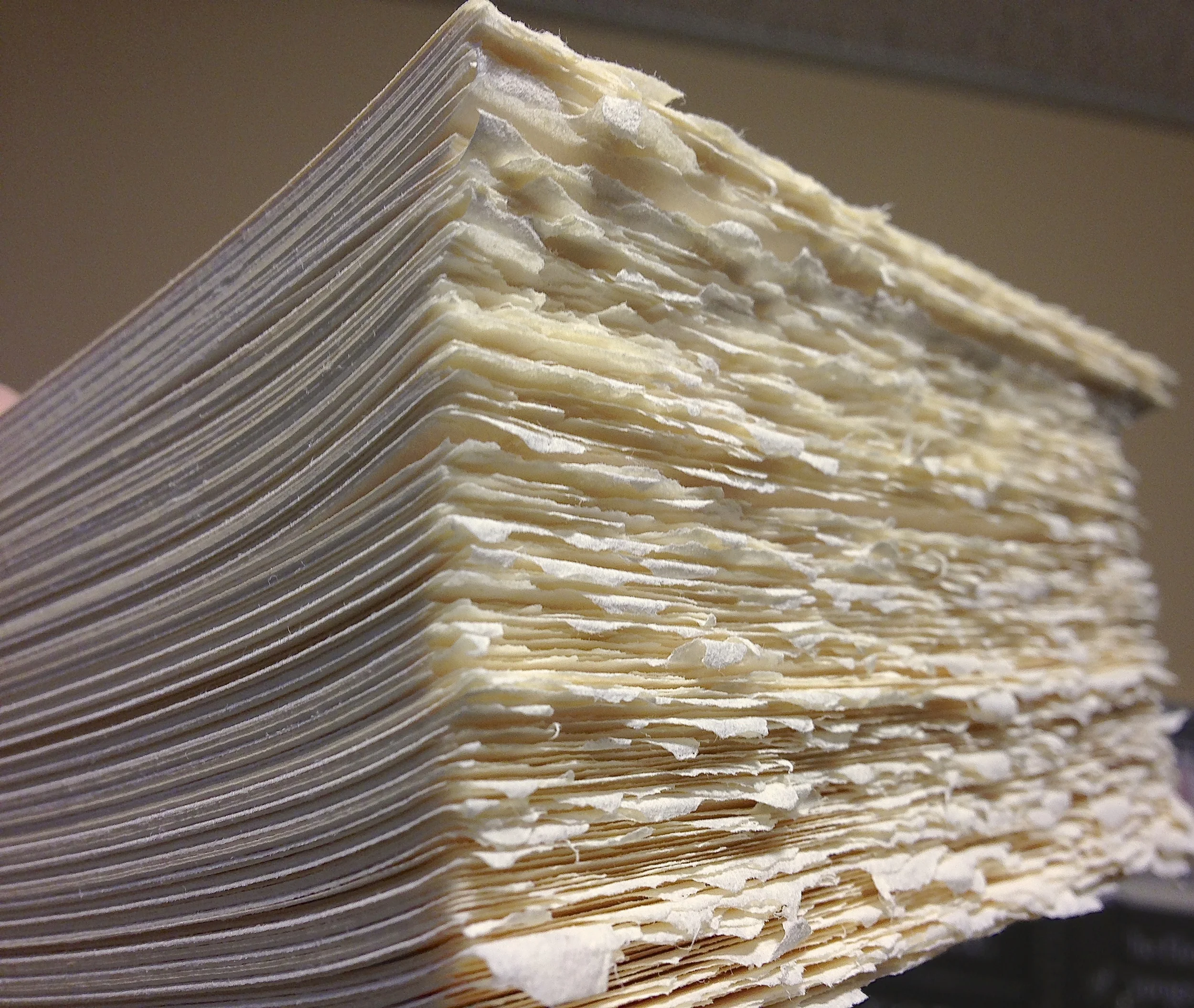
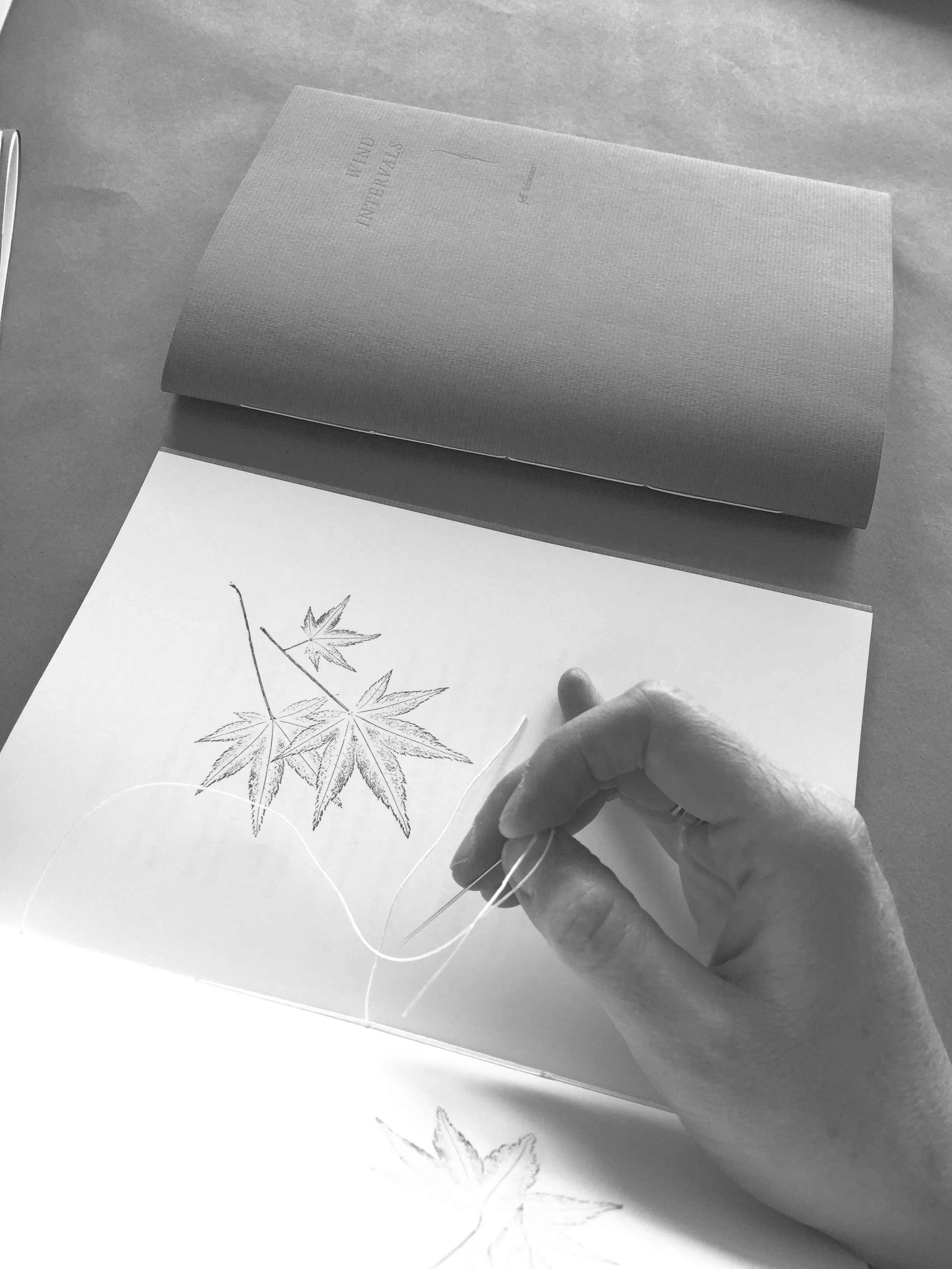
One of the many (many) unexpected delights of learning to make books circa centuries-past has been that of sewing them. When I began this journey into letterpress printing and book-craft over thirteen years ago, I didn’t know a thing about any of it, including how pages are held together. With the generous aid of other printers (Stephanie Carpenter, Paul Ritscher, Andrew Steeves, and more) and detailed texts (by Keith A. Smith, Kojiro Ikegami, and Heather Weston), I slowly began to learn the basics of binding paper.
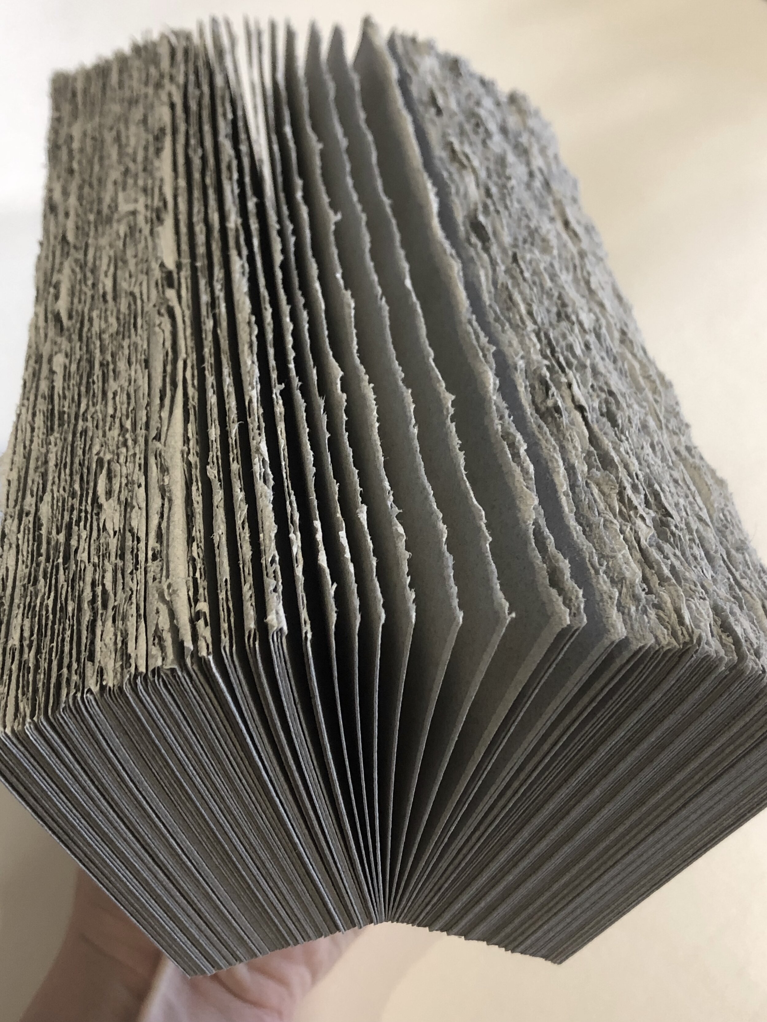
That I have stayed pretty much within those basics reflects no insufficiency on the part of those teachers, whether beings or books. For me, most of the energy of navigating book-craft’s complexities goes into the design and printing stages; I like to keep the sewing simple. And it has become a joy. After I’m satisfied that the sewing pattern fits the format and that my fingers know the route, I settle back and relax. The work becomes meditative, clarifying. Mind and hours slowly unspool as smartly-bound books stack up, and I feel a suffusing contentment.
Not one bookbinding project goes by that I do not think of and thank my maternal forebears. That moment in time with them, over 30 years ago, has stitched itself to the present and to the future, securing both a memory and a tradition within me and threading its way to others, too — whenever I hand a book that I make to another person, the stitch goes with it, connecting all in widening relations of creativity and care.
You are woven in now, too.
Thanks for reading, supporting, and sharing, friends. May each of you know your own belonging, whether within a family or a circle of friendship or within the weave of the larger world. Mysteriously, gracefully, we are held in living relations that make and mend us. May our hands be open to both receive these gifts and to pass them on again.
Emily
Here’s a video of my process of sewing a booklet: punching holes in a text block and then sewing it together with the flyleaf and jacket papers. The booklet shown here is One Lightning Bug, a limited edition letterpress setting of a poem by Anna Lena Phillips Bell, published by St Brigid Press, 2026.
(Many thanks to my brother-in-law Bill for giving me a phone-holder so I can make better videos!)