Old Poems, New Forms

Comment

Old Poems, New Forms

During some Spring Cleaning at the Press a few weeks ago, I rediscovered a sweet small project that had somehow gotten buried by other works-in-progress. 

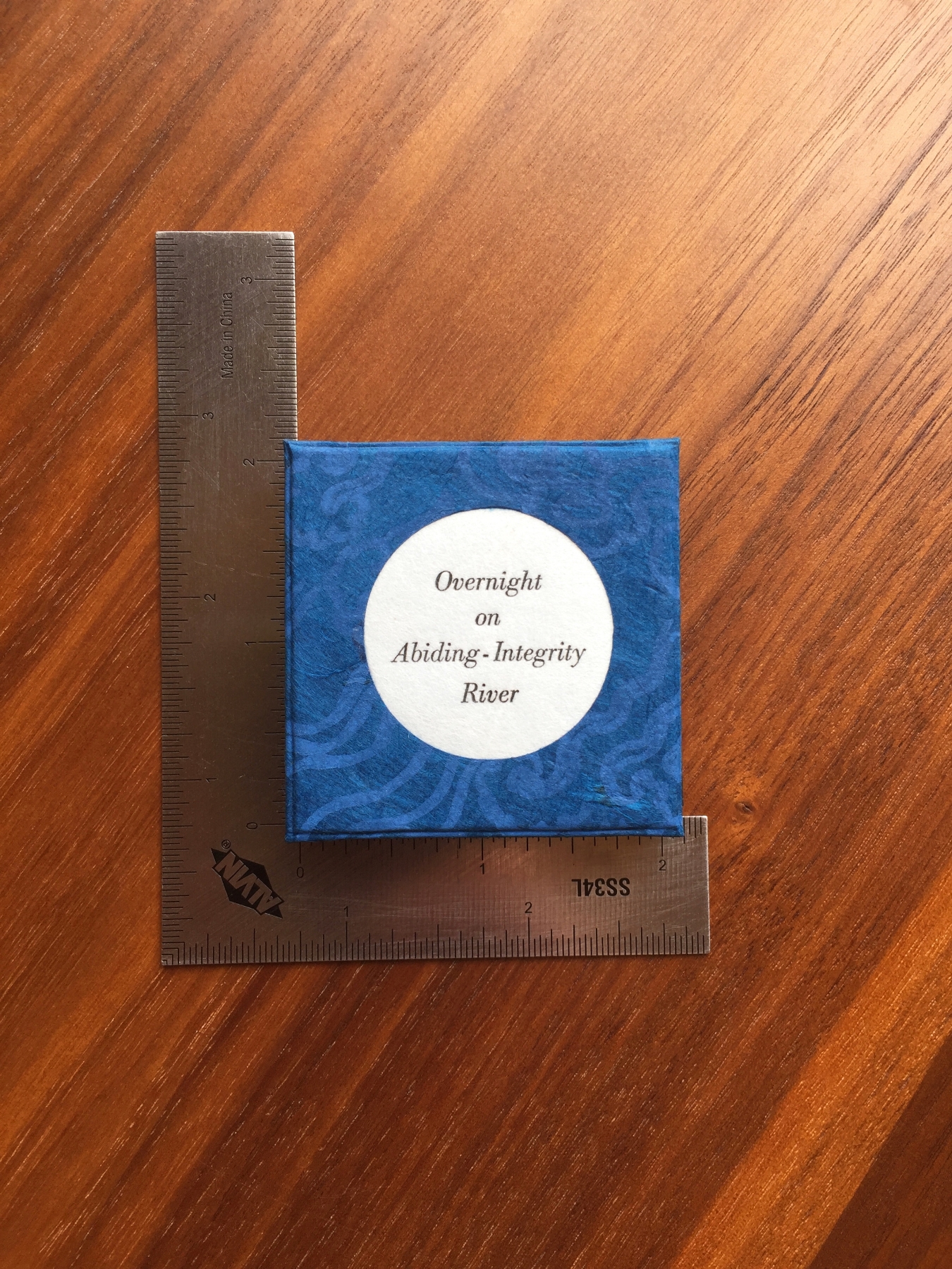
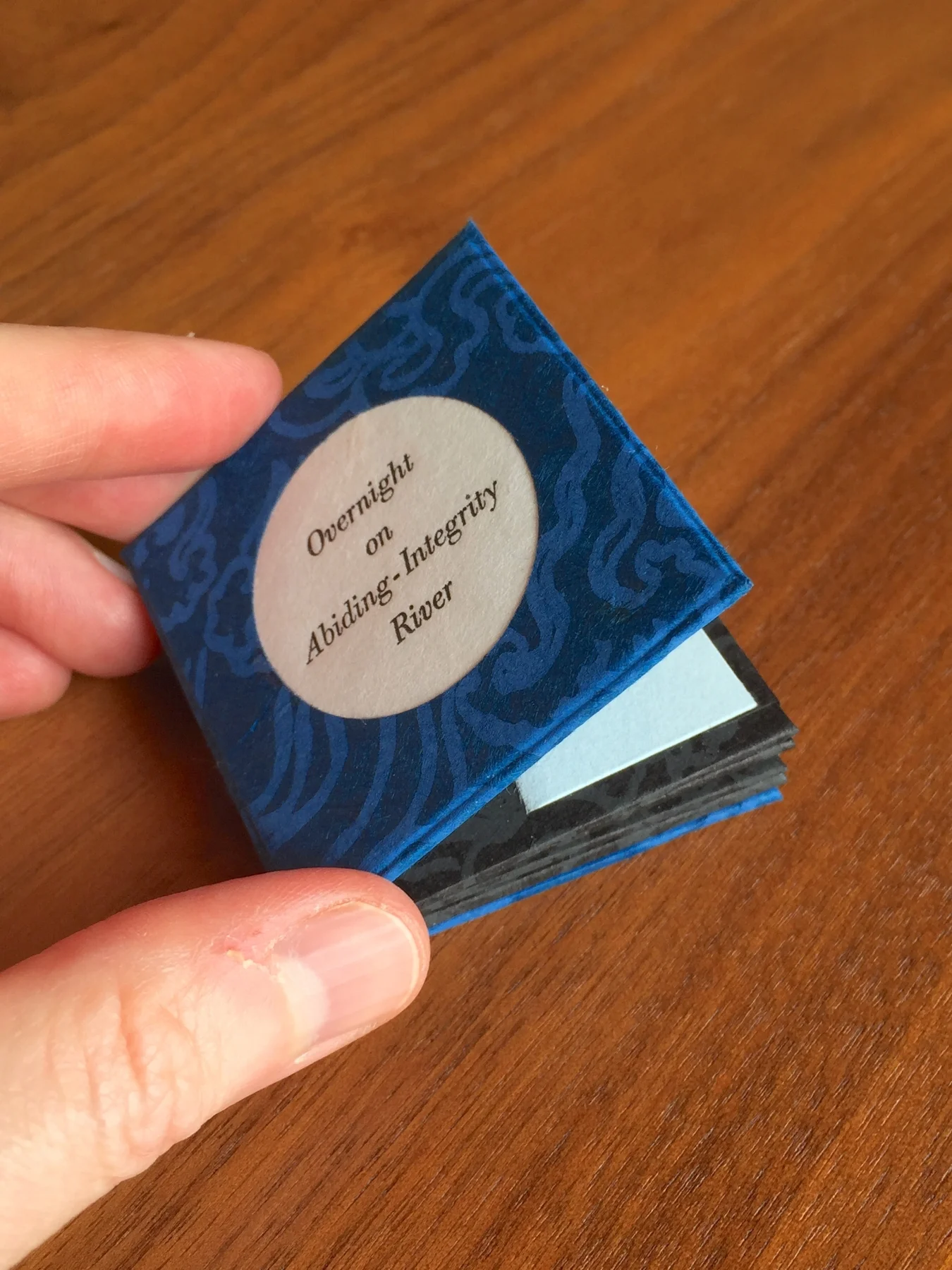
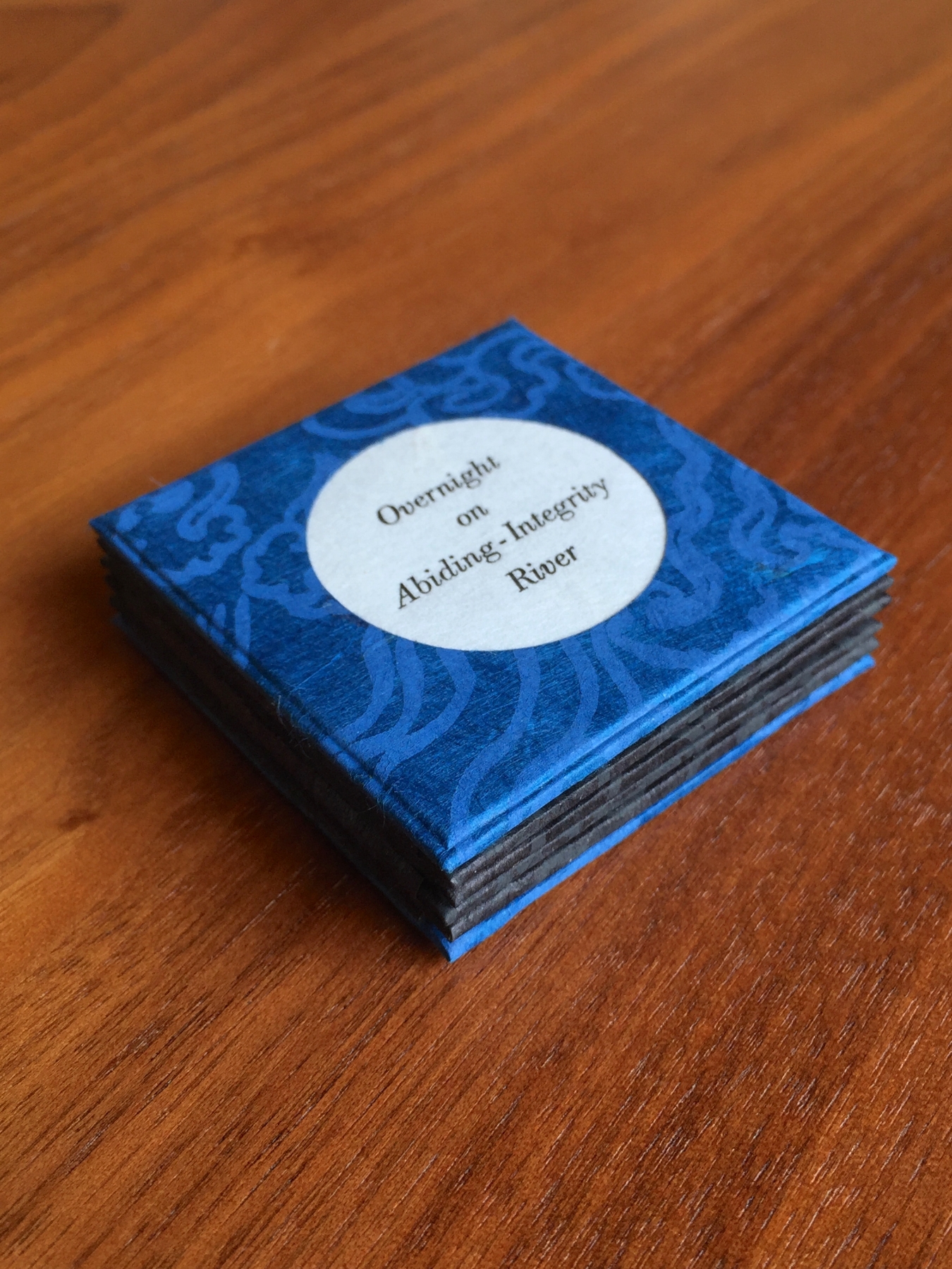
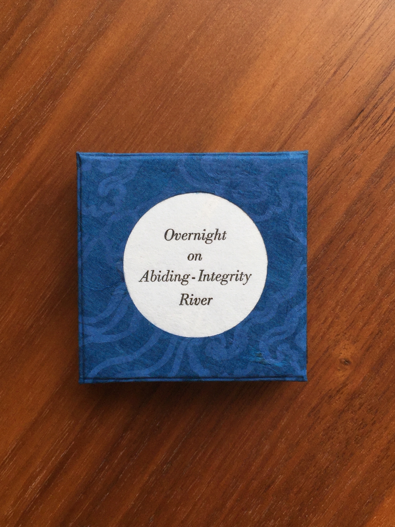
“Overnight on Abiding-Integrity River”
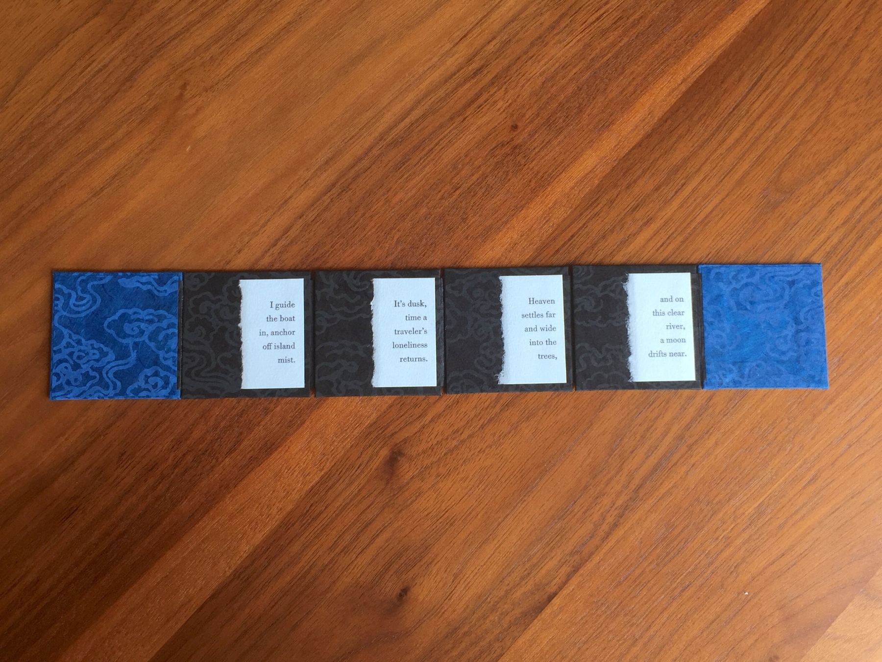
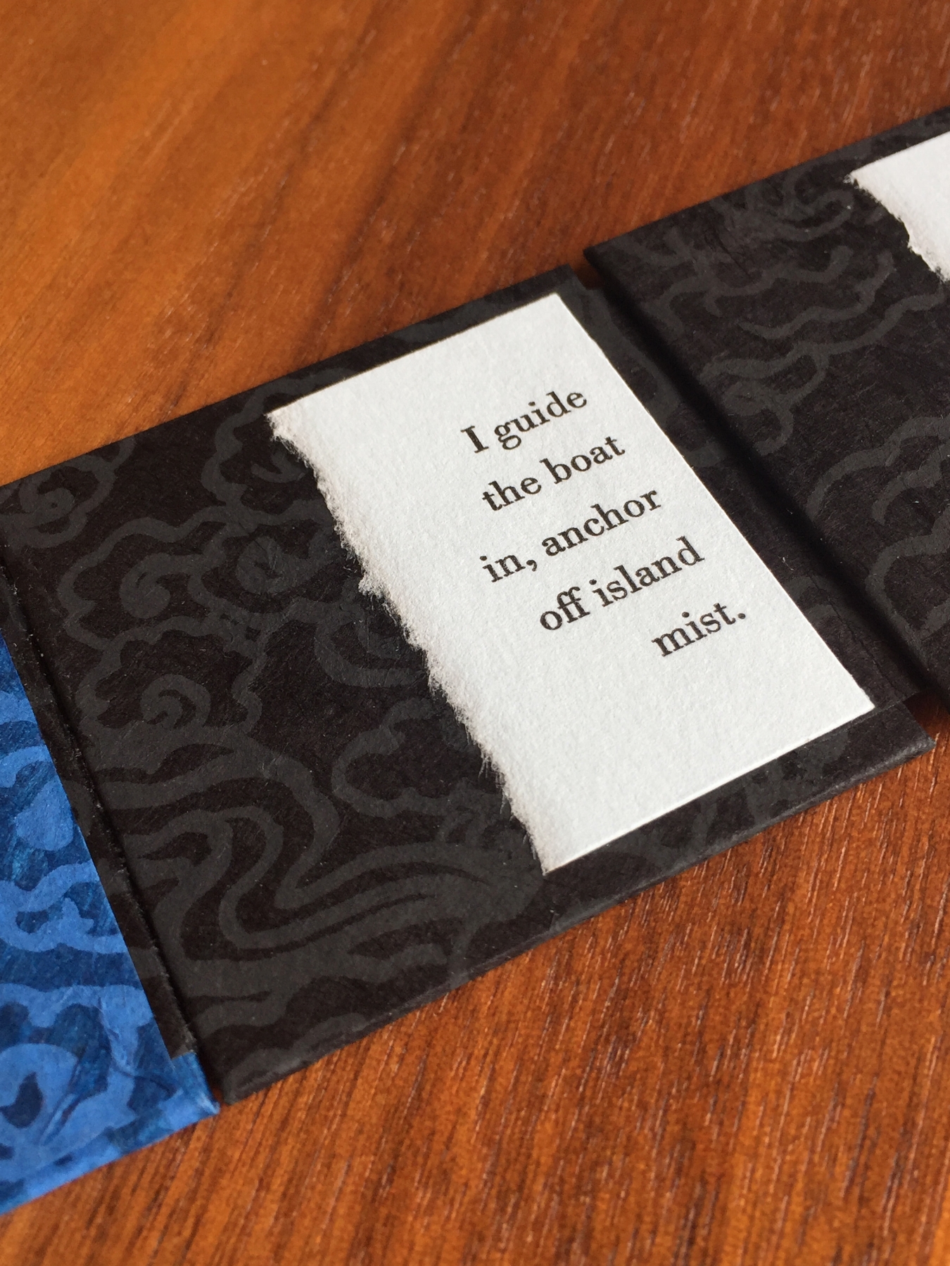
an unfolding poem

Ancient Chinese poetry has long been an enjoyment of mine, particularly poems translated by David Hinton. And a favorite author that Hinton translates beautifully is the early T’ang Dynasty poet Meng Hao-jan (689-740 C.E.).

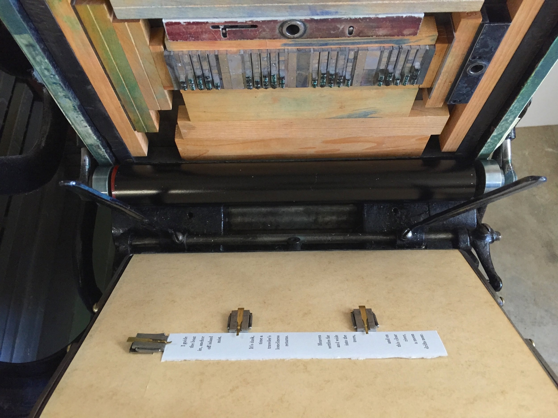
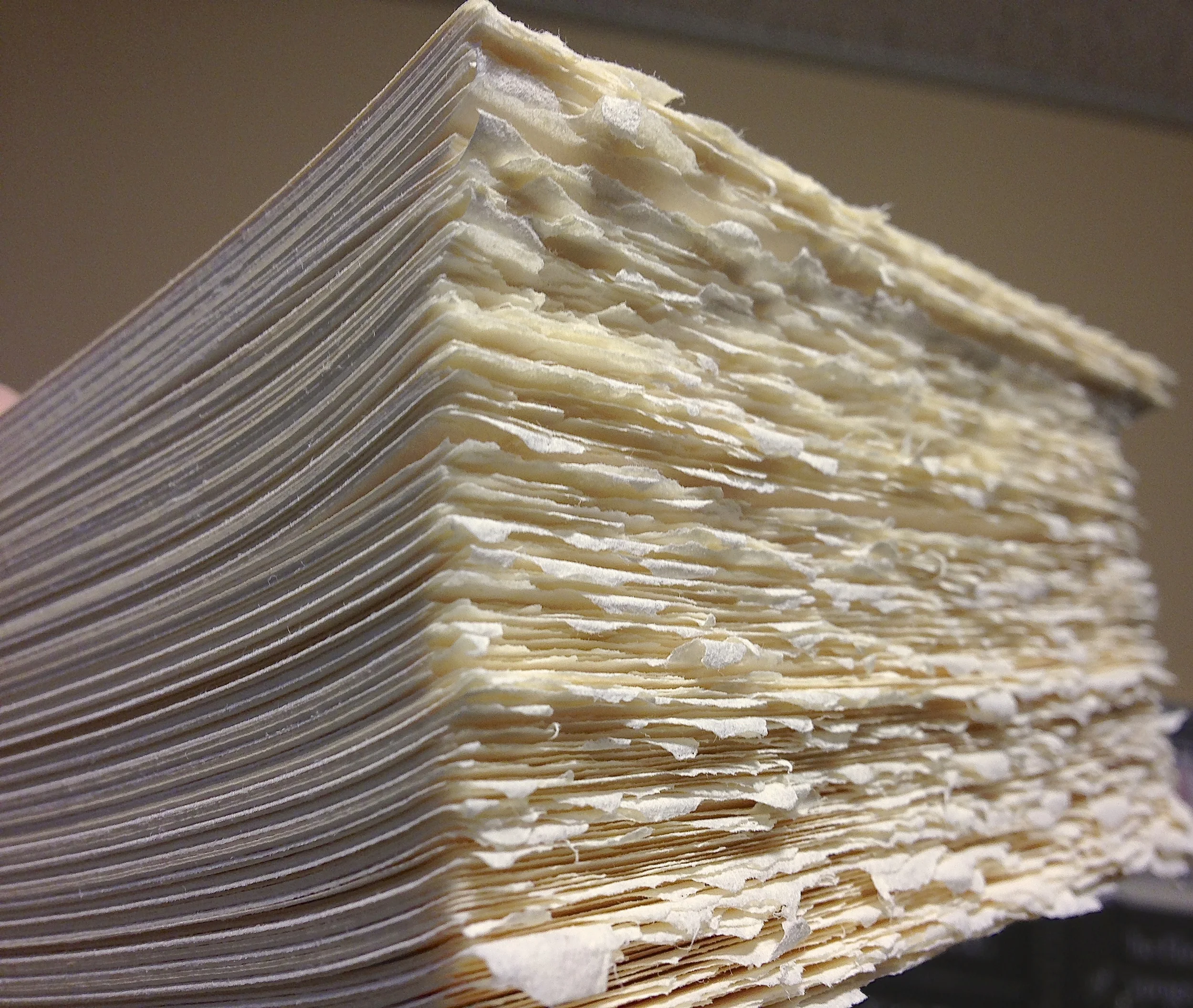
One of Meng’s crystalline four-line poems struck me as a lovely candidate for a miniature book. At 2-inches square and a half-inch thick, this unfolding journey is small in size but large in scope. Meng’s linked, sensory lines seemed to naturally suit themselves to a linked, tactile format.

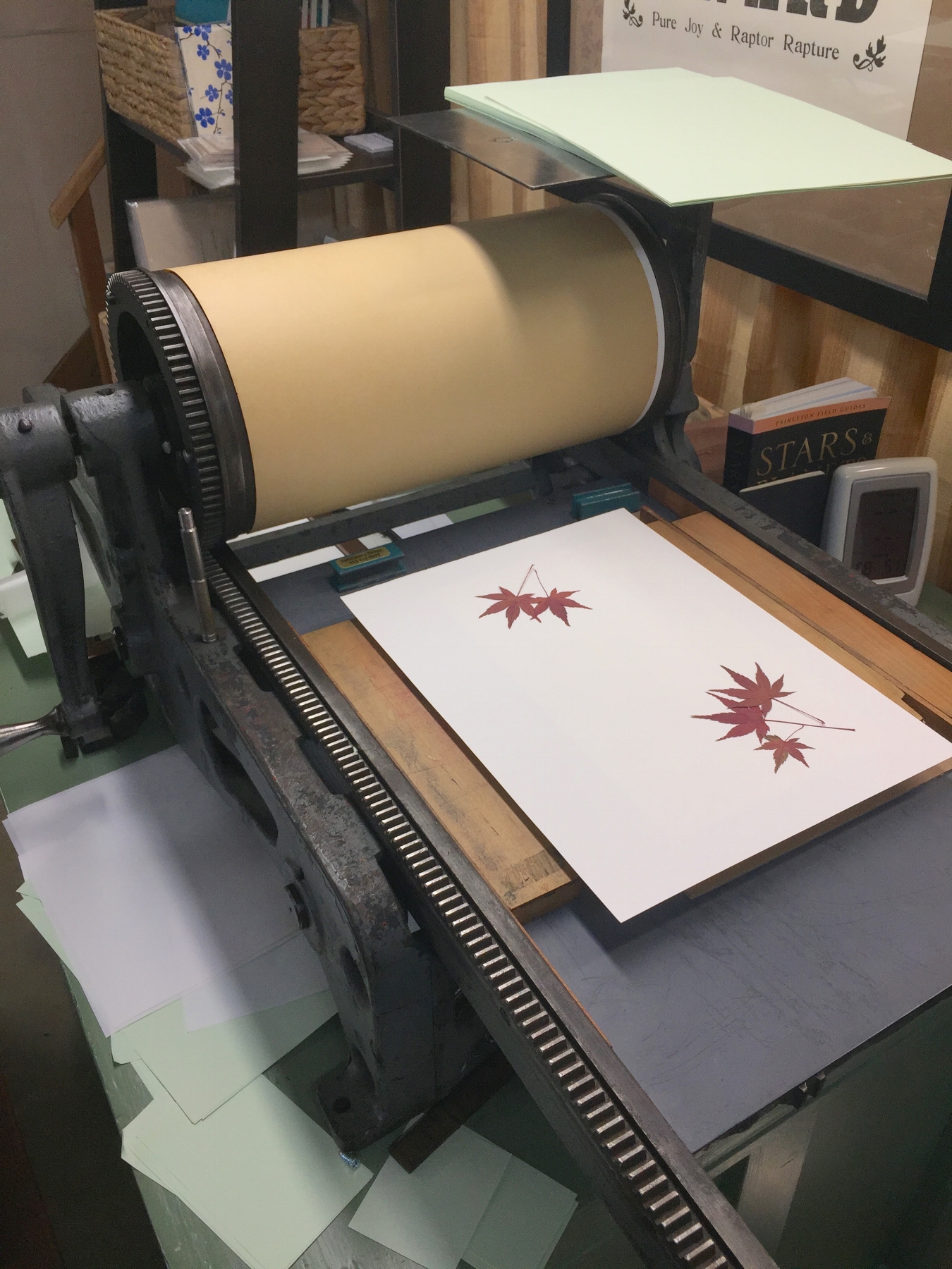
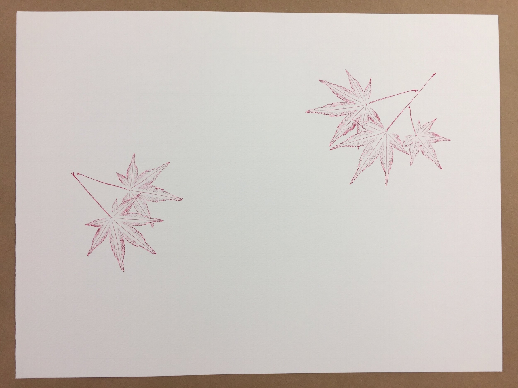
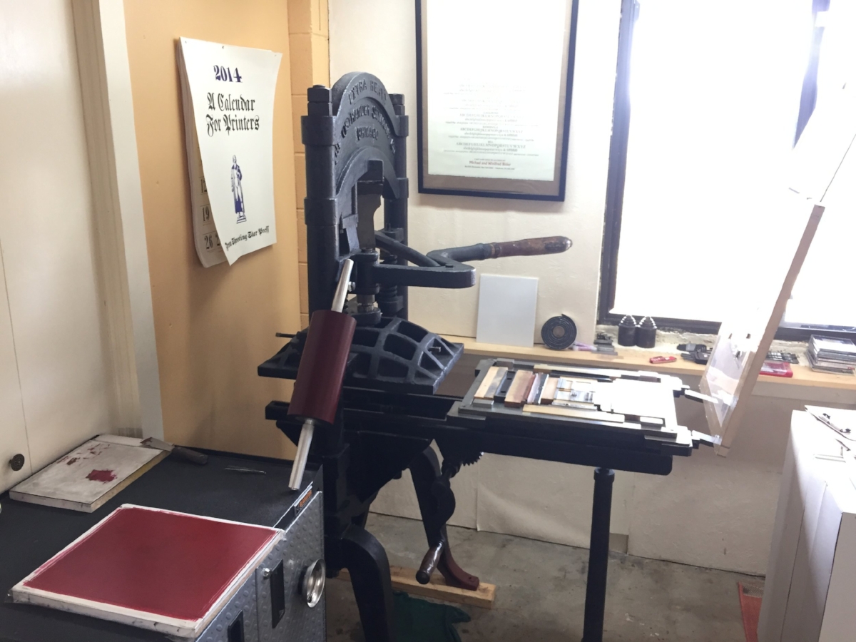
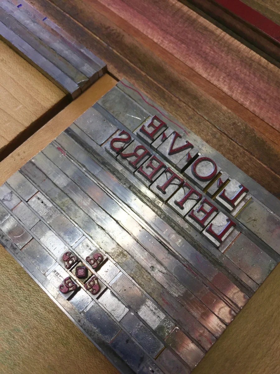
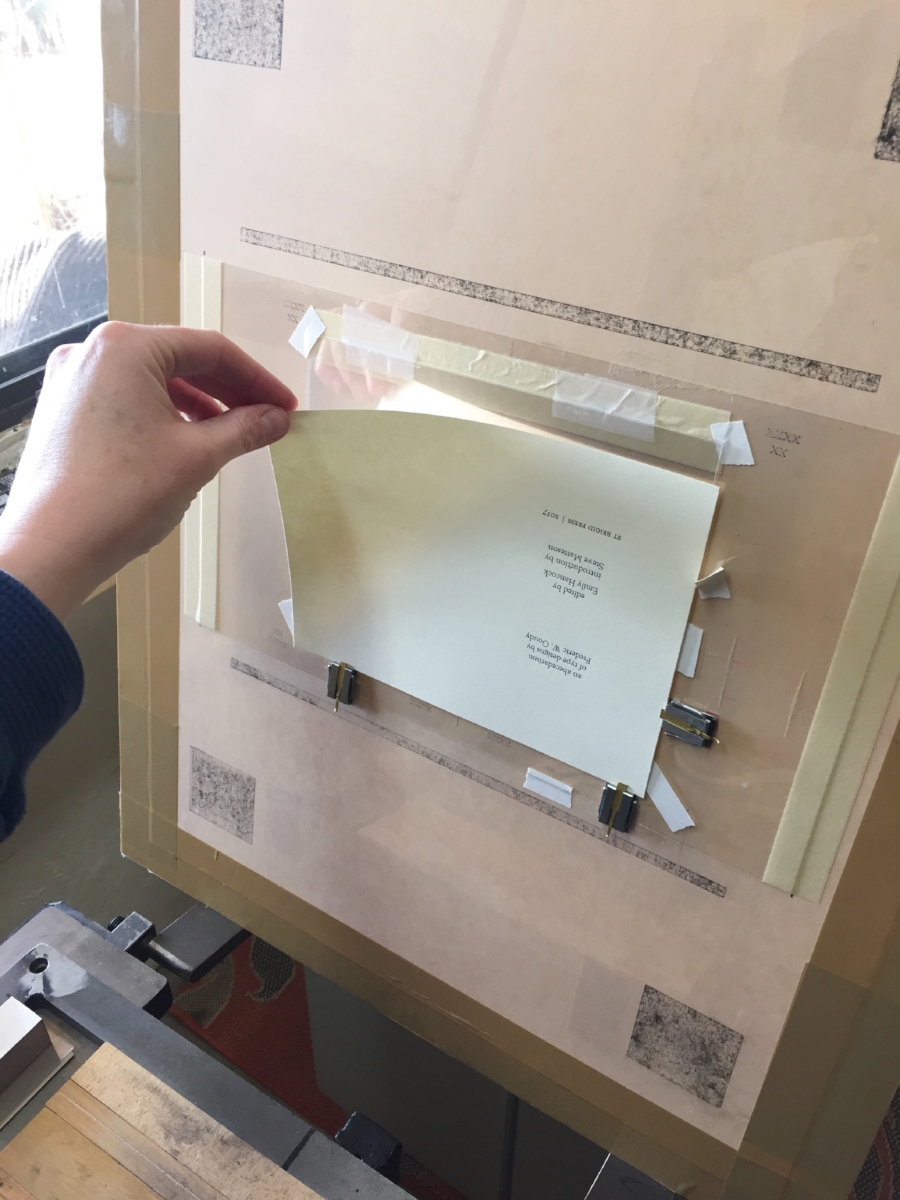
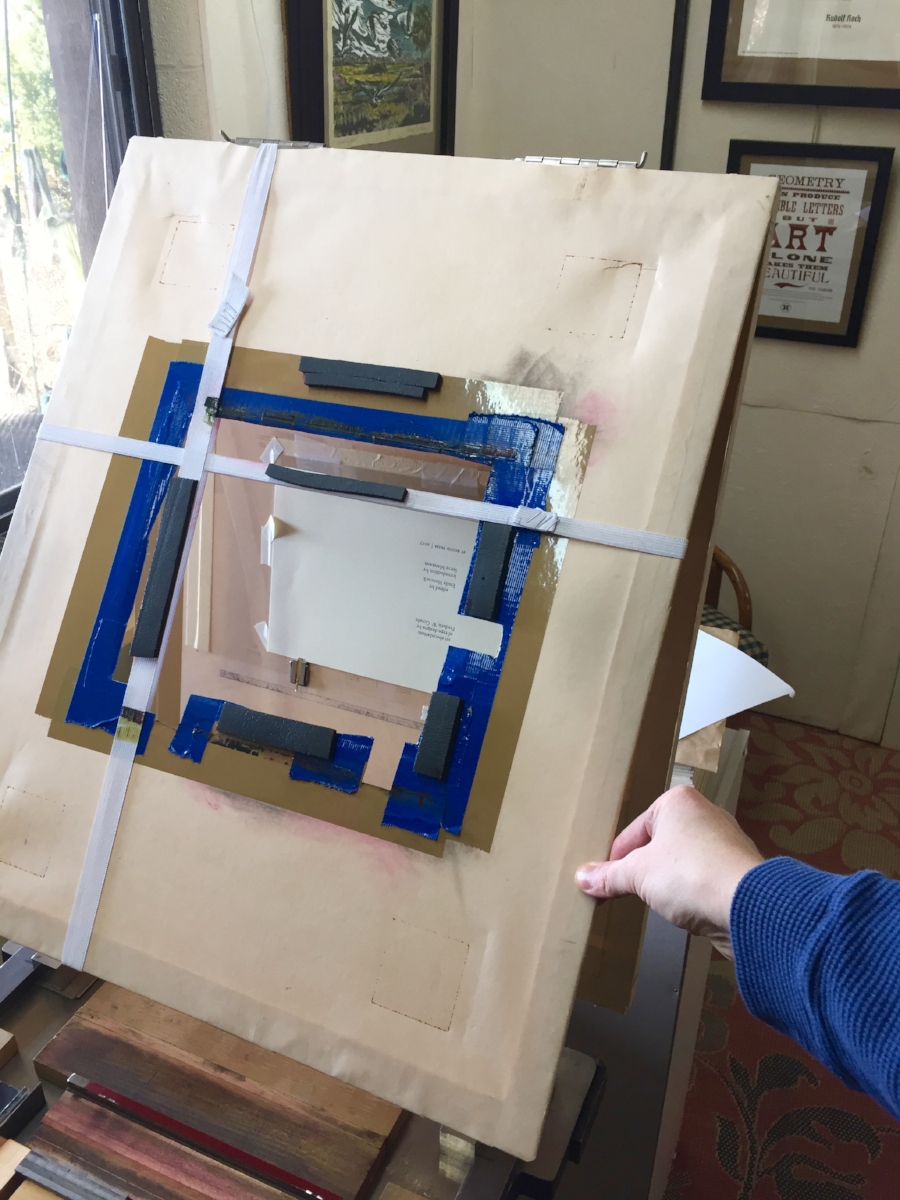
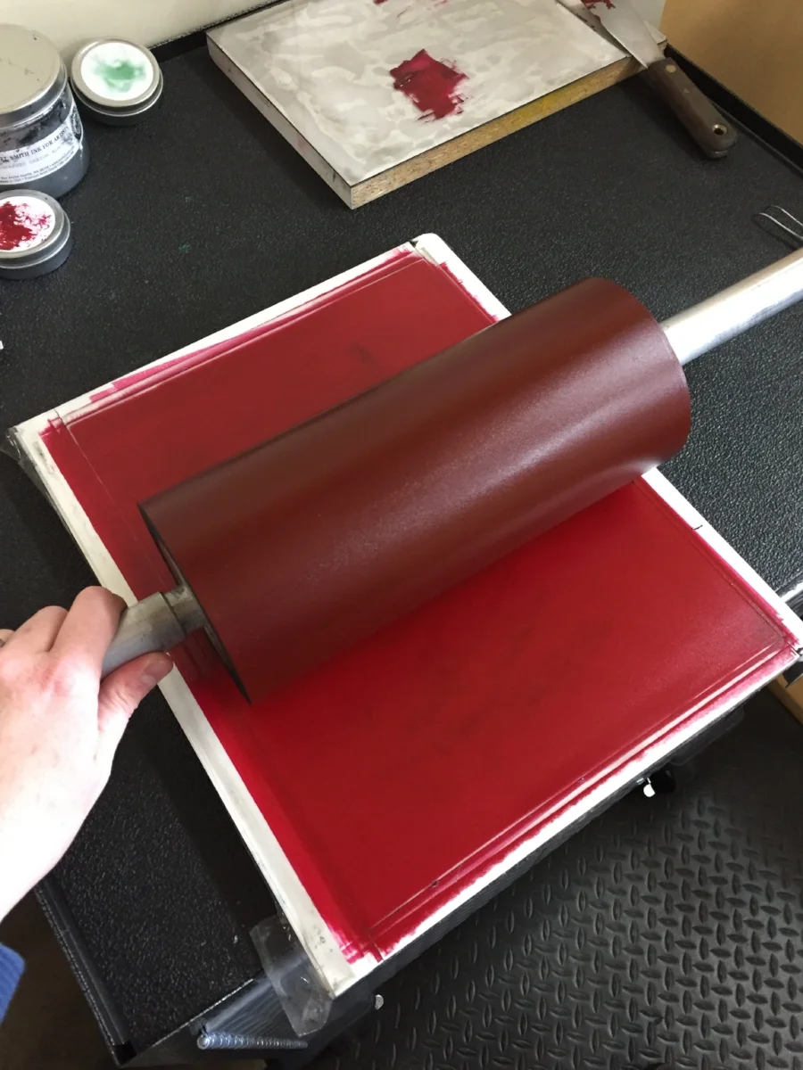
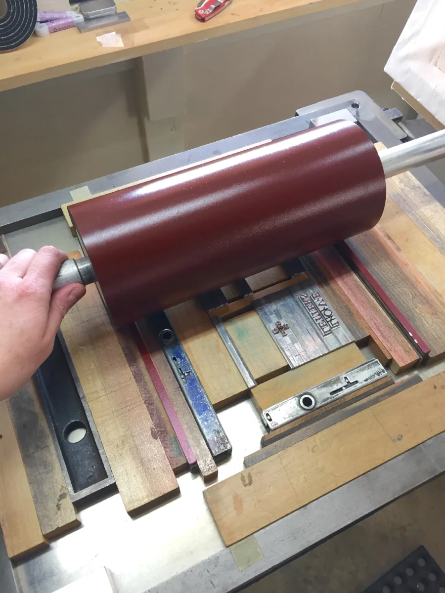
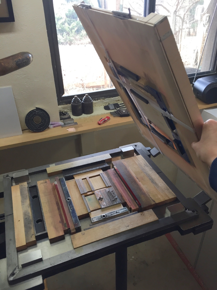
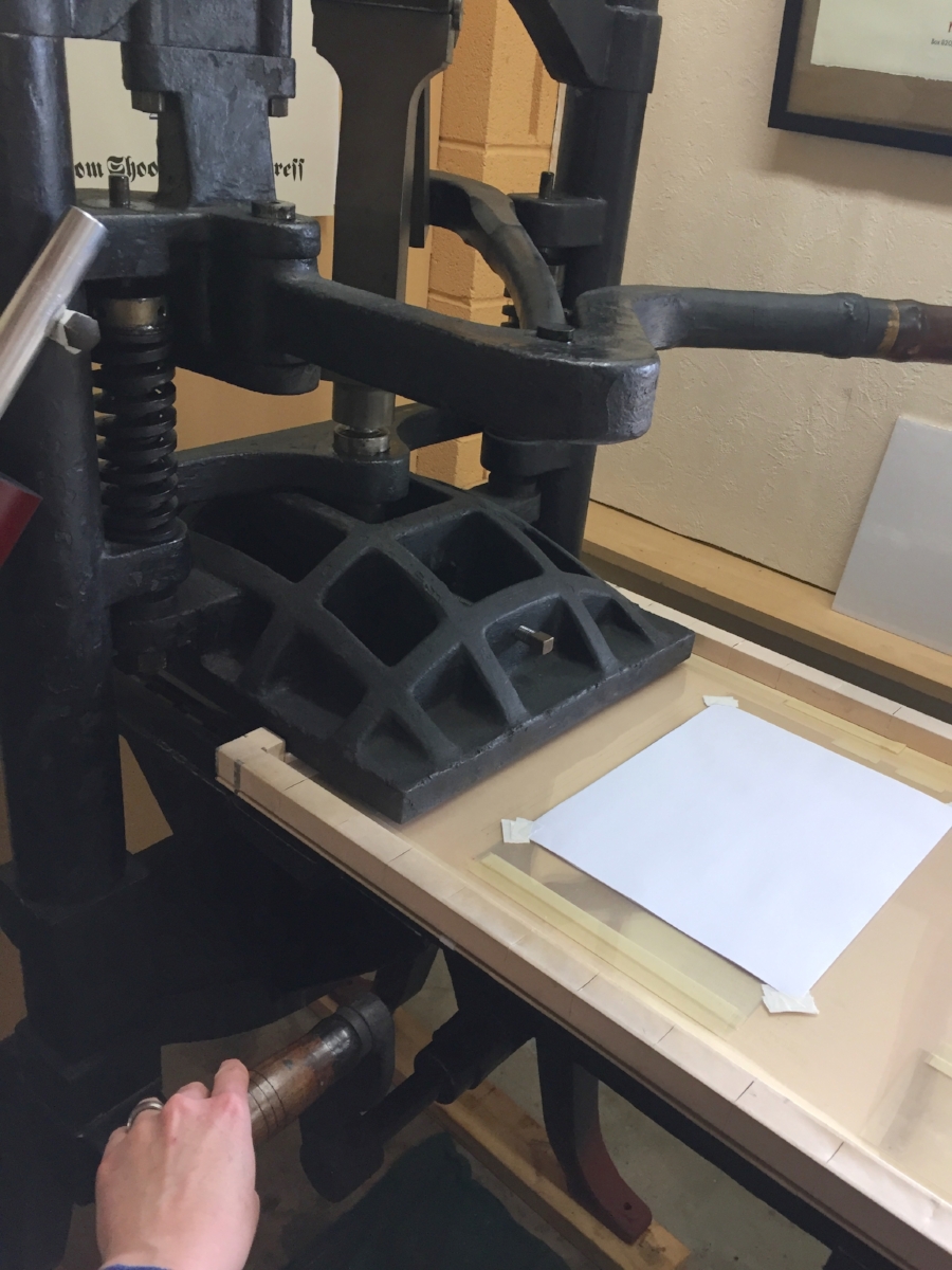
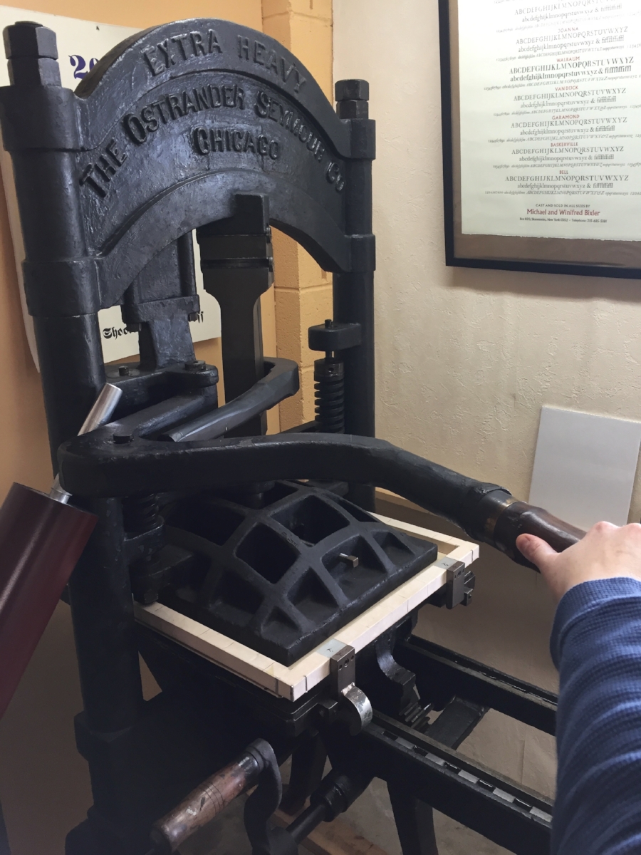
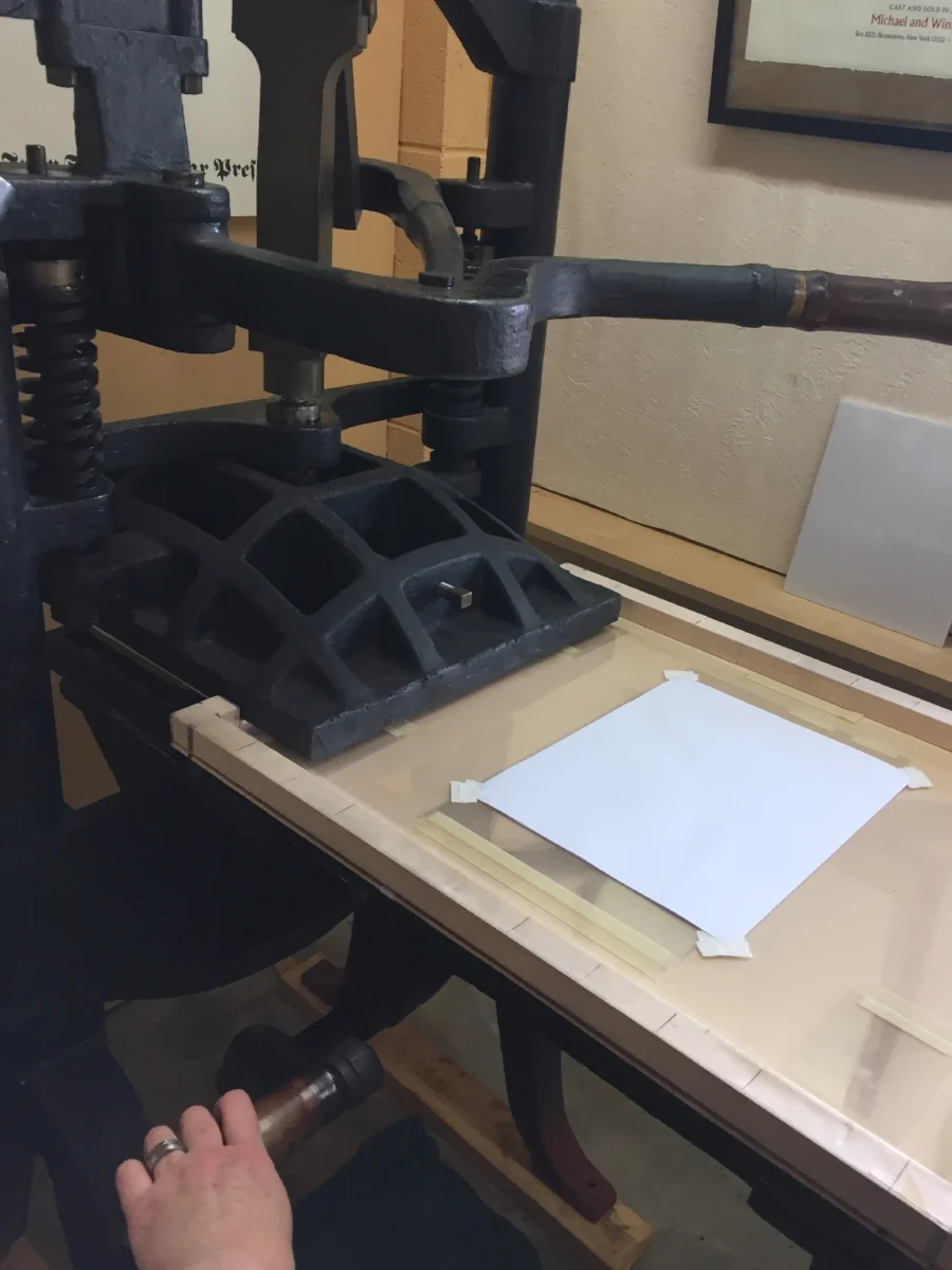
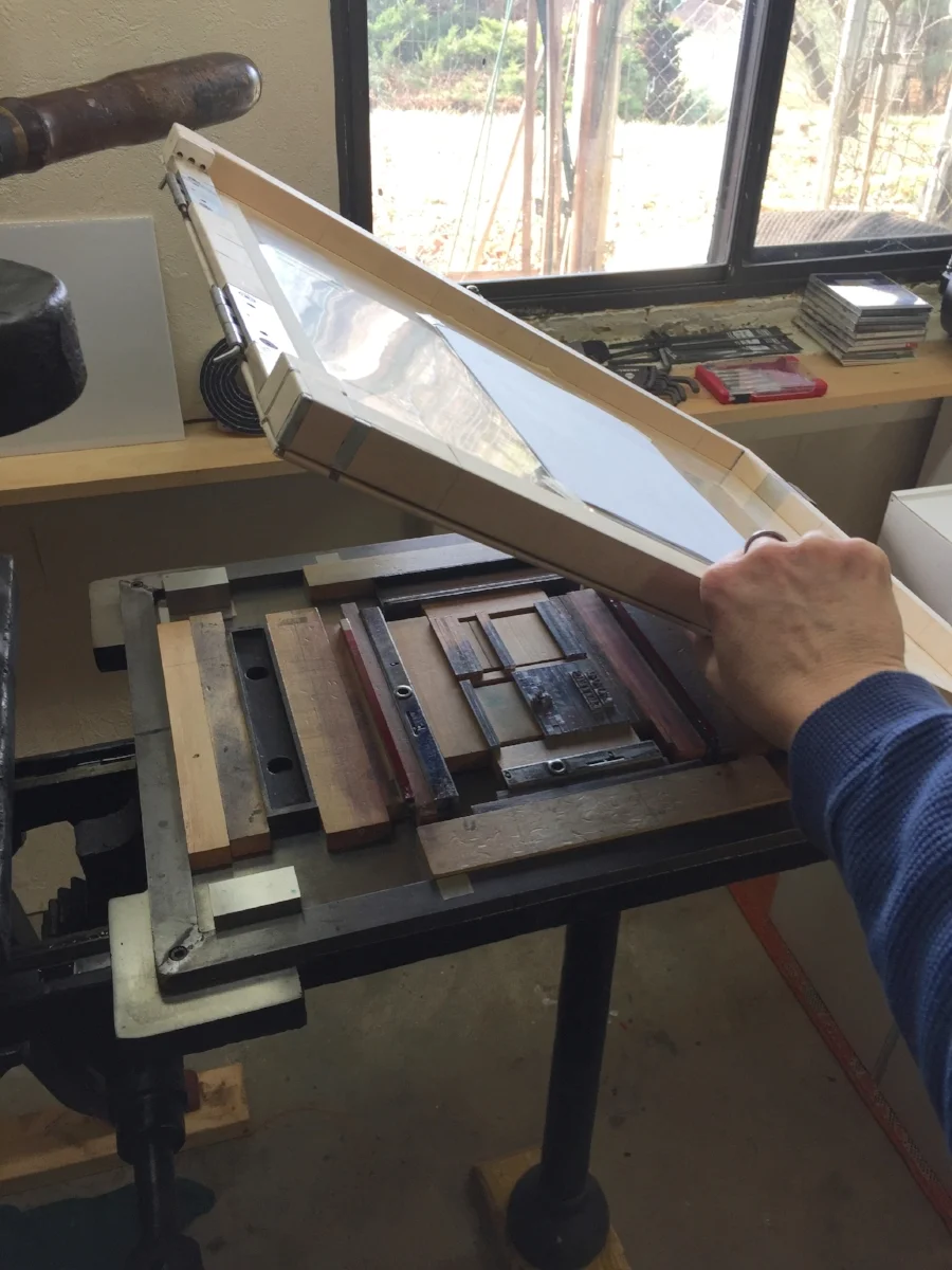
I set the poem in metal type, printed it on my trusty foot-treadled Golding press, and cut-and-assembled the paper pieces by hand to form the book. It’s a very limited edition — just 21 books. $15 each.

If you'd like a little ancient new book of poetry, click here.

Many thanks,

St Brigid Press

Comment

Thoreau and Friends

2 Comments

Thoreau and Friends

Hi dear Friends of the Press,

As the temperatures rise on this eve of the Summer solstice, we are rocketing along with new work here at St Brigid Press. Thanks for taking a moment to hear about it!

Recently we turned our attention to a new book honoring someone with a Very Big Birthday coming up in July ~ Henry David Thoreau turns 200 on the 12th! 

Thoreau's birthplace, the Wheeler Minot Farmhouse in Concord, MA. Photo credit: John Phelan

Thoreau's birthplace, the Wheeler Minot Farmhouse in Concord, MA. Photo credit: John Phelan

What began as a small commemorative project has since evolved into a multi-faceted book. As Emily’s research into Thoreau’s life and writings progressed and as local, national, and international news unfolded, we began to see a strong connection between Thoreau’s work and that of Mahatma Gandhi and Martin Luther King, Jr., and began to feel the timely resonance of all three men today. 

Turns out, Thoreau’s famous essay “Civil Disobedience” had a profound influence on both Gandhi and King. In different times, places, and circumstances, each man developed a philosophy and a practice of nonviolent resistance to injustice. Those ideas and their implementation lead to powerful individual and societal change, and are as relevant today as in the 19th and 20th centuries.

So, we’d like to introduce the new publication due out soon:

A Handbook for Creative Protest: Thoreau, Gandhi, & King in Conversation

The Handbook will present selected excerpts by each author, along with a Preface and commentary by Emily Hancock.

At about 35 pages, it proved a bit too large for us to accomplish at this time via hand-set metal type, so we decided on a unique and flexible “hybrid” design: The interior pages have been digitally typeset and designed by Emily and will be printed offset at a local shop; Emily will then letterpress print the covers and hand-sew the book here at the Press. This hybrid design lets us allow the full text to be what it needs to be, and yet still incorporates signature elements of the handmade book that are important to us and to you. 

Our fingers are crossed for a late-July release. Stay tuned!

If you would like to put your name on the pre-order list, please email Emily at stbrigidpress@gmail.com 

Many thanks, and all the best,

St Brigid Press

Action from principle, the perception and the performance of right, changes things and relations; it is essentially revolutionary.
— Henry David Thoreau, "Civil Disobedience"

2 Comments

Printing with Nature

10 Comments

Printing with Nature

Hello Friends of the Press,

Last year we published Reverie, a little book poems that featured illustrations printed from grasses growing in our field. I loved the process and the look of these nature prints (which I first learned about from John Ryder's wonderful book Printing for Pleasure), and they came immediately to mind when I began to think about what illustrations might accompany our newest production ~ Wind Intervals, a chapbook of poems by Jeff Schwaner.

Collected and dried last autumn from the tree outside our print shop door, I had a stash of beautiful Japanese maple leaves under weights in a corner of the shop. Many of Jeff's poems include the presence and imagery of trees, including maples. It seemed like a perfect match.

So, this past week I began adding prints made directly from these dried leaves to the pages of Wind Intervals. Here's a little peek at the process ~ enjoy!

10 Comments

Wind Chimes

Comment

Wind Chimes

On the heels of this week's snow and sleet, the wind has come howling in. Today at the Press we're feeding the woodstove, catching up on reading and writing, and going over proofs of Wind Intervals, the new chapbook of poetry by Jeff Schwaner.

What is the sound of a loosening of leaves
like forgetting hands just before they drop
to our sides?
— Jeff Schwaner, in the title poem "Wind Intervals"

One of our favorite poets, Jeff brings to his work a deeply engaging mixture of observation, introspection, and connection. We are honored to be publishing his next chapbook of seven poems, carefully selected and printed by Emily Hancock.

Recently, we invited Jeff to the Press to record some of his poems. Let these whet your whistle for the rest of the book!

Wind Intervals will be published in two formats, a Standard Edition and a Special Edition. We are currently taking pre-orders of both.

STANDARD EDITION

  • 150 numbered copies
  • hand-set in Bembo types (cast by the Bixler Letterfoundry in NY)
  • two original illustrations
  • letterpress printed on our 1909 Golding Pearl treadle press
  • Mohawk Superfine text paper
  • Hahnemühle Bugra covers
  • hand-bound at the Press
  • $24

SPECIAL EDITION

  • 35 signed and numbered copies
  • hand-set in Bembo types (cast by the Bixler Letterfoundry in NY)
  • two original illustrations
  • letterpress printed on our 1909 Golding Pearl treadle press
  • Revere Book mouldmade text paper
  • St Armand handmade covers
  • hand-bound at the Press
  • $35

To pre-order a copy, please email Emily Hancock at stbrigidpress@gmail.com, or fill out the form below.

Mark your calendars ~ the official book launch for Wind Intervals will be April 28th, at 7pm at Black Swan Books in Staunton, Virginia! (Pre-orders will ship that day.)

Thanks Friends, and hold onto your hats!

St Brigid Press

Comment

The People's Press

6 Comments

The People's Press

The constitutional guarantee of freedom of the press is something we’ve always taken seriously here at St Brigid Press. We’re grateful to be able to practice our crafts of printing and poetry in a free spirit and a free society. 

It’s important, however, to continue to be vigilant ~ to remind each other and our elected representatives of how precious and vital are our democracy and freedom. We have many wise voices, past and present, who stood up (or, like Rosa Parks, sat down) and spoke out for our inalienable rights. 

In honor of their voice ~ your voice, my voice, our collective American voices ~ we’ve created a series called The People’s Postcards.  

Alexander Hamilton was an immigrant from the Caribbean who, in his early 20s, found a job as an assistant to George Washington. He eventually became a delegate to the Constitutional Convention, helped author the Federalist Papers, and served as the first US Secretary of the Treasury. The quote on our postcard was part of a speech Hamilton gave at the New York state convention in Poughkeepsie, where he urged representatives to ratify the US Constitution.

Born a slave in Maryland about 1818, Frederick Douglass became one of the most ardent and eloquent human rights activists and orators in US history, speaking and writing on behalf of African-Americans, Native Americans, women, and immigrants. He also became a government official and newspaper publisher. The above quote was part of a speech Douglass gave in the District of Columbia on the 23rd anniversary of emancipation in DC.


Friends, we are the WE in “We the People…” Let’s keep up the good work of forming a more perfect union. Together.


The People’s Postcards

  • letterpress printed by yours truly
  • postal service-compliant at 6” x 4.25”
  • pre-stamped! — ready to pen and send
  • sturdy bamboo cardstock paper
  • $8.50 for a set-of-10 stamped postcards
  • order direct from Emily Hancock at stbrigidpress@gmail.com

6 Comments

Loving Letters

6 Comments

Loving Letters

Hi Friends of the Press, and a very Happy Feast-Day of St Brigid to you all! We are most glad to celebrate this day with the launch of our latest book ~

Love Letters: An Abecedarium of Type Designs by Frederic W. Goudy

This project all began with the simple love of letters ~ letters beautifully designed, cast, printed, and shared. 

One of the most gifted and prolific type designers in American history, Frederic Goudy began his life’s work at his Village Press in Park Ridge, Illinois in 1903. Beginning in the 1890s and continuing until his death in 1947, he designed well over 100 typefaces, many of which are still in use today in both metal and digital formats. 

At St Brigid Press, we are honored to care for and print with a couple of rarer metal castings of Goudy’s designs. This book presents the gorgeous 60-point Cloister Initials and the elegant Friar in the form of an abecedarium, or “a-b-c book” ~ the large Initial letters are accompanied on each page by the name of another of Goudy’s typefaces, printed here in his Friar. The book was designed, handset in metal type, and printed on the circa-1915 iron handpress here at the Press by Emily Hancock.

If you want to see more of the process on printing a page of this book, please see our previous post, “Diary of a Printed Page.”

Steve Matteson, Creative Director at Monotype and historian of Frederic Goudy and his type designs.

Steve Matteson, Creative Director at Monotype and historian of Frederic Goudy and his type designs.

Frederic Goudy energized a new generation of type designers with his beautiful, time-tested work. One of those designers who takes inspiration from Goudy is Steve Matteson. Steve is one of the finest digital type designers in the world, serving currently as Creative Type Director at the legendary Monotype Corporation. His roots are in metal and cast iron, though — he and I met in the Fall of 2015, at the American Printing History Association’s conference celebrating the iron handpress, held at the Rochester Institute of Technology where Steve first studied typography. 

From the Droid font family to digital revivals of Goudy’s own types like Bertham Pro and Friar Pro, Matteson has a brilliant sense of lettering and typography. And history, too — we were thrilled when Steve agreed to write an introduction for Love Letters. In a few paragraphs, he manages to introduce us to Goudy the late-19th/early-20th century craftsman, and to bring the beauty of Goudy’s art and heart forward into our present age. 

We love letters. And Frederic Goudy's are some of the most beautiful ever designed. May they spark joy in you as well!

  • Edition of 45 numbered books.
  • 6 x 4 inches (closed)
  • Interior papers are Rives Lightweight mouldmade paper (cream), with accents of French Paper Company’s Parchtone Natural.
  • Covers are Chestnut-Pinto Lokta, handmade in Nepal.
  • Sewn side-bound with linen thread.
  • Preface by Emily Hancock.
  • Introduction by Steve Matteson.
  • Goudy Old Style type for the text was specially cast for this printing by Patrick Reagh in Sebastopol, California.

TO ORDER, please continue to our secure check-out HERE.

6 Comments

Diary of a Printed Page

16 Comments

Diary of a Printed Page

I must confess ~ each time a piece of paper goes into the printing press blank and emerges again filled with words, I am astonished. 

What still feels like the sudden epiphany of language out-of-nothing is not, in fact, miraculous. It is careful, collaborative craftsmanship by author and papermaker and metal-caster and printer, among others. It’s a strangely fluid movement of human and machine ~ an always-changing choreography of eye and iron, hand and fiber, thought and ink and breath. 

Joyous!

Here’s a little photo diary from today’s print run. I was printing the second color (in red) on the title page of St Brigid Press’s newest book, forthcoming in early February.

Thanks so much for joining us on this journey. All best to you all,

St Brigid Press

16 Comments

How Far Is It From Here To There?

4 Comments

How Far Is It From Here To There?

This is a Printing Office
...armory of fearless truth...
— Beatrice Warde (1932)

"This is a Printing Office," by American journalist and typographer Beatrice Warde (1932). Here printed by the Hamilton Wood Type and Printing Museum (Two Rivers, Wisconsin).

I see this poster, "This is a Printing Office," each time I walk into my print shop, where it hangs in a prominent place. The text was written by American journalist and typographer Beatrice Warde in 1932, and printed by the Hamilton Wood Type and Printing Museum a few years ago. Each time I see it, the manifesto grounds me and focuses my intention for the day’s work — this work of offering the daily bread of language.

The events of 2016, from global heartaches to national and personal ones, have challenged me; they’ve challenged my perception of the world, of my place in the world, of what is real, of what is trustworthy, and of what is possible (both for ill and for good). In the chaos of events and emotions, one question emerged to guide my inner reflections: How far is it from here to there?

How far from where I stand — the bit of earth, the people and places, my experiences and my feelings — to where others stand, what they experience, what they feel. That inquiry was the key in my heart’s lock, and, when turned, out tumbled a year’s worth of words and wonderment about my relationship to others, to the world, to suffering, and to action.

"How far is it from here to there?"  12x18 letterpress poster by Emily Hancock, $12 post-paid. For ordering, email us at stbrigidpress@gmail.com .

The only thing I knew to do with all of this was to set my reflections in wood and metal type and print them. So, I offer these thoughts and questions now to those of you who may be interested, as a small act of communion — a trust that we’re in this together, in all the dark chaos as much as any dawn.

As the calendar year turns to 2017, I have no answers. But at St Brigid Press we do have a mission — to be a Printing Office. To engage truth and beauty and experience as honestly and wholeheartedly as we can; to converse with care and courage with our community. With you.

Thank you for your presence in my life and in the conversation. All the best to you all,

Emily Hancock

If you would like a copy of my print, "How Far Is It From Here To There?", please email us ~ stbrigidpress@gmail.com . ($12 post-paid to US addresses; inquire for oversees postage.)

4 Comments

New Year's Greetings from the Press

10 Comments

New Year's Greetings from the Press

Dear Friends,

Gratitude is something that we aim to practice and cultivate here at the Press. With the turn of the calendar year, we are especially mindful of this today and want to share some of what's at the top of our Thankful list:

YOU ~

Without your friendship and support, St Brigid Press would not be able to continue. We are so deeply grateful for your active presence with us on this creative journey, and for your enthusiasm for and patronage of the work we do.

MAKING BOOKS ~

2016 saw the publication of our first book printed on the iron handpress, Reverie. (If you missed that exciting process, check out these previous posts: "Printing a Poem on the Handpress" and "Printing With Plants".)

2017 begins with two books in process: Love Letters (an abecedarium honoring the beautiful work of American type designer Frederic Goudy, with an introduction by contemporary type designer Steve Matteson), and Wind Intervals (a new chapbook of poems by Jeff Schwaner, illustrated with nature prints). More on these projects soon!

TYPE ~

We are grateful to care for and print with an excellent collection of metal and wood type, and we give great thanks for folks who are still casting new metal type for us letterpress printers to use. Pat Reagh, of Patrick Reagh Printers in California, cast a gleaming font of Goudy Old Style for us this summer. And Michael and Winifred Bixler of The Bixler Press and Letterfoundry in New York created a gorgeous set of Bembo letters for us earlier in the year. These two castings will feature in the new books-in-progress.

In addition to metal type, we are honored to house the St Brigid Press Collection of Historic Wood Type. This collection received some wonderful TLC by graphic designer and 2016 Press intern, Julia Grammer. Julia identified, catalogued, and cleaned the type, and then produced some stunning letterpress printed type specimens of selected faces. We are very thankful for her excellent work of curating this collection.

THE FUTURE ~

In addition to the books-in-progress mentioned above, we have several new and extremely exciting irons in the Press fire. Over the next few months, stay tuned as we unveil these creative adventures, from a new wood type poster series to new vistas in poetry publishing! As always, we are grounded and guided by our mission to continually offer the daily bread of language, especially poetry, while practicing the traditional arts and crafts of printing and book making. Thank you, once again, for journeying with us!

With gratitude, and all best wishes,

Emily Hancock of St Brigid Press

10 Comments

A Letterpress Lexicon, Part 3

7 Comments

A Letterpress Lexicon, Part 3

Hi, Friends of St Brigid Press!

Here is the third installment in our occasional blog series about the words and phrases that identify printing's particular tools and processes ~ A Letterpress Lexicon. Enjoy!

(If you missed Part 1, you can find it HERE. And Part 2 is HERE.)


Today's Words Are:

PIED  ~  Pronounced with a long “i”, as in "cherry pie." The term for metal type that has become all jumbled up, disarranged, mixed up.

HELL BOX  ~  The box or bucket into which is thrown metal type that is too worn or damaged to print well.

PRINTER'S DEVIL  ~  An old term for the young assistant in a printing shop who was given menial tasks or errands, such as sweeping floors or sorting type.


I had a completely different set of interesting words from the printing trade ready to share with you all. And then this happened:

Pied type on the floor at St Brigid Press.

I allowed myself to get in a hurry recently, while looking for a particular dash in the back of a typecase. I pulled the case out too far, without pulling the case below it out slightly (a safety measure, to prevent what happened from happening), and CRASH — a small tsunami of metal letters fell to the floor. The concrete floor. ARGH. There they stayed for a few days, until I could face the mess again and gently scoop up the pied type.

A 12pt letter "m" from the pile of pied type. It is, unfortunately, damaged and bound for the hell box.

Much of the type is salvageable, thank goodness. But there are still many letters, numbers, and punctuation pieces that were damaged. Type metal is soft enough to scratch or dent easily if dropped. Those pieces that are too damaged to print correctly will be weeded out and relegated to the hell box. When the box is full, a type foundry can melt down the metal and cast new letters with it.

The St Brigid Press hell box, into which we pitch metal letters that are broken, scratched, dented, or otherwise rendered unprintable. Grateful acknowledgement goes to the Shop Dog, Mira, for generously donating an empty biscuit tub for the task.

Obviously, sorting pied type is a time-consuming job. One that is at once drudgery and exacting — each letter must be inspected to see if its face is dented or scratched, or if it survived the ordeal unscathed. Since we are in the full swing of book production here at the Press, we decided to call upon our own printer’s devil, Julia Grammer, to help out. Julia is a student of typography and graphic design at an area college. Not only is she knowledgable about type, but she brings the kind of care, curiosity, and intelligent attention that are guiding principles at the Press. Here’s a case of type after Julia was let loose on it:

Ahhhh.... Order, wrought from chaos, thanks to the Press printer's devil, Julia Grammer.

Thanks, as always, for joining us on this journey, Friends! 

All best to all,

The Pied Typer of Afton

7 Comments