Viewing entries tagged
wood type

Pressing on together for change

Comment

Pressing on together for change

Hello, Friends of the Press,

The long, costly fight for justice and equality for all Americans is not over. The recent welling of protests against racism and police brutality, and in support of Black and Brown lives and livelihoods, has been unprecedented in the US and around this globe we all call home. Now is the time to press on further, to lift our voices higher, and lean in to the momentum for change across this land.

As Rev. Dr. William Barber and The Poor People's Campaign say, "We Rise Together!"

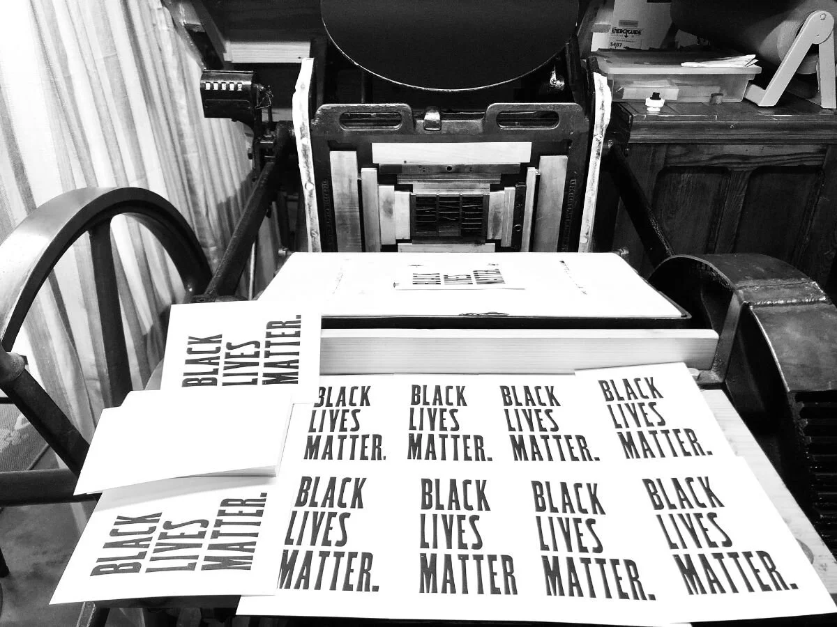
In support and in aid of the movement for justice and equality for all and the dismantling of racist policies at every level, I'm pumping out a new series of The People's Postcards. Lending the power of the printing press to empower you ~ to tell your elected officials what you think, how you feel, what you want to see accomplished in the next chapter of this experiment called America.

From small-town mayors to big-city senators, chiefs of police to environmental advisory boards ~ take ten minutes to send a note of thanks or challenge, question or urgent appeal. It matters. This is, you are, democracy in action ~ alive and embodied and an agent for meaningful change in the world.

Building on previous editions of The People's Postcards featuring Hamilton, Adams, and Douglass, ready now is this edition for Black Lives Matter:

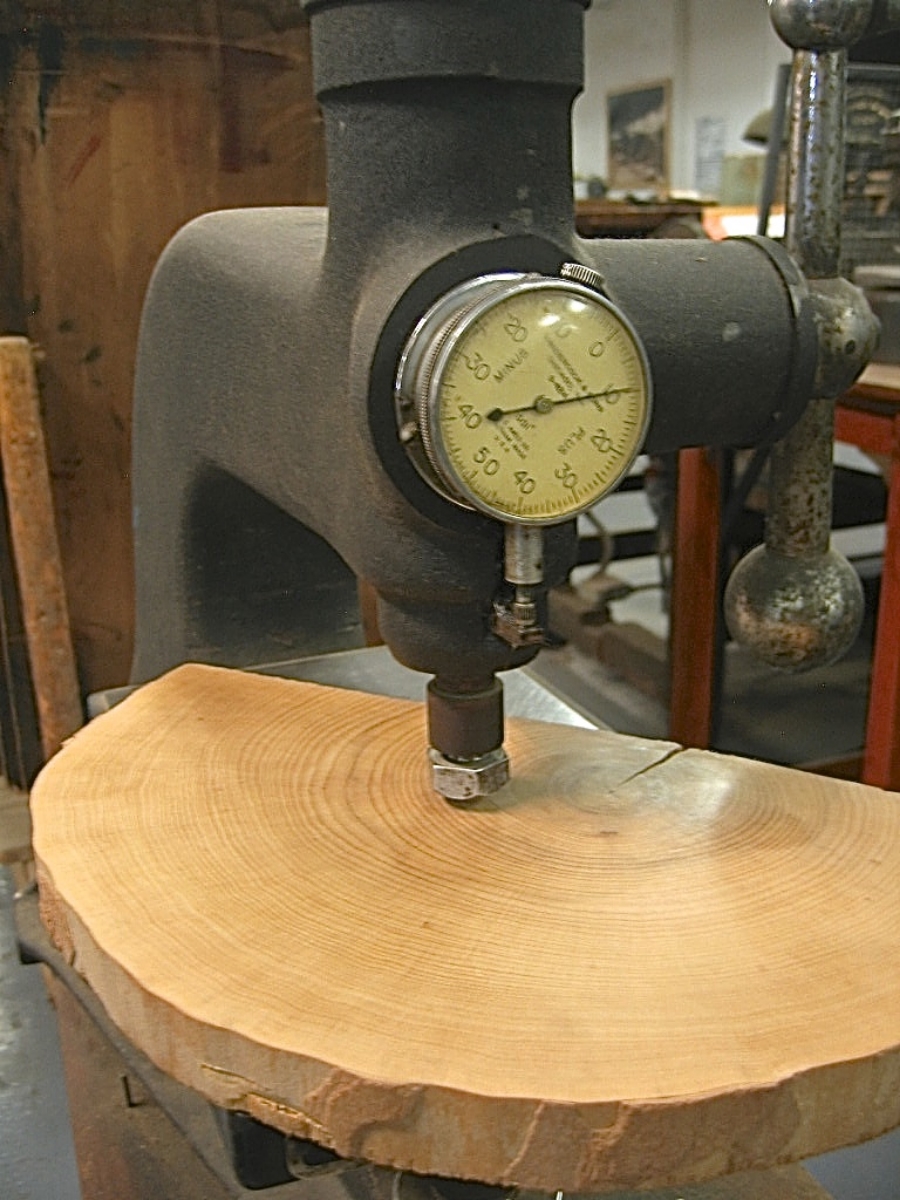
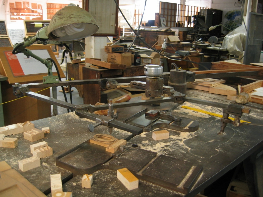
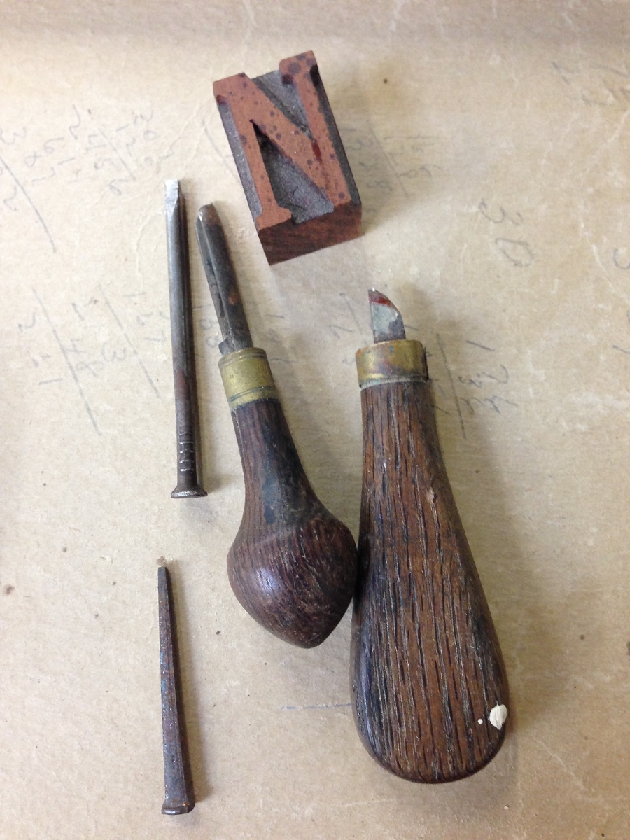
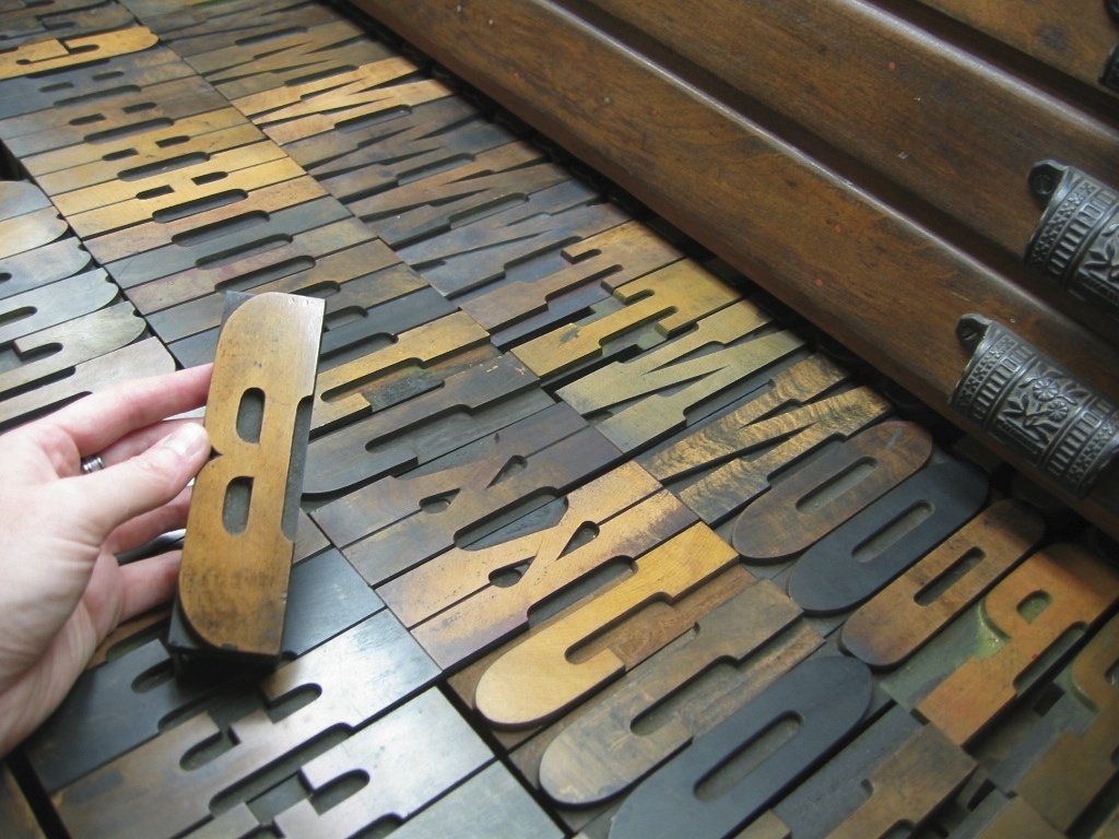
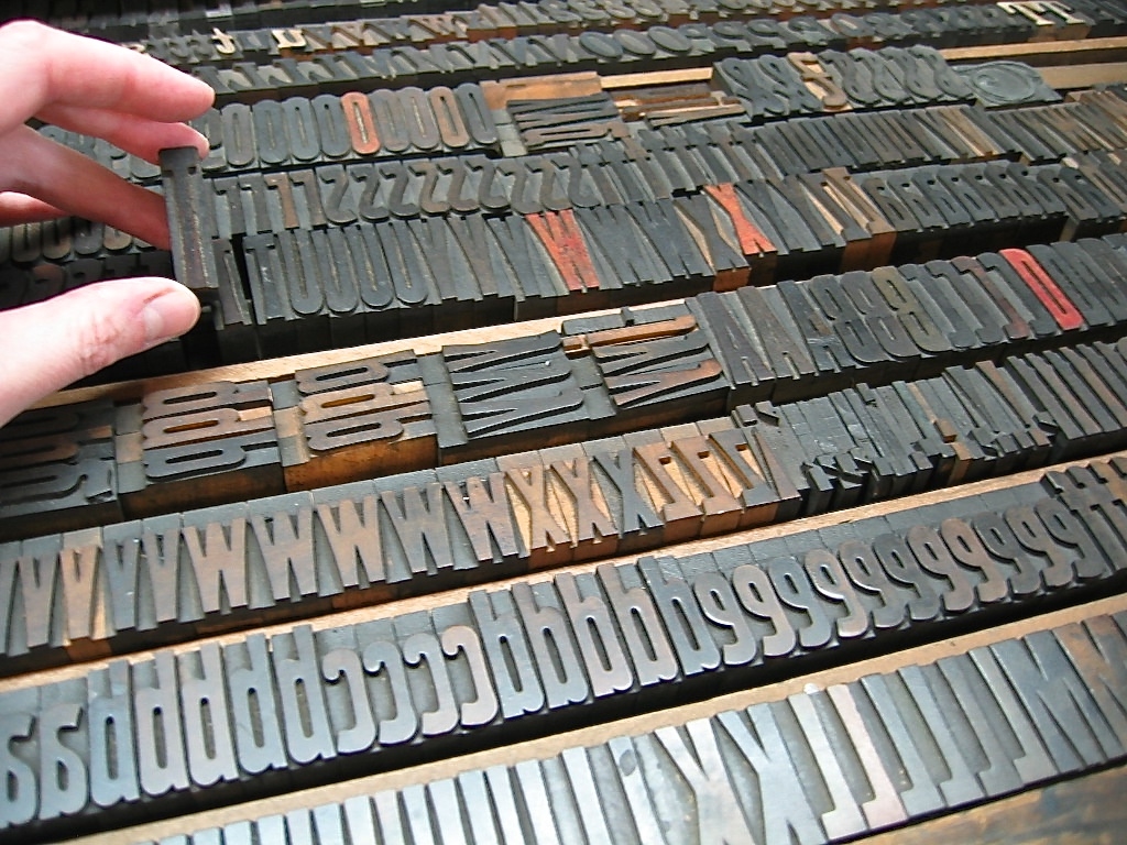
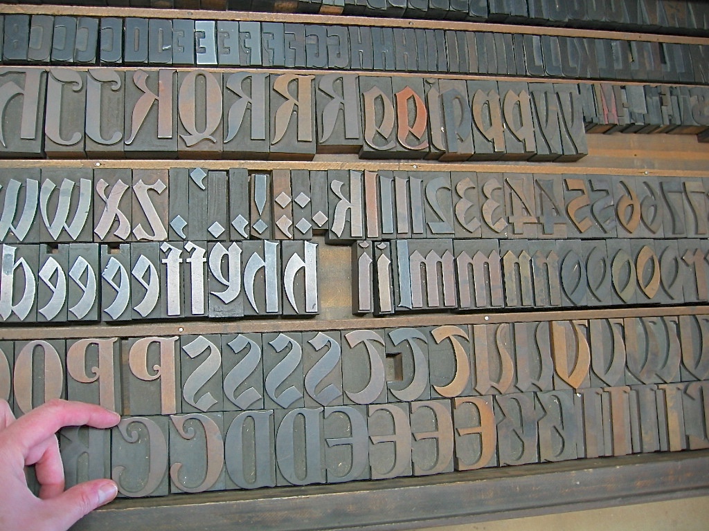
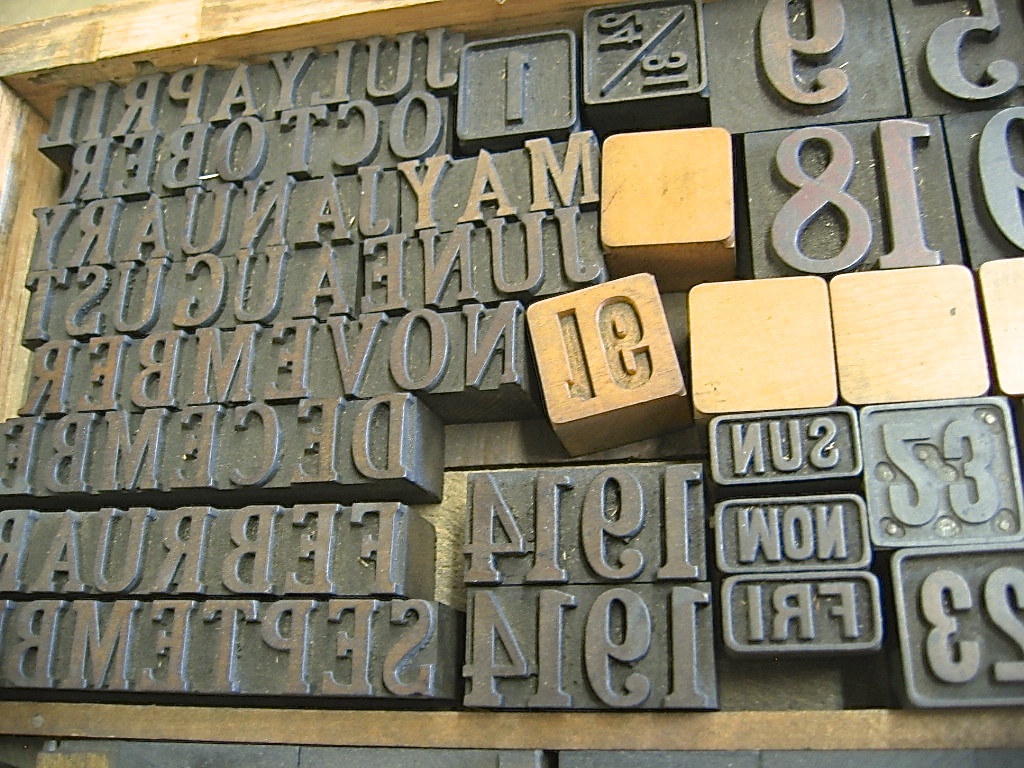
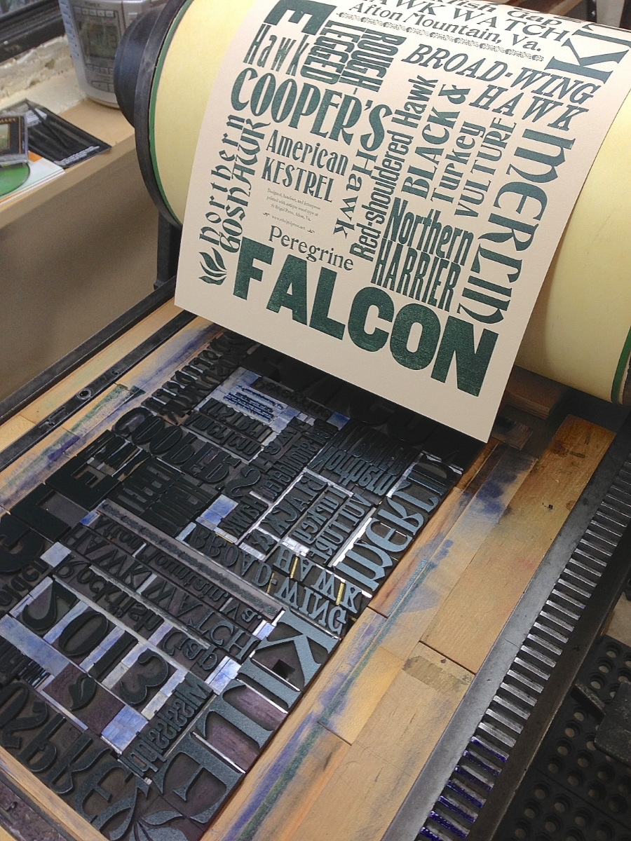
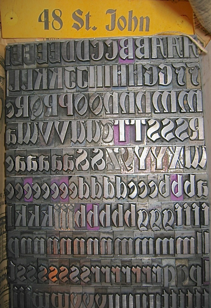
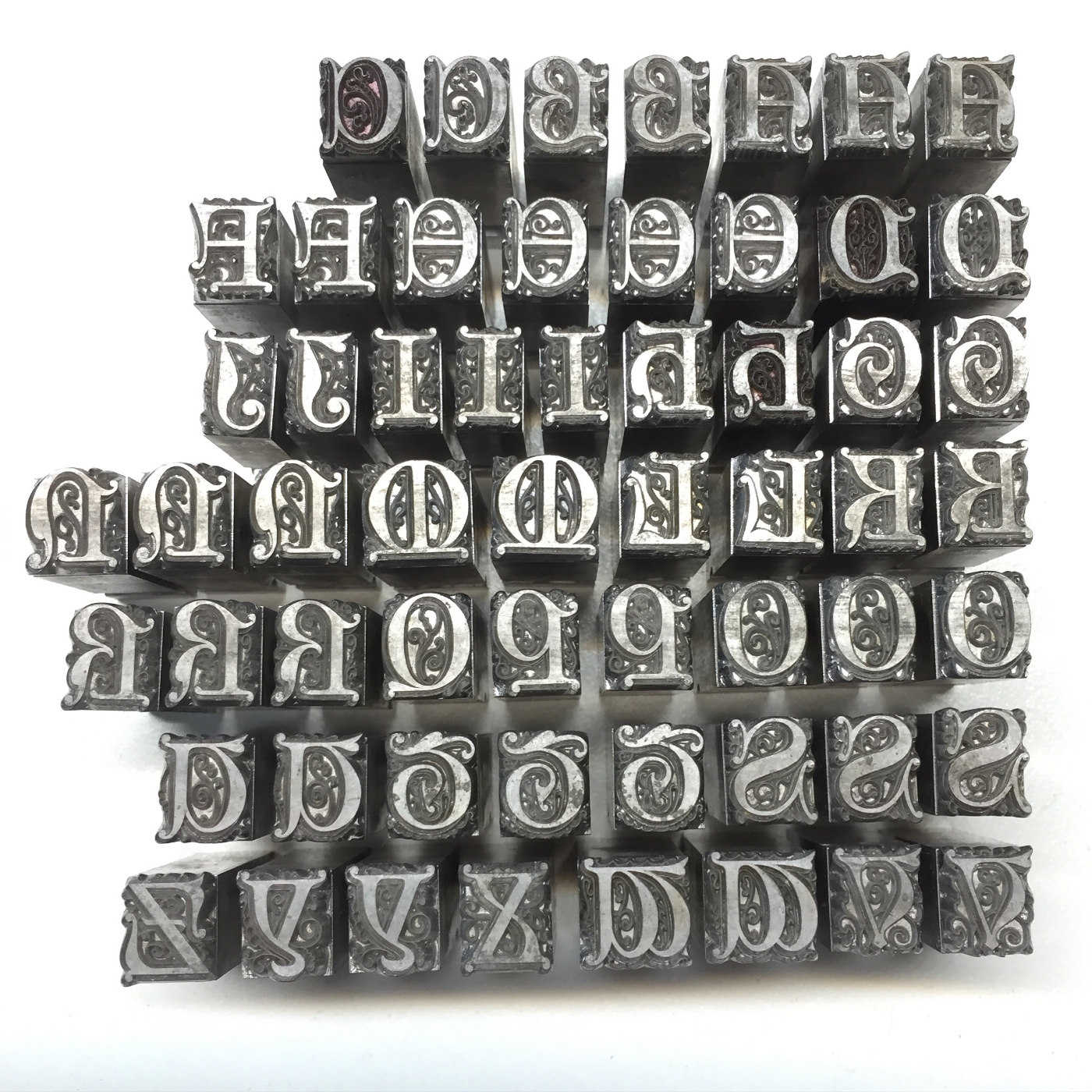
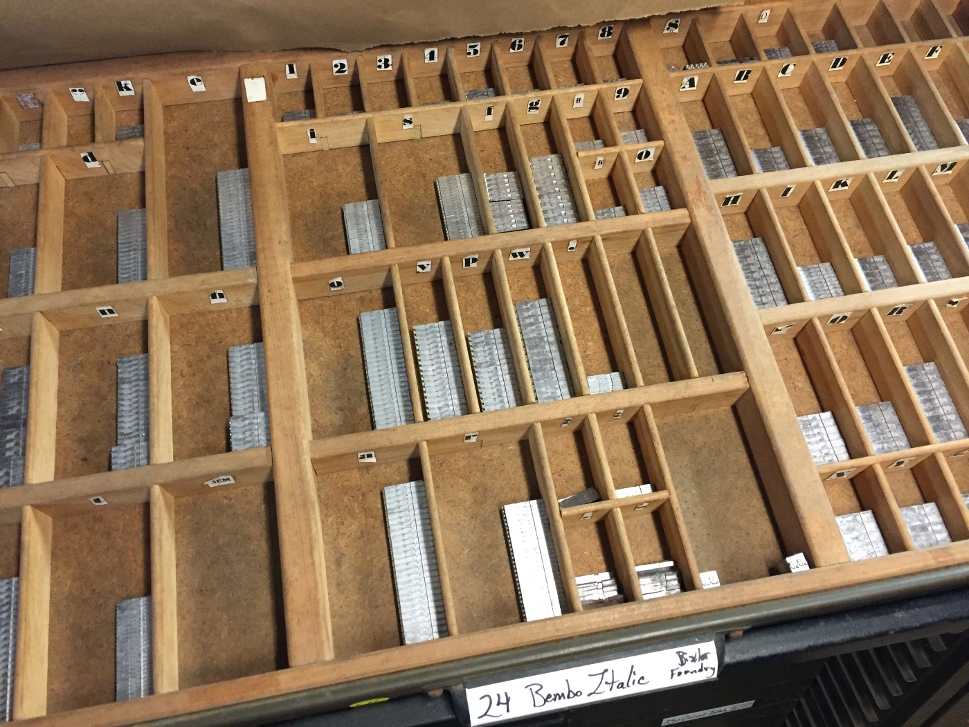
  • Letterpress printed with antique wood type.

  • USPS postcard size 6" x 4.25"

  • Pre-stamped / postage-paid.

  • Packs of 10 ($10) and 25 ($25).

  • Proceeds donated to The Poor People's Campaign.

A social movement that only moves people is merely a revolt. A movement that changes both people and institutions is a revolution.
— Martin Luther King Jr., in "Why We Can't Wait"

Let's be the change, friends.

In solidarity,
Emily

Emily Hancock
St Brigid Press
Afton, Virginia

Comment

How Type is Made, Part 2

3 Comments

How Type is Made, Part 2

Traditional letterpress printing requires physical letters, cast from metal or carved from wood, which get inked and pressed into paper to make a print. In the last post, we took a look at the process of making type from metal (if you missed it, click here). In this installment, we’ll see how it’s created from wood.

Civil War recruitment poster.
From the International Printing Museum website.
http://www.printmuseum.org/museum/wood-type-2/

Wood came to be used as a material for making letters for printing primarily in the 1800s, when the printing and advertising industry became more widespread. Imagine trying to lift a big “Wanted”-poster-sized chase of metal type — pretty darn heavy! (See the photo of a Civil War recruitment poster.) Letters carved and routed from holly or maple were MUCH lighter, and could be made MUCH larger than their metal counterparts. 

Here at the Press, we’re fortunate to care for and print with a nice selection of wood type, most of which was made between 1875 and 1910. If used with plenty of TLC, it’ll outlast us (just like our presses)!

Here's a slide-show of some of the materials and tools used to create wood type, along with some of the type in our collection here at the Press:

A lot of vintage type, however, either went to the scrap heap decades ago, is just too damaged to print well anymore, or is too scarce and expensive for most printers to purchase. Thankfully, there are a few excellent folks who are making brand new type from wood today!

Here is a great interview (4 mins) of Geri McCormick of Virgin Wood Type (Rochester, NY), by Frank Romano.

And another great short (1 min) video of Scott Moore, of Moore Wood Type (in Ohio), making new wood type:

Want to know more about the wonderful world of wood type?

Here are some great resources ~


Thanks for joining us on this journey into type! Please sign up below for more occasional dispatches from letterpress land!

St Brigid Press

3 Comments

How Type is Made, Part 1

Comment

How Type is Made, Part 1

Traditional letterpress printing requires physical letters, cast from metal or carved from wood, which get inked and pressed into paper to make a print. In the next two blog posts, we’ll take an introductory look into how these letters get made.

First up, metal type!

A typecaster of centuries past, pouring molten metal into a mould to cast new letters. (Courtesy of the The University of Manchester Library.)

A typecaster of centuries past, pouring molten metal into a mould to cast new letters. (Courtesy of the The University of Manchester Library.)

Johann Gutenberg’s big Ah-HA! moment in the 15th century was figuring out how to create multiple letters with which to print, and print again and again — a system of “movable type,” where each piece is cast in a mould from an alloy of metals (lead, tin, and antimony). These pieces, all the letters and numbers and punctuation, etc., of the alphabet, could be used and reused — a huge savings of time, effort, and expense compared to the work of scribes!

Metal type wears down over time, because it is relatively soft, and gets scratched or dinged easily. Thankfully for us 21st century printers, some hardy folks are still casting brand new metal type!

Here's a short (1:58), awesome little video by Dave Keyes of Michael Curry casting 48pt Garamond ampersands on his caster in New Zealand:

And here’s another little window into the world of typecasting, courtesy of Michael and Winifred Bixler, who operate their Bixler Letterfoundry in upstate New York, and who have cast much of the new type we have here at St Brigid Press. This beautiful 2-minute video was done by Mary M Jones:

Some of our type comes from a wonderful foundry in Germany, run by the renowned Herr Rainer Gerstenberg. Click the photo below to see an excellent photo-tour of Gerstenberg's foundry, taken by letterpress printer and teacher Thomas Gravemaker.

The beautiful Koch-Antiqua typeface, cast for us by Rainer Gerstenberg in Germany, here printed for the colophon of our limited edition book of poems, Soundings. Click the photo for more about Gerstenberg's foundry.

The beautiful Koch-Antiqua typeface, cast for us by Rainer Gerstenberg in Germany, here printed for the colophon of our limited edition book of poems, Soundings. Click the photo for more about Gerstenberg's foundry.

So, would YOU like to order some shiny new type?? Here's a list of foundries ready to take your order!

List of Type Foundries in the US and Abroad

Thanks for joining us, friends! We'll see you again soon,

St Brigid Press

Comment

2 Comments

We're Gettin' Personal

Monogrammed Coasters R

With personalized monogrammed coasters!

Here at St Brigid Press, we are honored to have a sweet collection of historic wood type, most of which was made between 1875 and 1910. So we thought this would be a great opportunity to show off the beauty of these vintage typefaces, while offering a new custom letterpress service!

Some of the vintage wood type in the St Brigid Press collection.  The typeface pictured is called "DeVinne," manufactured by the Morgans & Wilcox Company (Middletown, NY), in the late 19th century.

The coasters are printed on 4"-round, extra-thick stock. They are durable, reusable, colorfast, and, when the last drip of Pinot Noir finally obscures the type, fully recyclable and biodegradable. In addition to the vintage wood type letter, each coaster is embellished with a gorgeous wood type decoration, featuring historic flower-and-leaf designs from the late 1800s.

Monogrammed Coasters, flourishes

Monogrammed Coasters, Inky A

In-stock coasters come in sets-of-6, printed in luscious deep green, and available direct from our Online STORE. Currently in-stock letters: A, B, C, G, H, N, R, and S.

Don't see your letter? Need a different color? Email us! We are happy to print custom orders of monogrammed coasters, journal covers, and stationery ~  stbrigidpress@gmail.com

With thanks, and all best from the Press,

St Brigid Press

For more information about the wonderful world of wood type, check out the Hamilton Wood Type and Printing Museum.

An "S" on the Press.  Coasters are letterpress printed on our 1914 Chandler & Price foot-treadled press.

In-stock coasters come in sets-of-6.

The back of each coaster features the St Brigid Press imprint.

Vintage wood type and wood decorations.

2 Comments

5 Comments

Raptors and Wood Type Fun

Hawk Poster on press

~

Warm Greetings from St Brigid Press!

Well, it's that time of year again -- the cooling days of late summer and early fall that provide the impetus for some of the most spectacular mass-movements of species on the planet:  the annual migration of hawks and other raptors from North America to Central and South America. Those of us in the beautiful Blue Ridge Mountains are fortunate to live along a major flyway -- the updrafts along the spine of the mountains support a bird highway from Canada and New England south toward the Gulf of Mexico. And Rockfish Gap, near our home in Afton, Virginia, is one of the best locations in the East to watch this magnificent flow of raptors.

To commemorate the birds and the hundreds of people who gather to witness them, I spent the last week joyfully rummaging through the 20+ cases of wood type here at the Press. Most of the type was made in the US between 1875 and 1910, and still in very good condition. The idea for the design this year came from the list of raptors that the official Hawk Watch Counters tally -- there are fourteen species for which they scan the skies, from Broad-winged Hawks (the most numerous) to the rare Mississippi Kite. Other species include Ospreys, Falcons, Eagles, and many different kinds of Hawks. I set the names of all fourteen raptor species in various typefaces of wood type, creating a fun collage of avians.

Each poster is hand-inked and printed on the Potter Proofing Press (circa 1915, Chicago). Paper is Stonehenge Rising Fawn, with oil-based ink in either deep blue or deep green, in 12"x18" size. The posters were printed in a limited edition of 35, all signed and numbered. Each is backed by stiff board and sleeved in protective archival plastic. Price: $30 each, with 20% of the proceeds being donated by St Brigid Press to The Raptor Conservancy of Virginia. To purchase, go to the St Brigid Press Online Store.

With thanks, and enjoy the beautiful days!

St Brigid Press

[ For more information about hawk migration, go to www.hawkcount.org ]

Beginning to assemble the names of 14 raptor species, in various typefaces and sizes of vintage wood type. Quite the challenging puzzle!

St Brigid Press is honored to have collected over 20 cases of wood type, most made in the United States between 1875 and 1910.

Checking and rechecking the fit of the type forme, making sure each letter and space are snugly in their place.

Getting the ink well-distributed on the roller.

Rolling the ink carefully over the type forme.

Checking and rechecking the final proof.

Signing, numbering, and packaging the 2013 Hawk Watch Poster.

5 Comments

11 Comments

Acquisitions and Migrations

Warm Autumn greetings from St Brigid Press! It's been a blustery couple of months here in the Blue Ridge Mountains. All that wind has pushed thousands of hawks south on their annual migration, and we've had the pleasure of watching some of them. Rockfish Gap, at milepost 1 of the Blue Ridge Parkway, is a prime location for spotting migratory hawks and other raptors -- Broadwing hawks, in particular, "kettle" (a term describing their spiraling formation in thermals of warm air) and stream overhead by the thousands, joined by the occasional bald eagle, falcon, osprey, and others. Veteran birders and neophyte's alike gather each September at the Afton Inn to scan the skies for these gorgeous birds.

To commemorate this year's Hawk Watch, St Brigid Press created a limited edition of 10 hand-pulled posters, in the old Western "Wanted" poster style. It was great fun, and gave a chance to play with SBP's newest acquisition: a tall antique cabinet filled with vintage wood type.

The wood type collection is comprised of 20-plus drawers (called "cases") of fonts, varying in size and style. Most were made in the United States between about 1880 and 1920, and range from the 5" tall letters of a chunky sans serif to the 1" tall elegance of almost calligraphic script. We are thrilled with the opportunity to care for and use this precious collection. Stay tuned for more printed matter using wood type!

11 Comments