Viewing entries in
The Craft of Letterpress

A Michigan Journey

2 Comments

A Michigan Journey

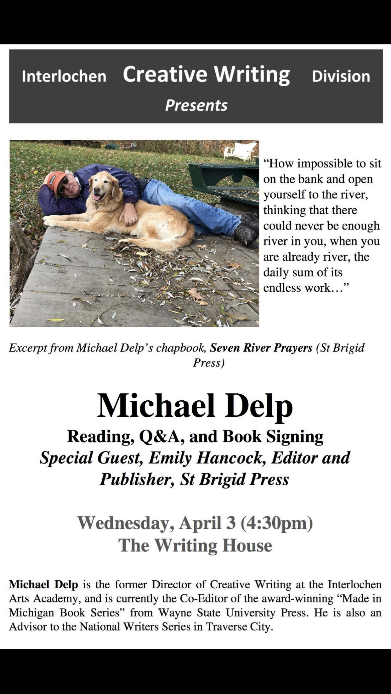
Last week I had the great pleasure of visiting poets and printers in Michigan, teaching a class on book making and traditional printing at Interlochen Arts Academy, and being present at the official launch of the newest chapbook from St Brigid Press—Seven River Prayers by Michael Delp. (There are only 5 chapbooks left, so if you’re interested, please see the webpage: www.stbrigidpress.net/books/seven-river-prayers )

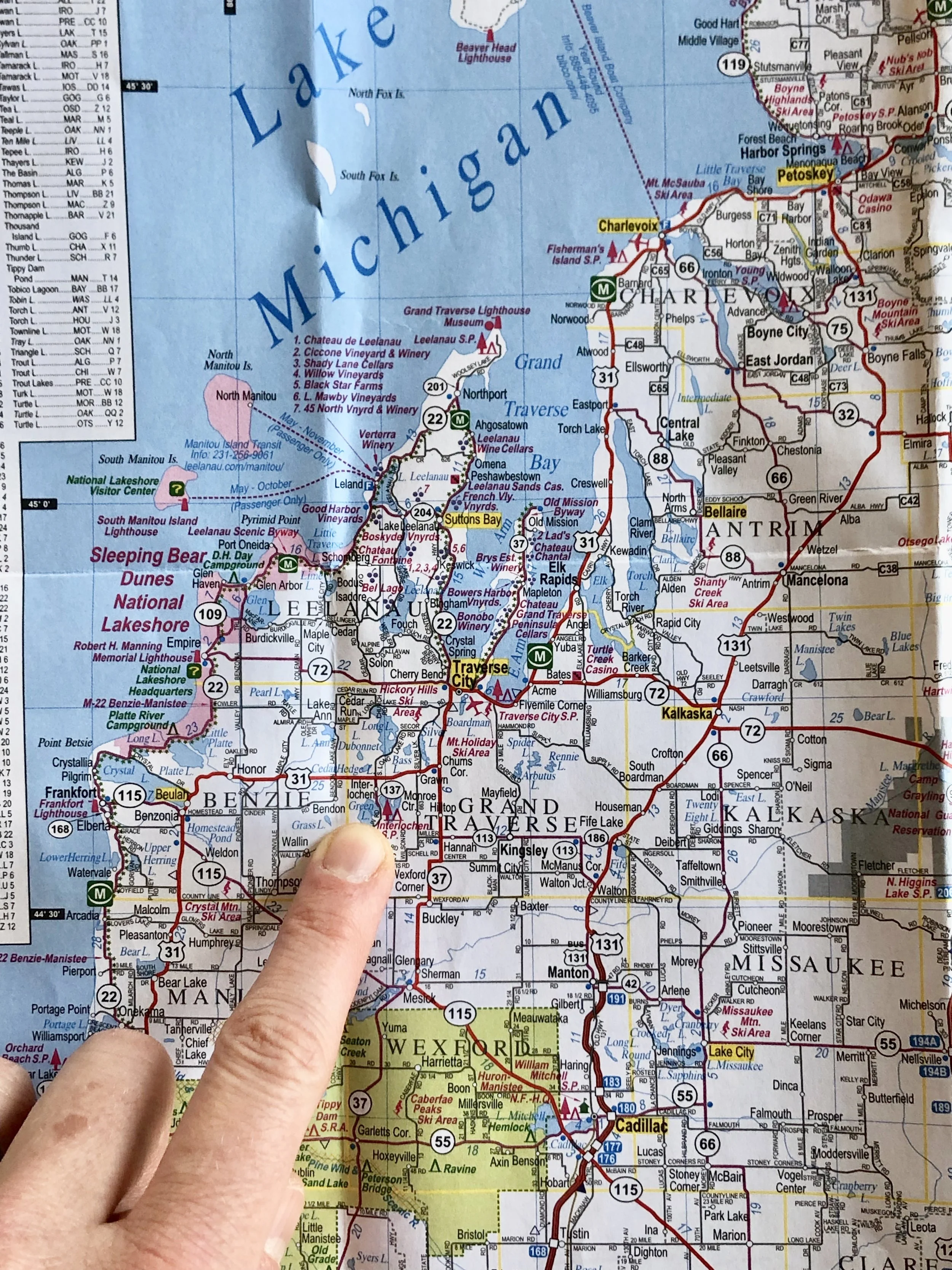
Pencil points to Interlochen, Michigan.

The seed for the journey was planted months ago, when Mike Delp and I were conversing about the chapbook’s final stages. “Long-shot thought,” I wrote to him. “It would be pretty special to have some kind of book launch event. Or at least to try. What do you think the chances are that Interlochen Arts Academy or some other place you think is good would allow us to hold such an event?” From that wondering-out-loud, a whole wonderful week’s worth of traveling, connecting, and sharing evolved.

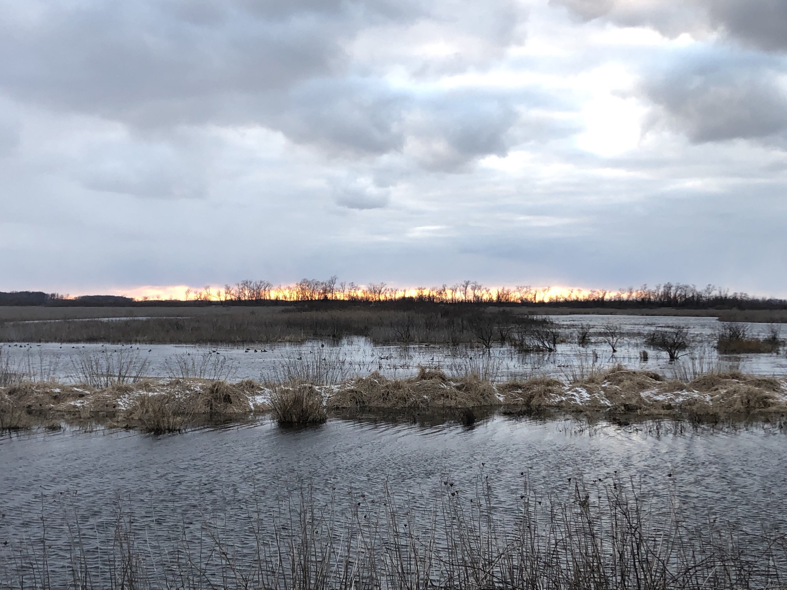
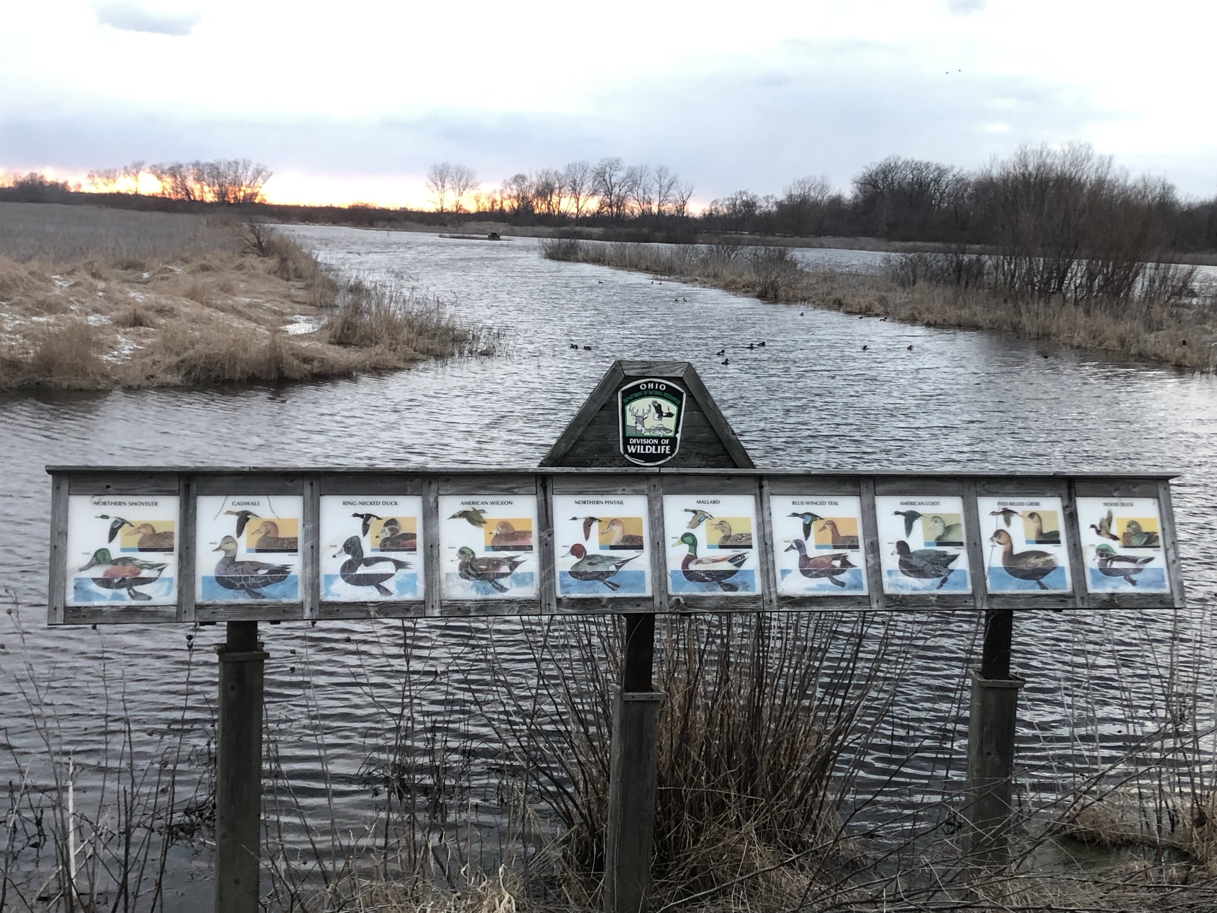
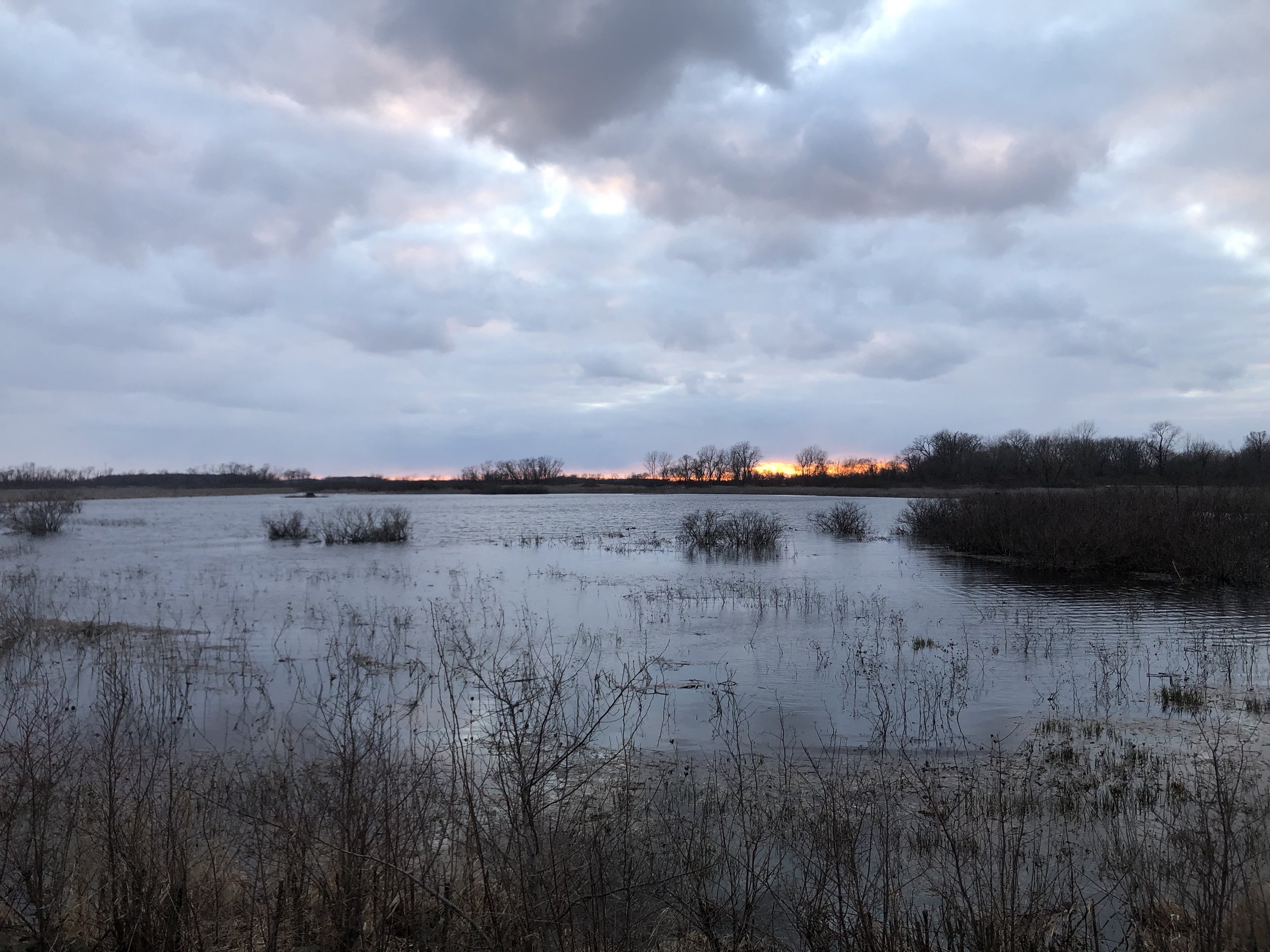
I left my Blue Ridge Virginia home on Sunday, March 31st, with a car-full of books, winter clothes, a tiny 1930s-era printing press, and an emergency tin chocked with my spouse’s homemade chocolate-chip cookies. I drove north-west through hours of snow showers. Eager to take a break from the highway, I got off the interstate in Ohio after seeing a sign for a natural area along the shores of Lake Erie east of Toledo. Around sunset, I pulled into Magee Marsh Wildlife Area (contiguous with Ottawa National Wildlife Refuge), and slowly drove the 1.5 mile park road. 

The wetlands were teeming with birds. Red-winged blackbirds were chatting in the brush along the edges of the road, and I rolled the windows down to take in their husky whistles (the air temperature was around freezing, but I didn’t care—this was the soundtrack to Spring!). As I rounded a woodlot into an expanse of wetland, two Sandhill Cranes banked over my car and settled down somewhere out in the marsh. Hundreds of waterfowl paddled, dabbled, and preened along the waterways—Pied-billed Grebes, Buffleheads, Ring-necked Ducks, gorgeous Northern Shovelers, and so many more. I stopped to listen and watch. Looking down at the darkening water at the road’s edge, I saw bubbles break the surface, a stream of them popping up for a dozen yards. Soon, the large chocolate-brown head of an adult beaver emerged. It swam past me, not twenty feet away, intent on its evening rounds. After the quick shadow of a Harrier strafed my car, I looked up—away to the west two Bald Eagles were flying toward their enormous nest, high in a tree along the lake shore. Stunned to grateful silence by it all, I resumed the highway just as last light was flaring neon yellow and pink through a distant snow squall.

The next day, already low on cookies, I drove in blessedly bright sunshine across Michigan to Hudsonville, just to the west of Grand Rapids and not far from the shores of Lake Michigan. There, I finally met-in-person the poet whose chapbook I had the honor of publishing in 2018— J. L. Davis. We had first connected through, of all things, Twitter. A couple of years ago, my admiration for her crystalline short-form poetry led to a conversation about the possibility of creating letterpress edition of some of her work. Wildflowers Ending debuted last November (and there are only 12 copies left; if you’re interested, see the webpage here— stbrigidpress.net/books/wildflowers-ending ). 

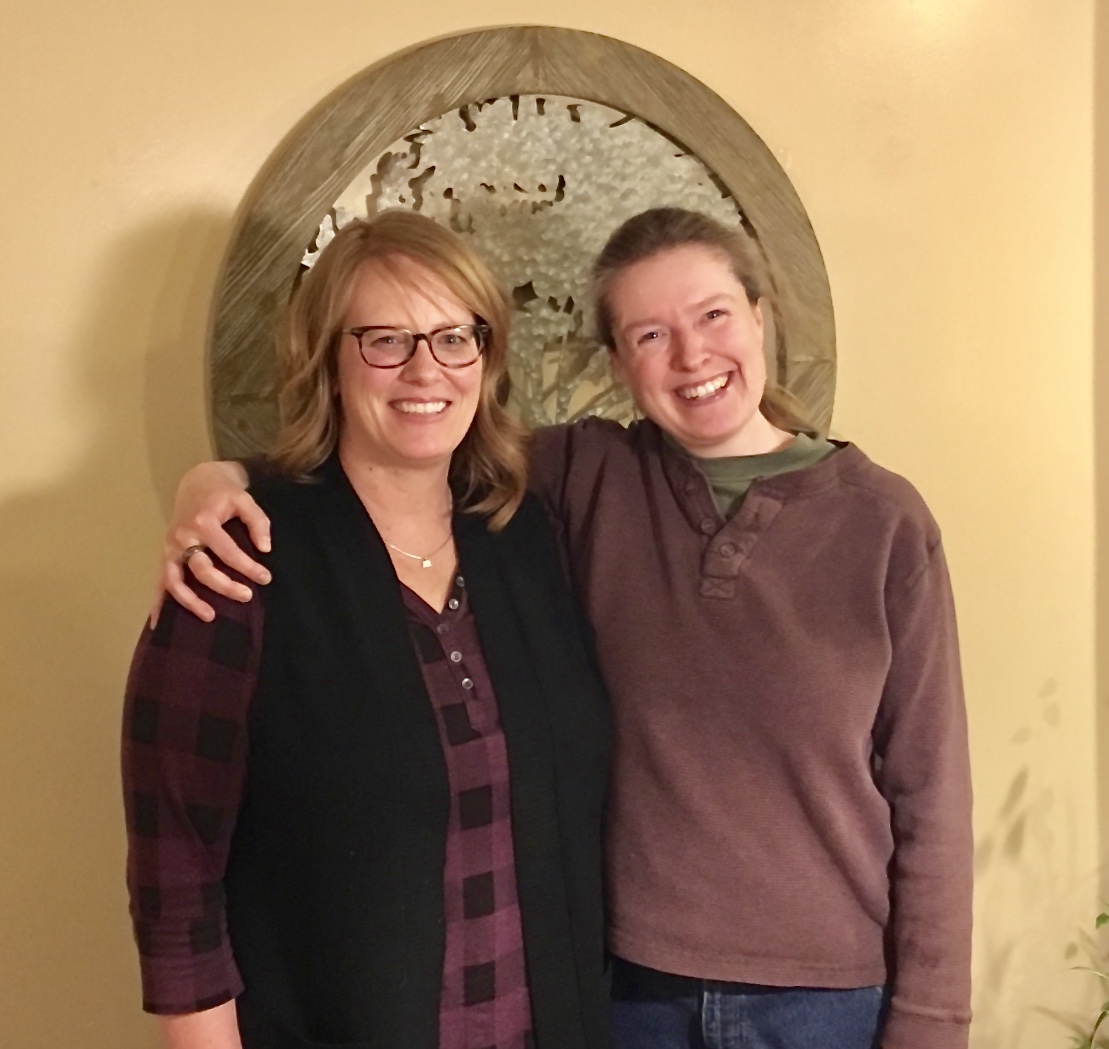
The poet Jessica Davis (L) and me.

The poet Jessica Davis (L) and me.

Jessica and her family generously put me up for the night last Monday, and we spent hours talking all things poetry-and-more over cups of ginger tea and, later, glasses of red wine. Like the beautiful oaks in her backyard, Jessica is an old soul; we traversed time and space, experience and emotion and creative expression, in our rich, wandering conversations. She’s as tuned to language and the heart as white pines are to wind and birdsong. Tuesday morning, I left their home filled with deep friendship, gratitude, and a baggie of delicious chocolate-chip muffins.

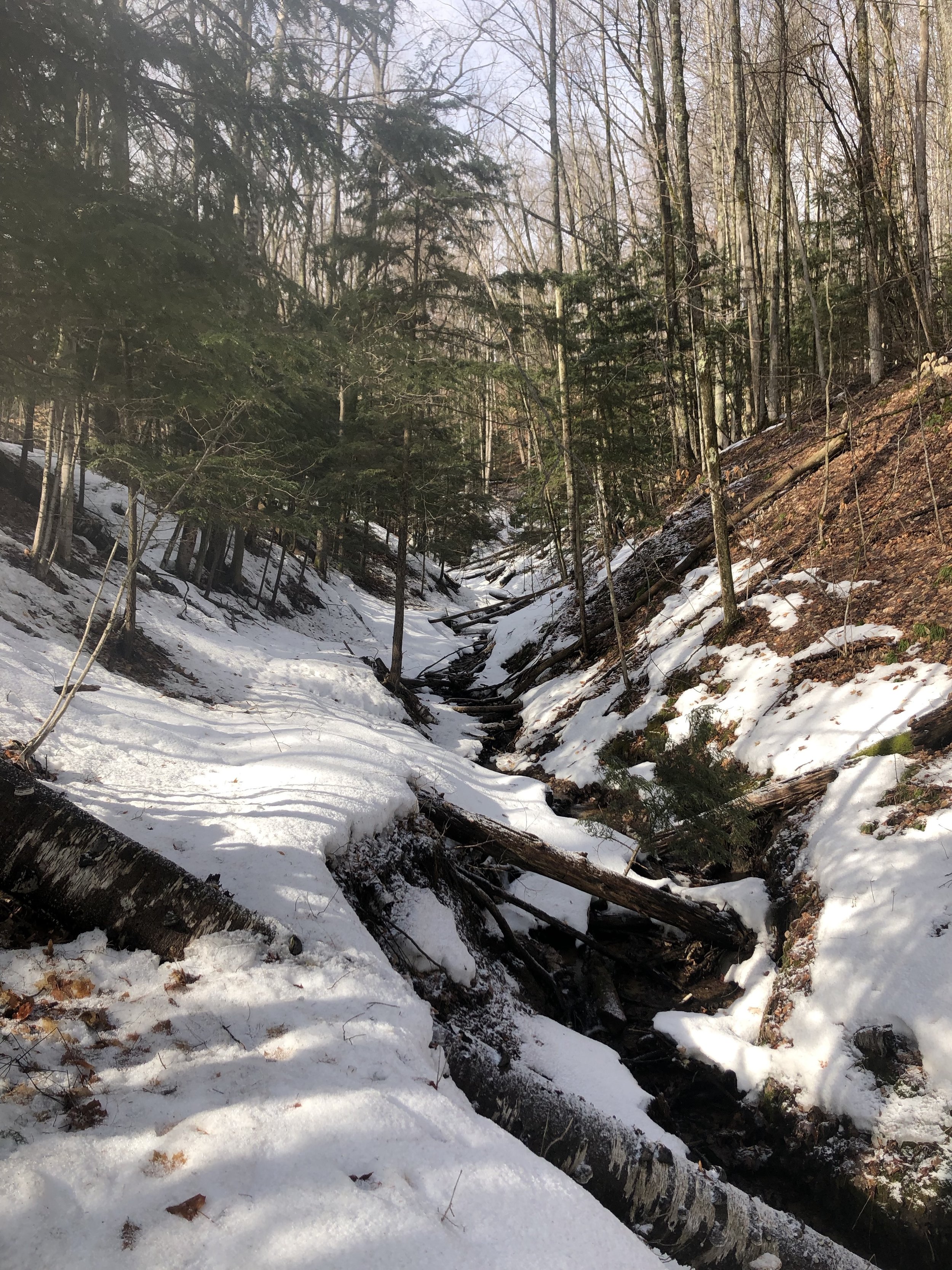
The road north lead into more snow. Due in Interlochen by late afternoon, I wanted to make a pilgrimage first to one of my early mentors in traditional fine press printing—Chad Pastotnik of Deep Wood Press. The ground began to whiten the further I went, until snow-plow piles of the dirty white stuff were banked higher than my head. I wound west and north of the small town of Mancelona until I found Chad’s place, tucked back in a grove of conifers along the swift Cedar River. Walking up to his shop across shoveled but icy walks, I inhaled the heady scent of the trees, the cold. A merganser floated past; a few chickadees announced me to the woods. 

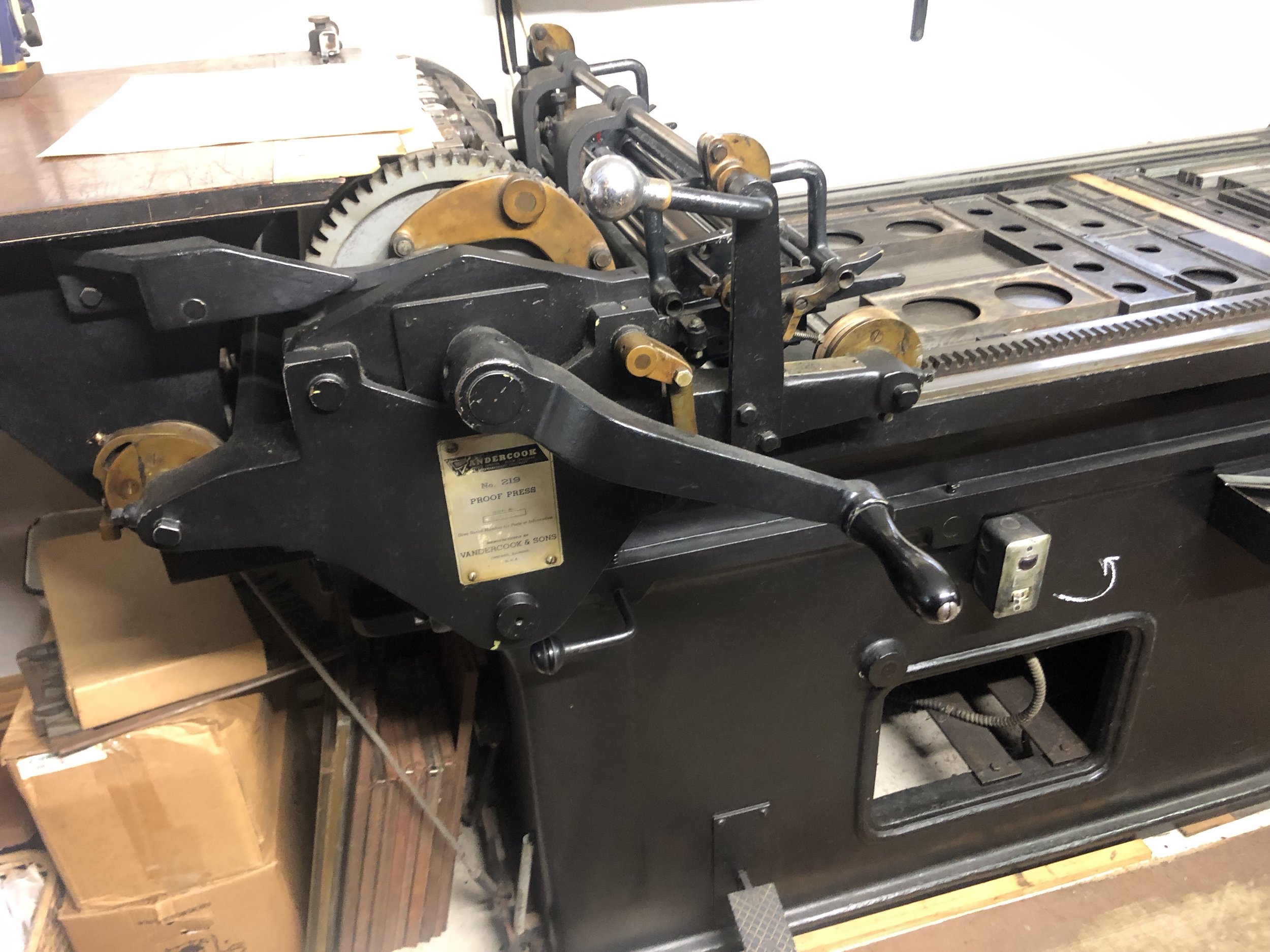
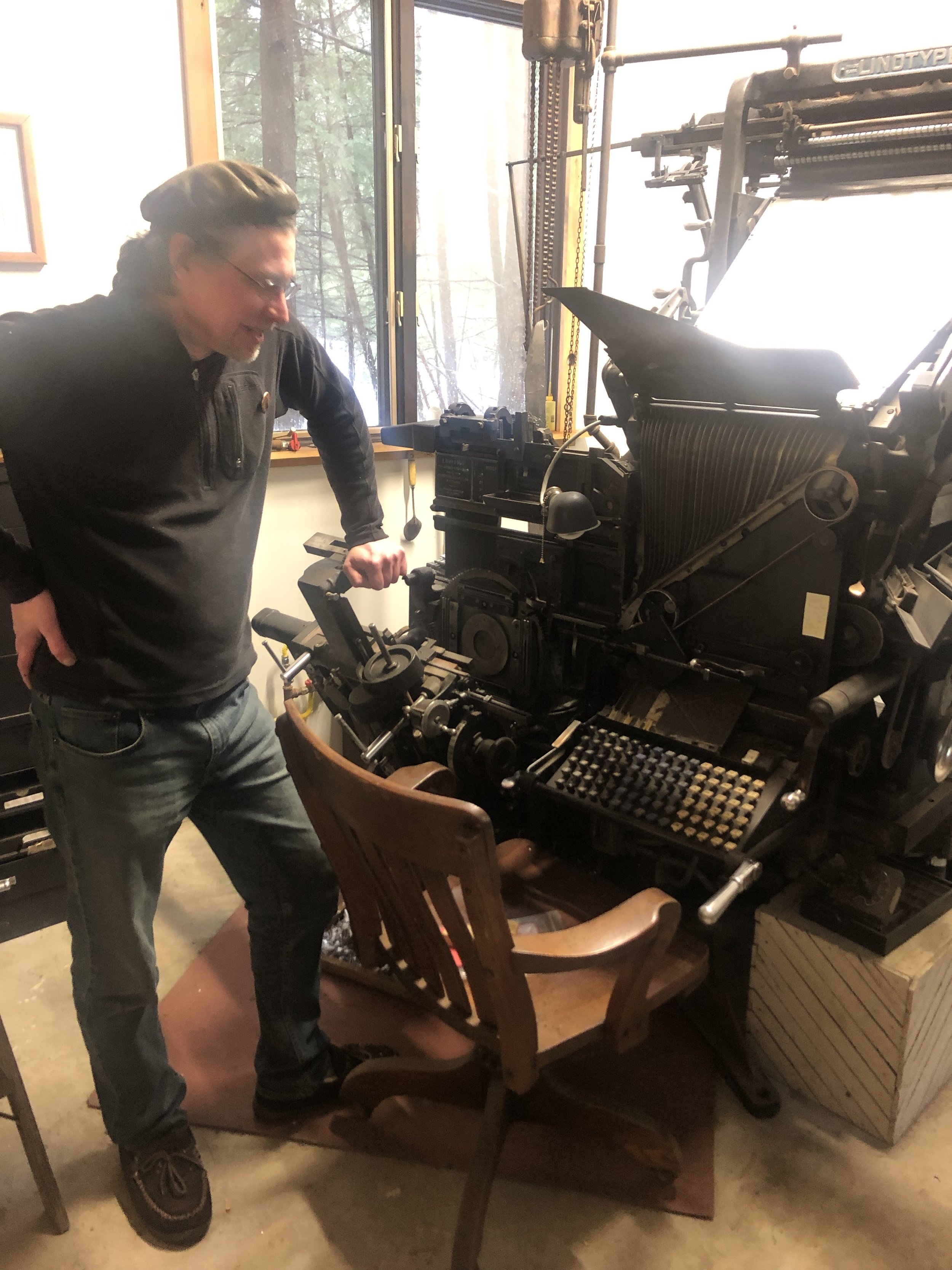
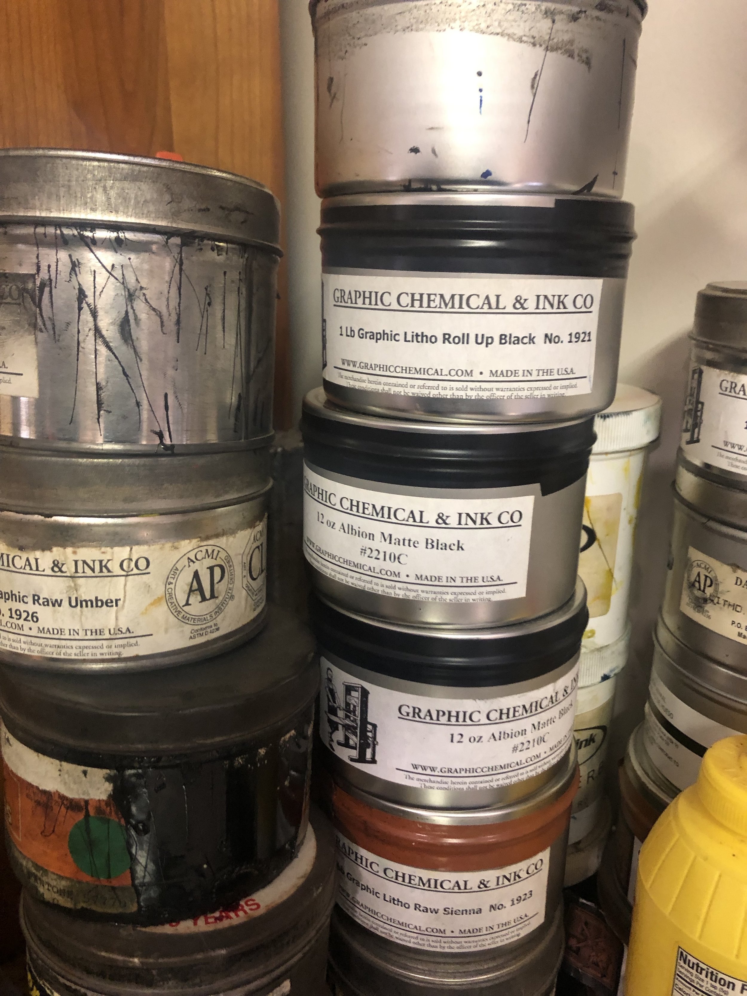
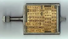
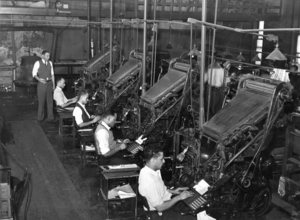
Opening the studio door at my knock, Chad ushered me into his world—ink and iron, lush papers and sharp tools, eagle eyes and exactitude. One of the most accomplished fine press printers on the planet, he has operated Deep Wood Press since 1991. I came across images of Chad’s work early on in my learning about traditional printing and bookmaking, and it was truly an honor to experience DWP first-hand. He has an excellent collection of hand-set type and Linotype matrices for book work, and prints mostly on a venerable old Vandercook 219. In the time he generously shared with me, we talked over equipment, inks, his stunning library of fine press books, the business of book arts, and some of the finer points of colophon construction. I left filled with new knowledge, inspiration, and more gratitude.
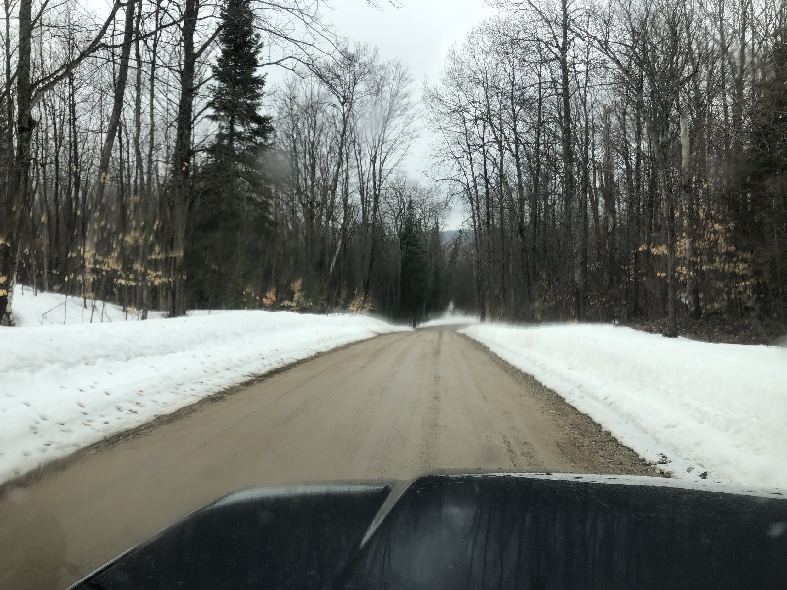
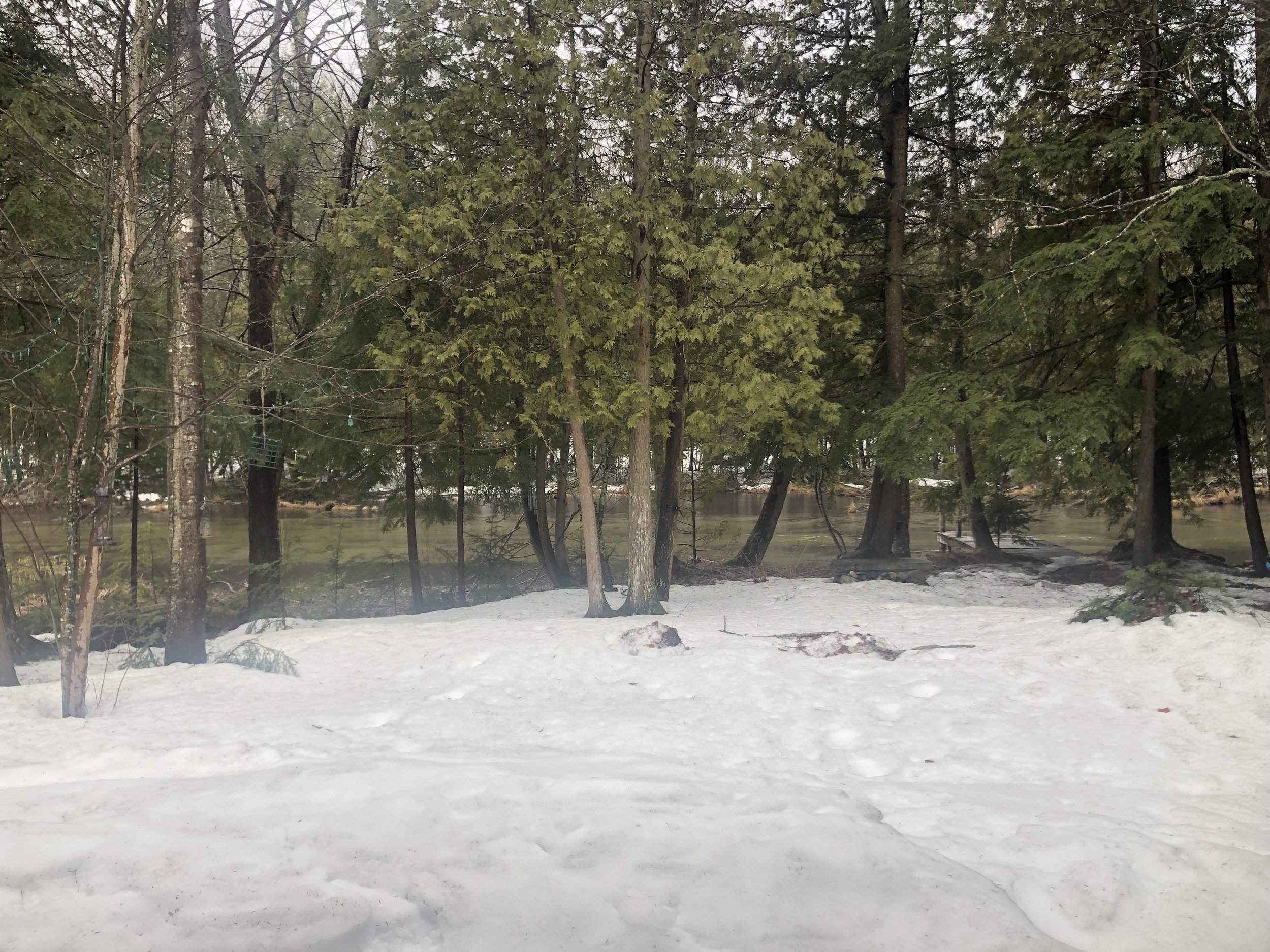
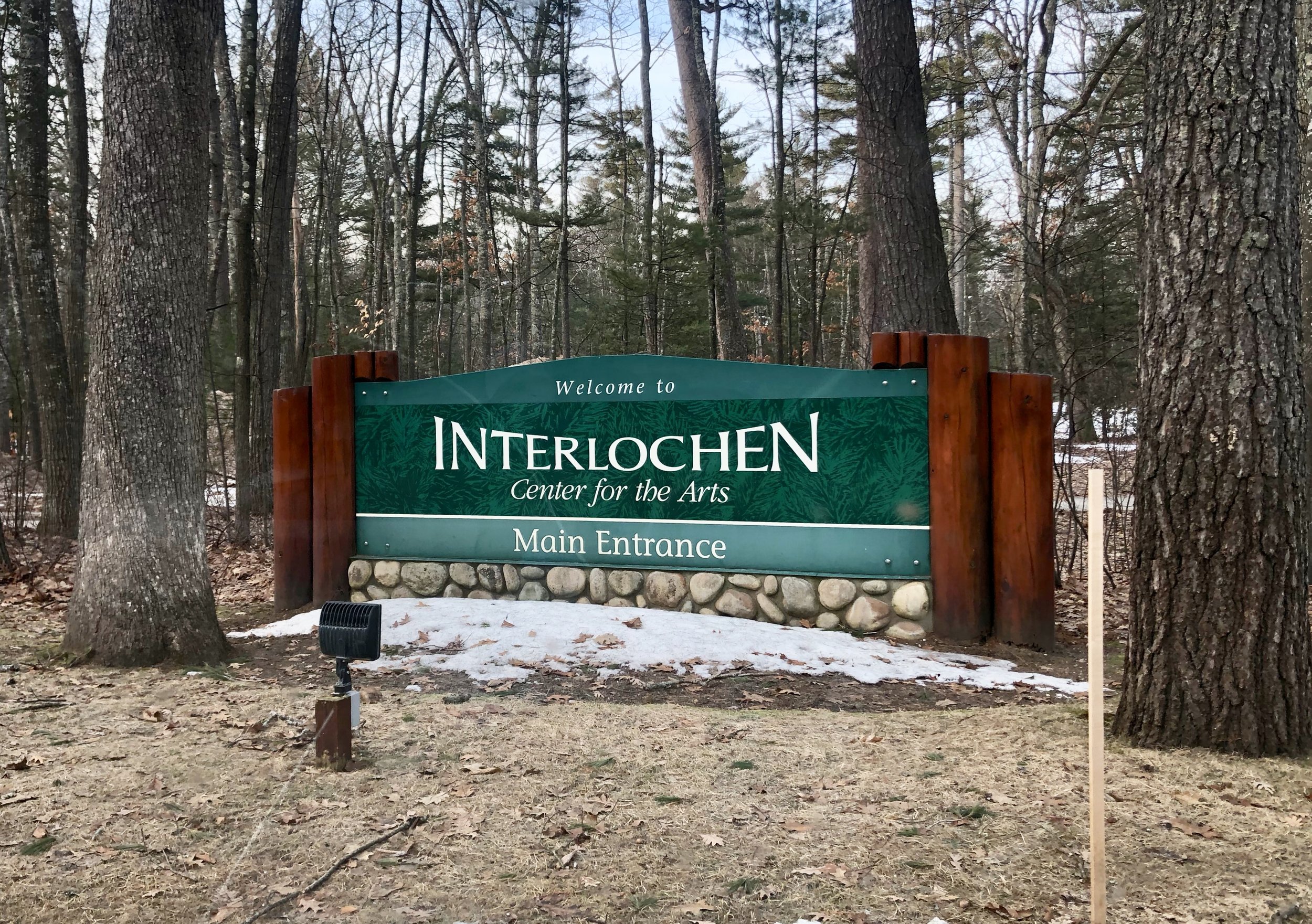
Winding my way southwest in the late afternoon cold drizzle, I glimpsed frozen Lake Michigan from Traverse City before dropping down to the world-renowned Interlochen Center for the Arts. I checked into the Stone Hotel on campus, where my second-story window looked out on frozen Green Lake. The sky and the ice were nearly the same pearl-grey color, with a green-black scar of coastline between. A few crows careened from the top of a pine and out across the expanse. 

Green Lake, Interlochen, Michigan.

At 6pm that evening, I went downstairs to the hotel lobby, where Michael Delp was waiting for me. The connection and rapport I’d felt with him through social media and email was immediately incarnated with a hearty hug and a deep dive into conversation. He took us a few miles down the road to Bud’s Coffee Shop, a local hangout. Over burgers and coffee, we rambled all over the woods—poetry and the poets we’ve known, families and dogs, his 30 years of teaching and administrating at Interlochen, his passion for words and rivers. As with Jessica Davis, after so long in electronic communication it was fantastic to actually sit across a table from each other and talk. It felt like we’d just got started when it was time to head back to campus and try to get my brain unwound enough for sleep.

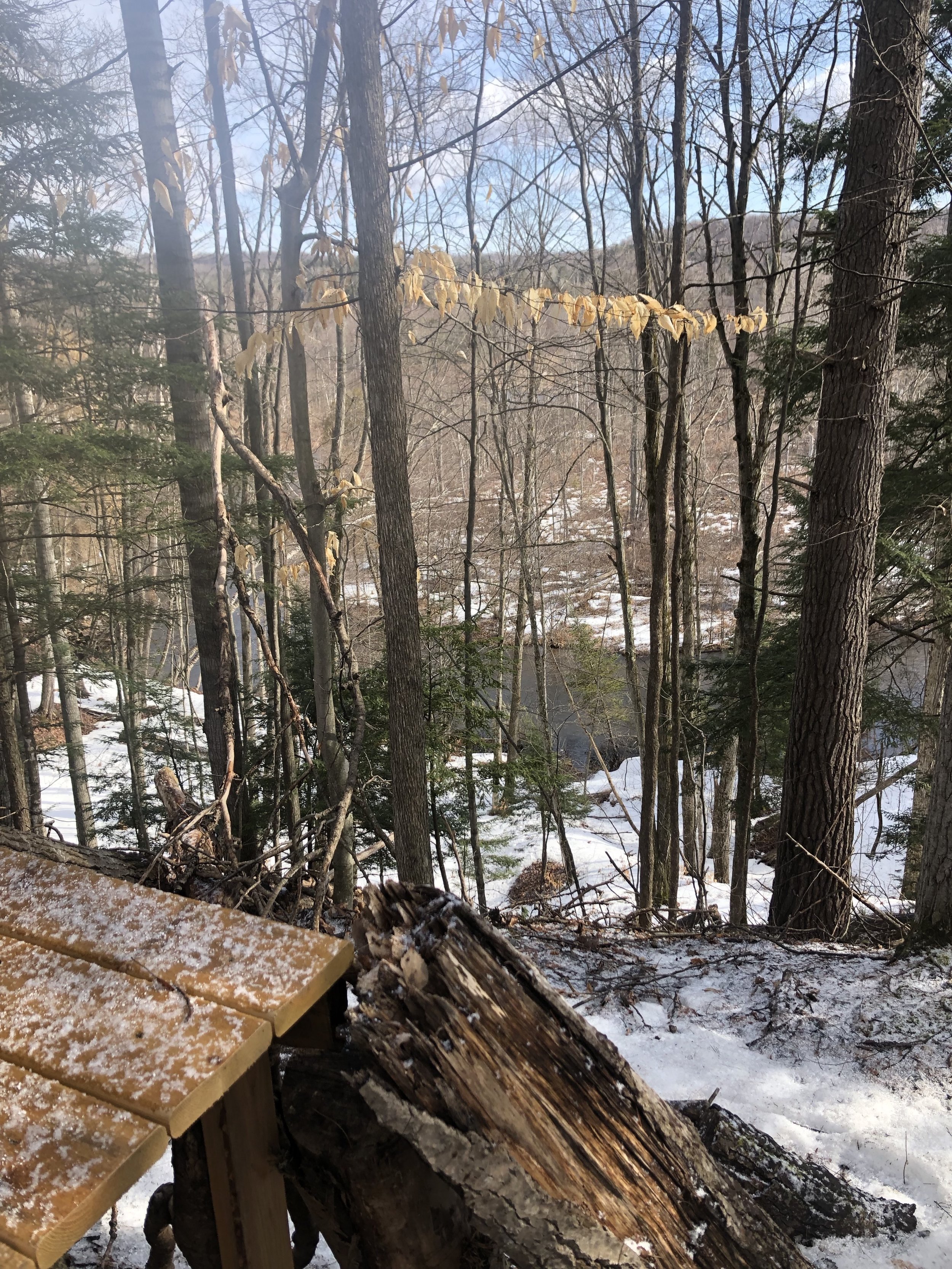
The next morning dawned bright and cold. Mike drove us a short ways east of campus to the spectacular little retreat he and his wife have on the banks of the Boardman River. We crunched down the slick slope of old snow to the fast-moving water—sunlight and eddies whorled across the surface. “It’s pretty high right now,” Mike said of the water level. “Usually I can walk across here to the other bank.” The small old cottage, renovated and enlarged over the years, held comfy furniture, fly rods, a wood stove, and a view of heaven. Before we left, I followed Mike up the steep grade through open stands of hemlock, poplar, and ash (the latter mostly decimated by the green ash borer beetle), stepping in his boot-prints for purchase in the crusted snow layer. Just a handful of miles as the crow flies from Interlochen, this place was a world away. And the beating heart of Mike and his family.
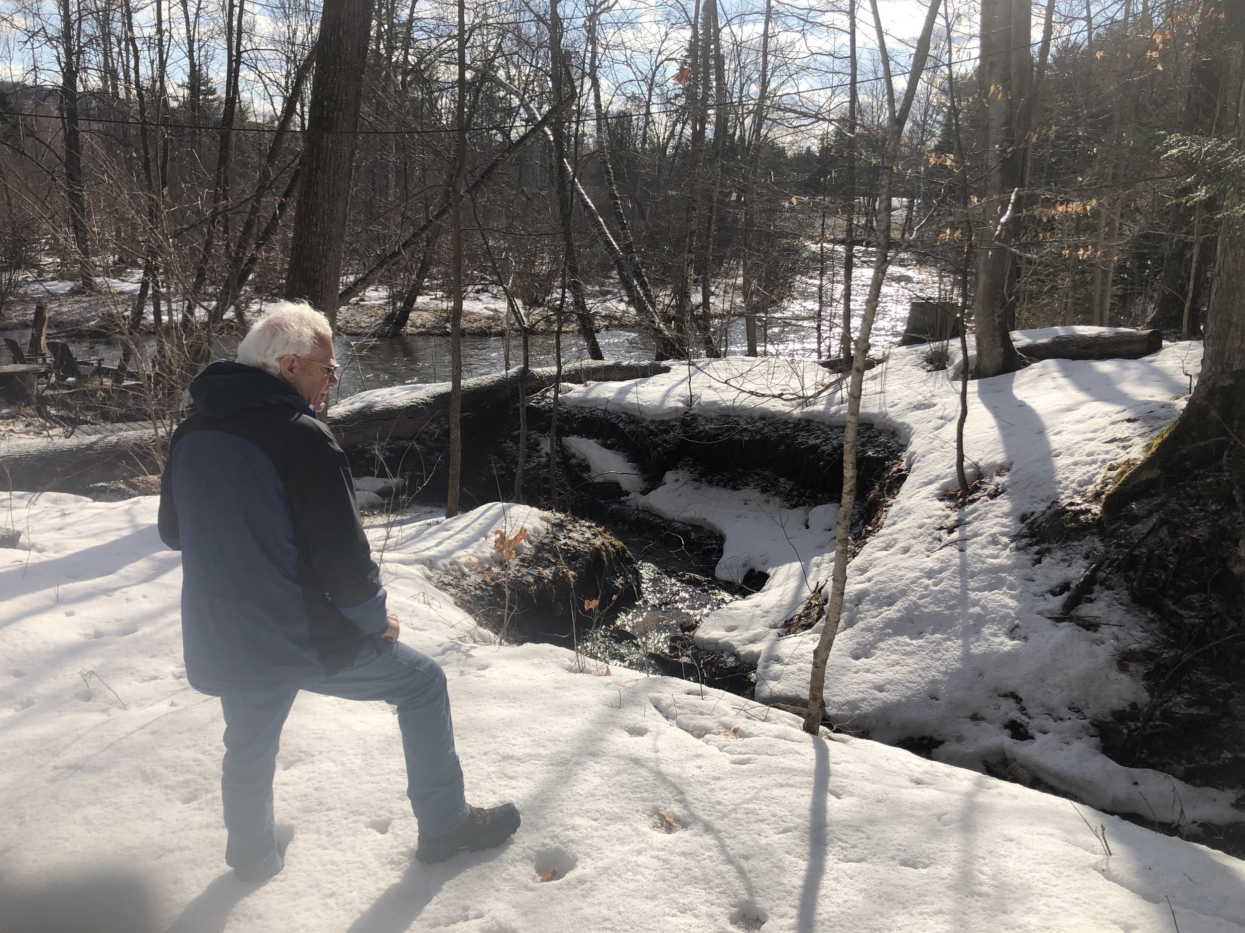
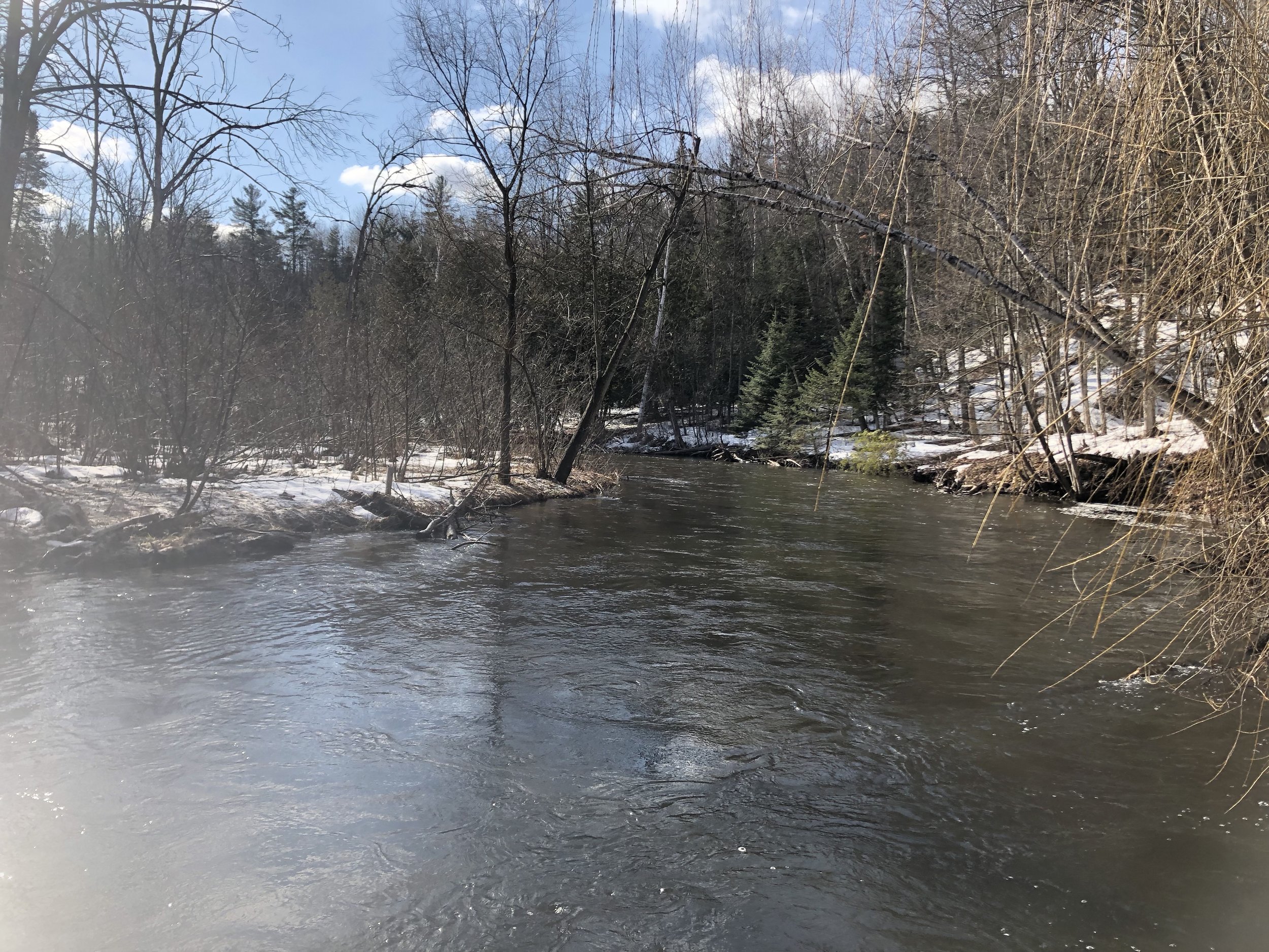
We headed back to campus in time for lunch with the Creative Writing Department Faculty. Mika Perrine, a friend and former student of Mike’s, is the Interim Director of the department, and the one who made it possible for me to come visit. She and Joe Sacksteder (the incoming Director, as of June 1st) and Bri Cavallaro and her husband Chase all welcomed me generously amid a cafeteria bustling with high-school boarding students carrying instrument cases and be-stickered laptops. The energy, intensity, and vigor of students and teachers alike was palpable. After an hour, this middle-aged introvert was excited and exhausted at the same time!

Photo courtesy of The Writing House Instagram account.

The master class on book arts that the department had invited me to do started at 3:30pm. By 3, the splendid Great Room of The Writing House was filling with students. After a bit of fiddling with the projector, Mika and Joe got my computer slideshow running, and I launched into a brief presentation on the history, immediacy, and vitality of traditional printing and publishing: “The Body of the Book: Toward an Embodied Ecology of Literature.” The students and faculty listened as I prattled on for a bit, until the talk drew to a close and it was time to get busy and actually make something. 

I passed around baggies of paper, punching awl, needle, and thread. In a short while, these dedicated, accomplished authors (students and teachers alike) had made a couple of blank books to hold their new ideas and creations. As they finished, I invited each one up to the table where I’d set up the only printing press I can lift—a sweet old 1930s-era hobby press—and everyone pulled a keepsake print. Huzzah! What a delight to meet and work with these young folks and their teachers. What an honor to spread the gospel of handmade books and letterpress printing to the likes of these brilliant human beings! 

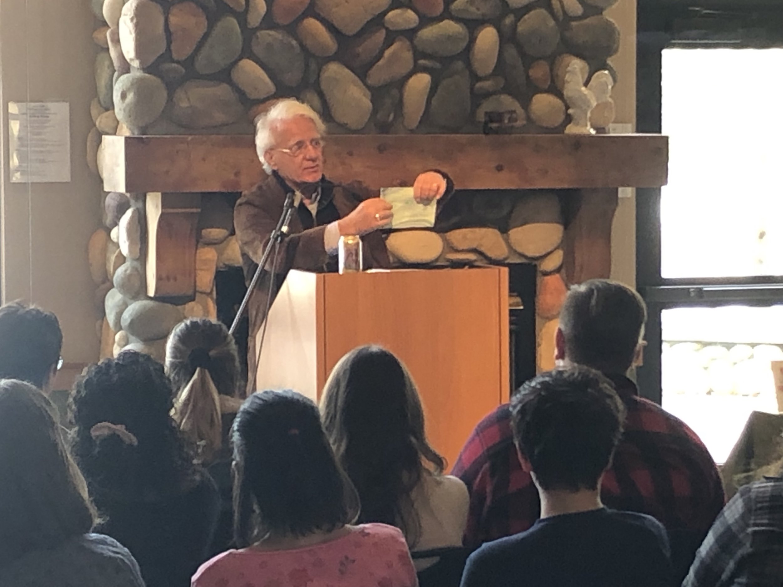
Directly on the heels of the class was the official launch of Michael Delp’s Seven River Prayers. The students moved en masse from the tables where we made the booklets to front row seats near the lectern. Faculty, friends and family of Mike’s, and community members filled the other seats. Mika called us all to attention and shared Mike’s bio, then turned the proceedings over to him. An old hand with a gathering of literature-lovers, Mike held us rapt with his particular rhythm of reading—sharing a poem; sharing part of his process as a writer; a quote by Jim Harrison; sharing another poem; a quote by Thoreau; sharing about the making of the book; one more poem. Five minutes in, we were all converts to this force-of-nature poetic experience. Including, apparently, Mike’s own grandson—four month old Wilder, bouncing in his parents’ arms at the back of the room, gurgled and burbled at his Grandad reading poetry. The expression of love and joy on Mike’s face was transcendent. 

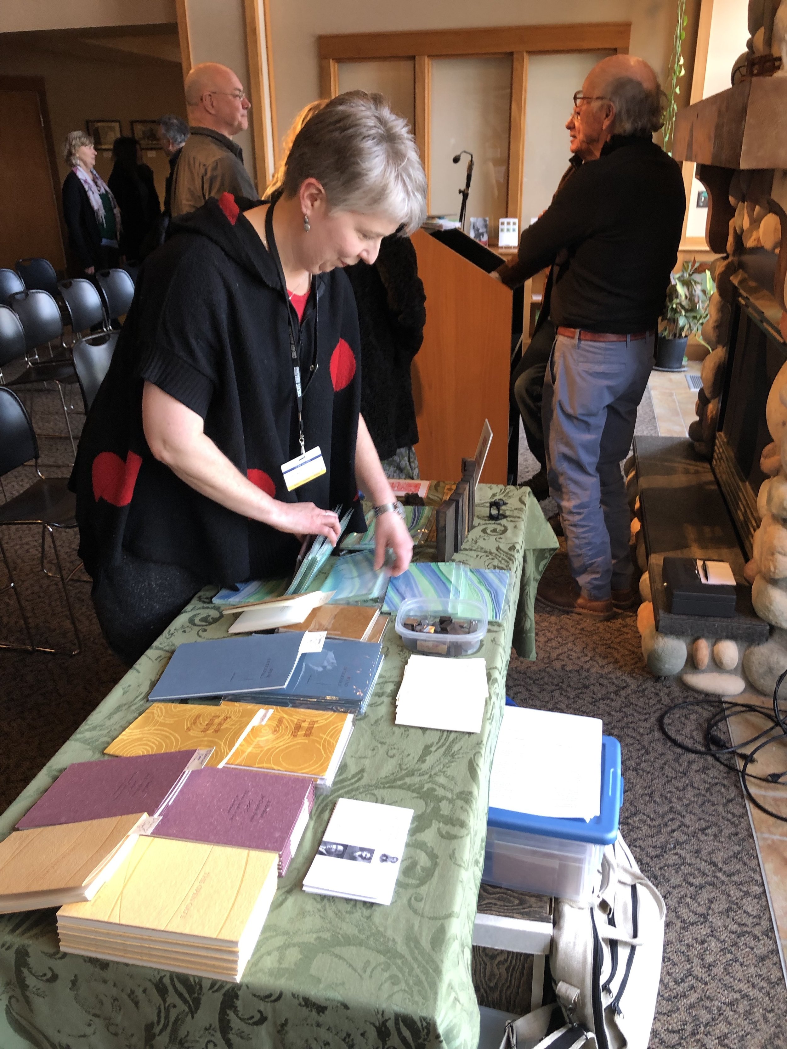
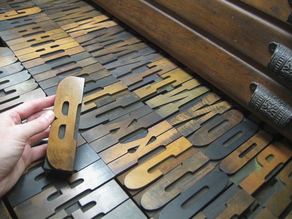
After the reading, folks hung out for a bit and talked, got their copies of the chapbook signed, and came up to the St Brigid Press table to peruse the show-and-tell display of type and tools. I had left one of Mike’s poems composed in metal type, so that folks could see some of the process of traditional printing, and also took along 125-year-old wood type letters to heft in hand. There’s nothing like picking up and holding language in its three-dimensional forms.

Mike and his wonderful wife Claudia, Joe Sacksteder, and a couple of their dear friends and I went out for a delicious supper that evening. (My first taste of Lake Superior whitefish was terrific.) More engaging and inspiring conversation flowed, first over food and later over a celebratory glass of wine at Mike’s and Claudia’s sweet, dog- and book-filled home on the shore of Green Lake. When Mike dropped me back off at the hotel, I stood outside my car for a while, cleaning ink off the press under cold starry skies. As with each experience on this trip, when night fell and I crawled back into the hotel bed, I felt at the same time exhausted, elated, and full of profound gratitude. 

The 1930s-era traveling printing press.

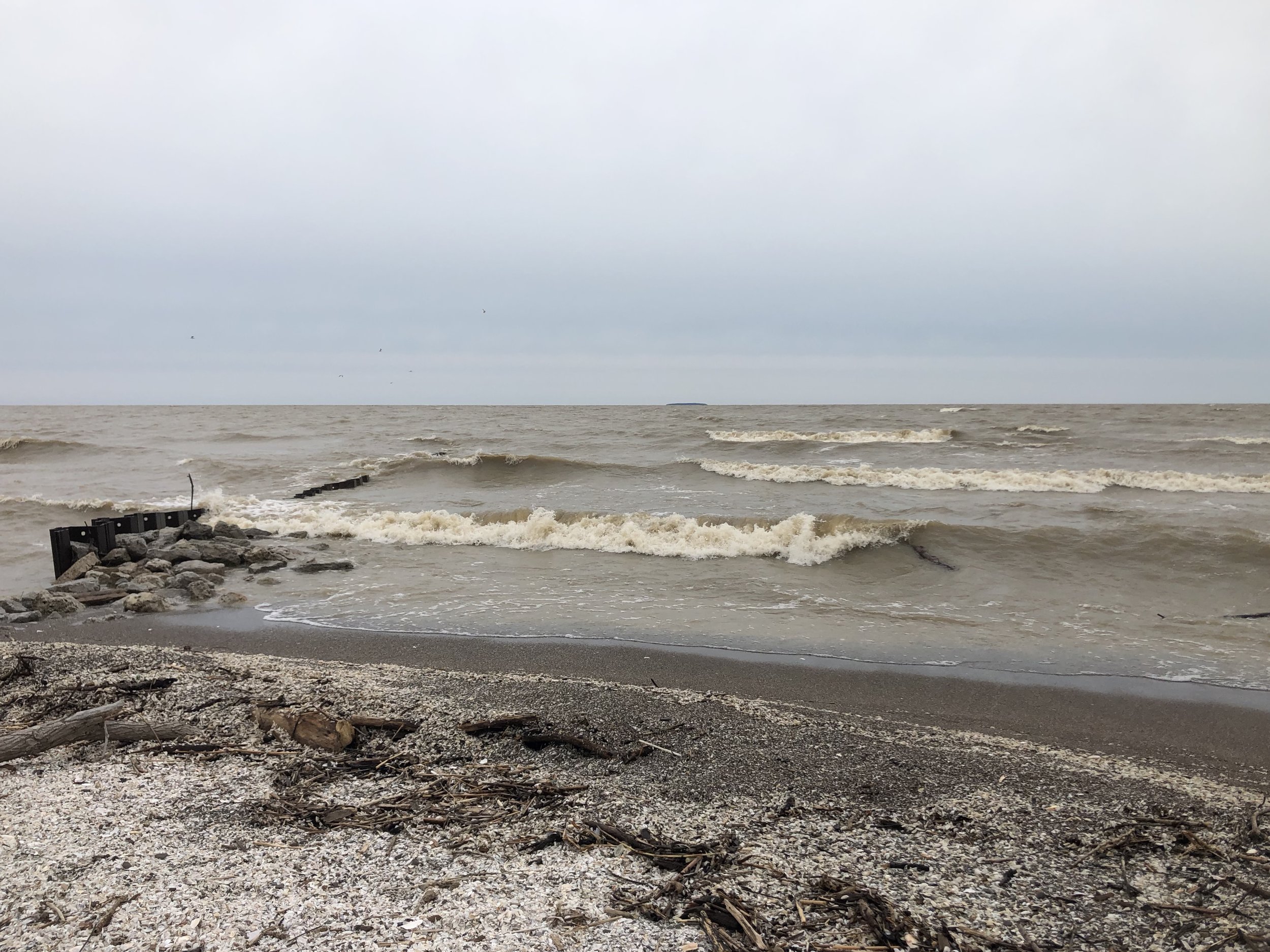
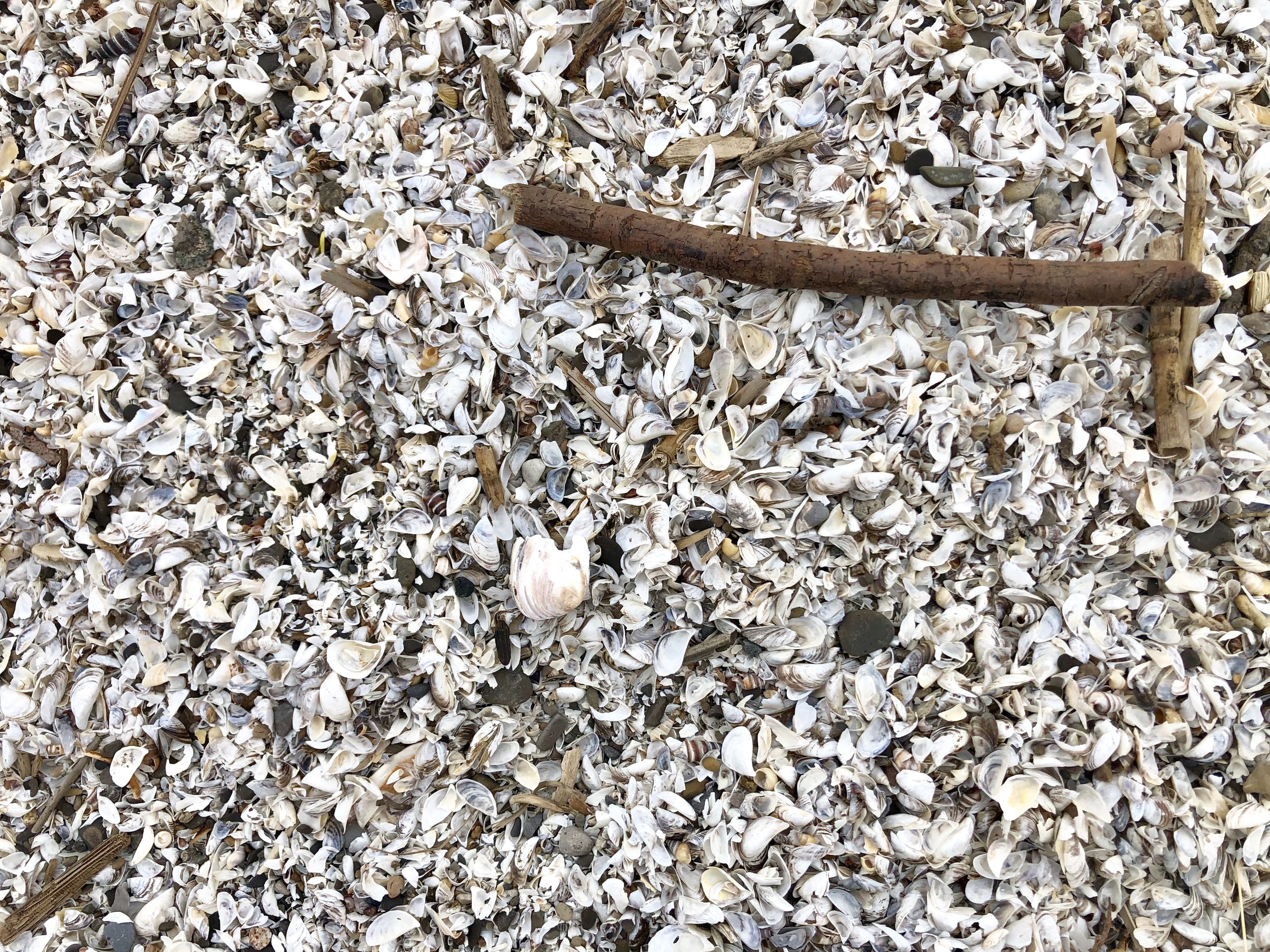
Next morning, there was only one thing left to do—head home. And I was ready! By 7:52am I pulled out of the campus parking lot and headed southeast, into a bitter cold but blessedly bright day. Around mid afternoon I reached the outskirts of Toledo, and decided to stop back by the wildlife refuge. Tree swallows were swooping and swirling over a pond near the entrance to the visitors center, and a Great Blue Heron and several Egrets stalked the edges. I drove the marsh road again, past clusters of waterfowl, to where it ended by the shoreline of Lake Erie. The fierce wind nearly blew me over as I approached the pounding, latte-colored lake edge on foot, crunching over low berms of empty shells . Seagulls winged by, west to east, unfazed by the gale. Turning back from the razor wind to the thin line of woods separating shore from marsh, I spied two Bald Eagle nests high in still-bare trees. Both were occupied, and I regarded with awe those parents hunkered against snow and cold, sheltering new life.

As I left the wildlife area and worked my way towards the interstate past fields of stubble, I must have seen a dozen more eagles. The day, and my energies, diminished as I left Ohio and pressed east into the ridges and valleys of western Pennsylvania, and I stopped for the night on the outskirts of Pittsburgh. The next morning broke with a cold rain, and I finished the long road-trip in soggy fog. It was all worth it, though, when I finally rolled up our driveway and was welcomed home into my spouse’s open arms and the pup’s ecstatic leaps. 

What an amazing, 1757-mile journey—new places, new people, new experiences, and enduring friendships, memories, and deep gratitude. 

Home very-sweet home.
2 Comments

 A Letterpress Lexicon, Part 4: Spacing Out

6 Comments

A Letterpress Lexicon, Part 4: Spacing Out

Hi, Friends of St Brigid Press!

Here is the long-awaited fourth installment in our occasional blog series ~ A Letterpress Lexicon ~ about the words and phrases that identify printing's particular tools and processes. Enjoy!

If you missed the first posts in this series, you can find them here:


A Letterpress Lexicon Part 4 ~ Spacing Out

We space out daily here at the Press ~ all for a good cause. ;-) 
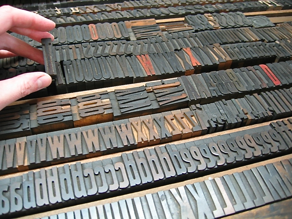
You might already know that every single letter of the alphabet that we set and print here is a physical piece of metal or wood ~ a piece .918-inches tall, with the reverse image of the letter on the top, in relief. 
IMG_0864.jpg

Hand-set type:

Moveable type, which makes everything possible here at the Press. Here, the letters of the word "haiku" in metal.

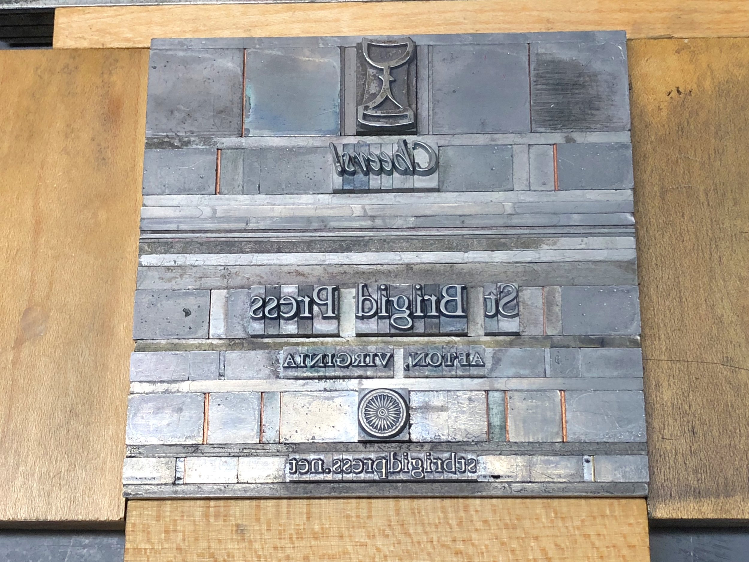
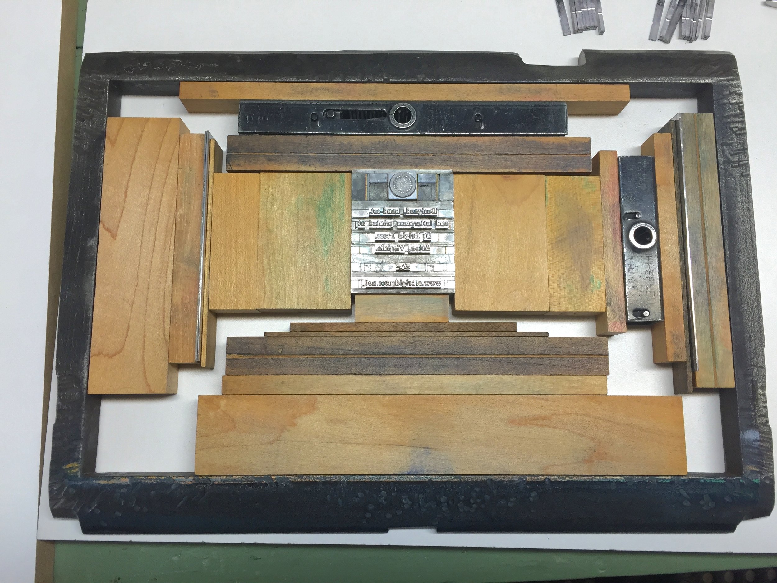
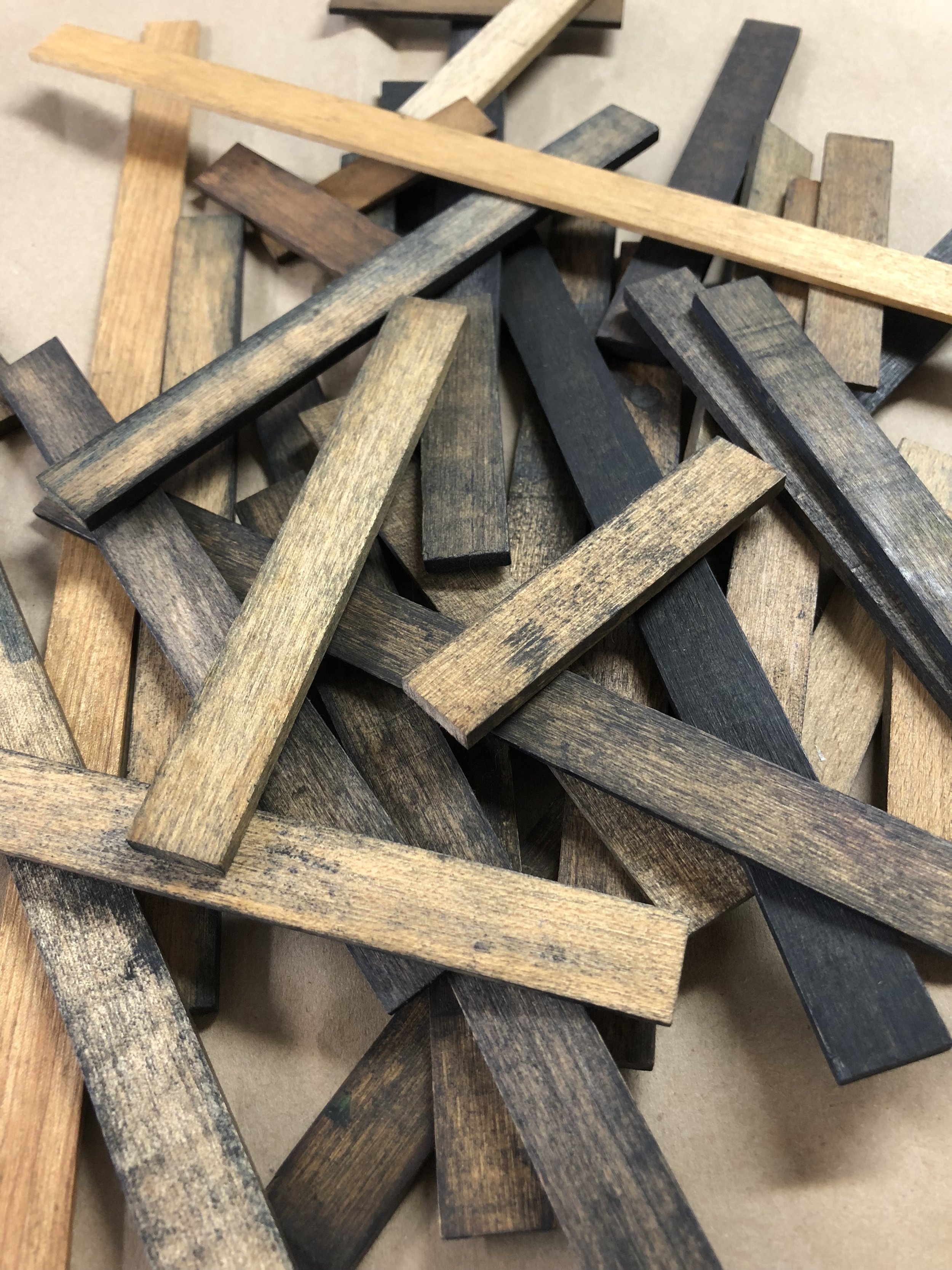
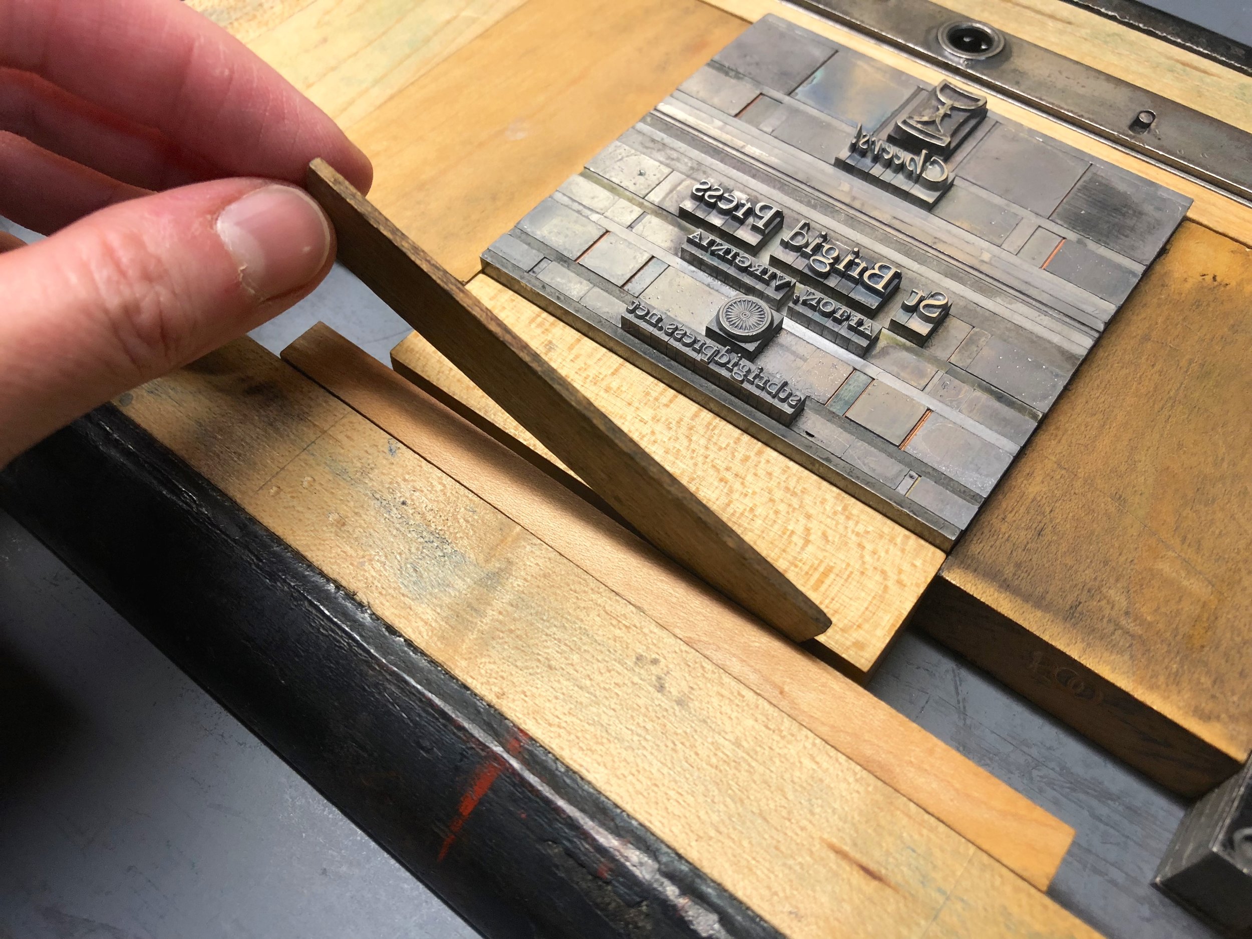
Well, every single SPACE between every word and every line is also a physical piece of metal or wood. These pieces are made a little lower than the top of the letters, so that they do not pick up ink.

IMG_7132.jpg

The forme:

In this photo, you can see all of the metal spacing material surrounding the metal letters. The spacing material is a bit lower in height, so it does not get ink on it, and comes in various sizes according to the size of the type (12-point, 24-point, etc.). The spacing between the lines of type is also metal, cut to length.

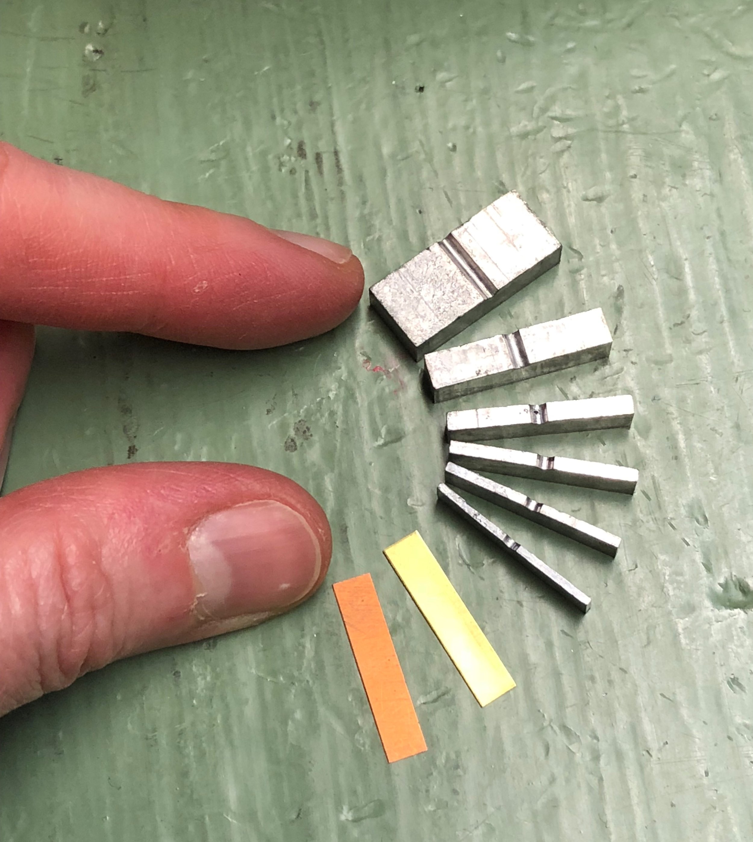
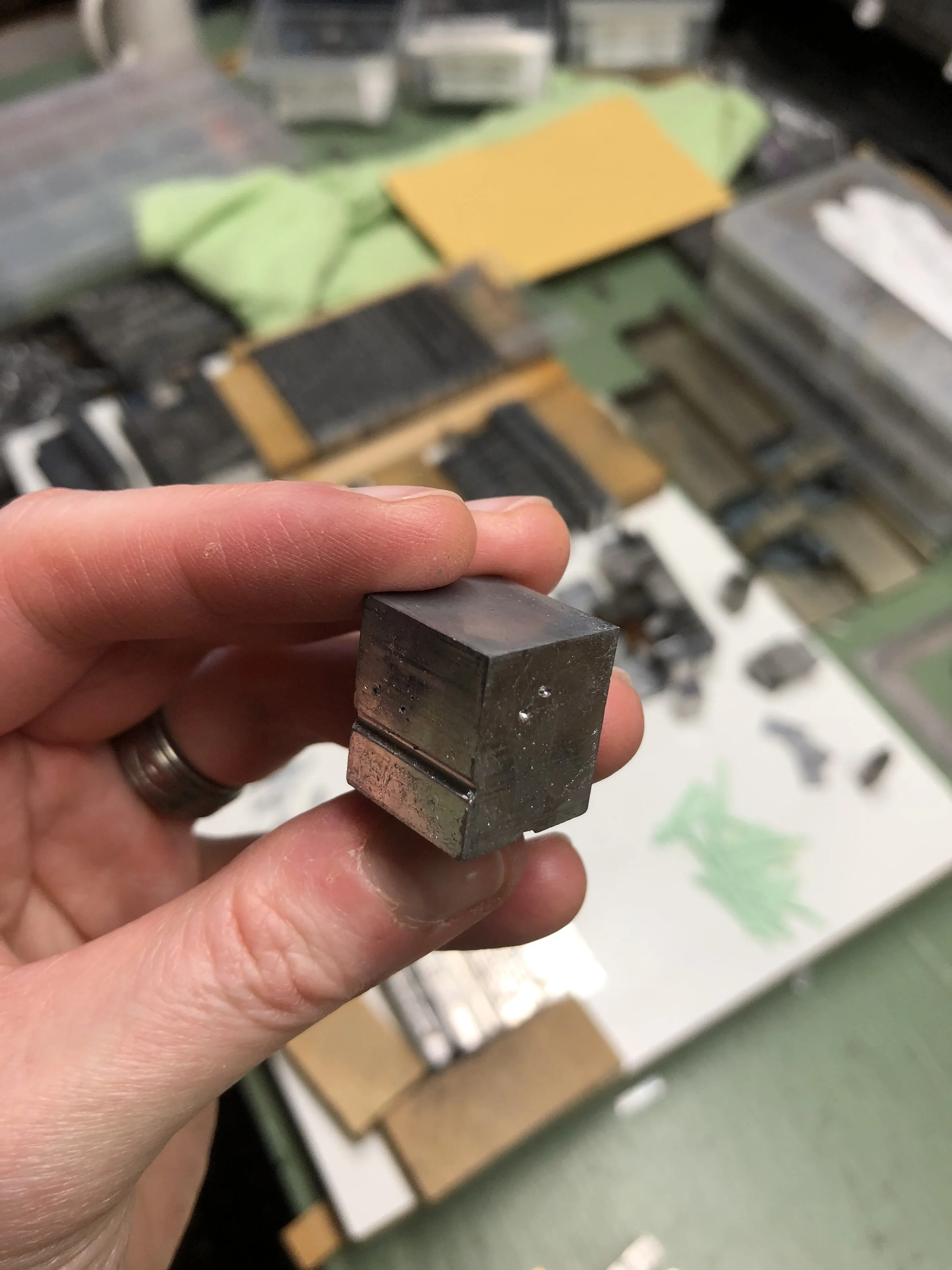
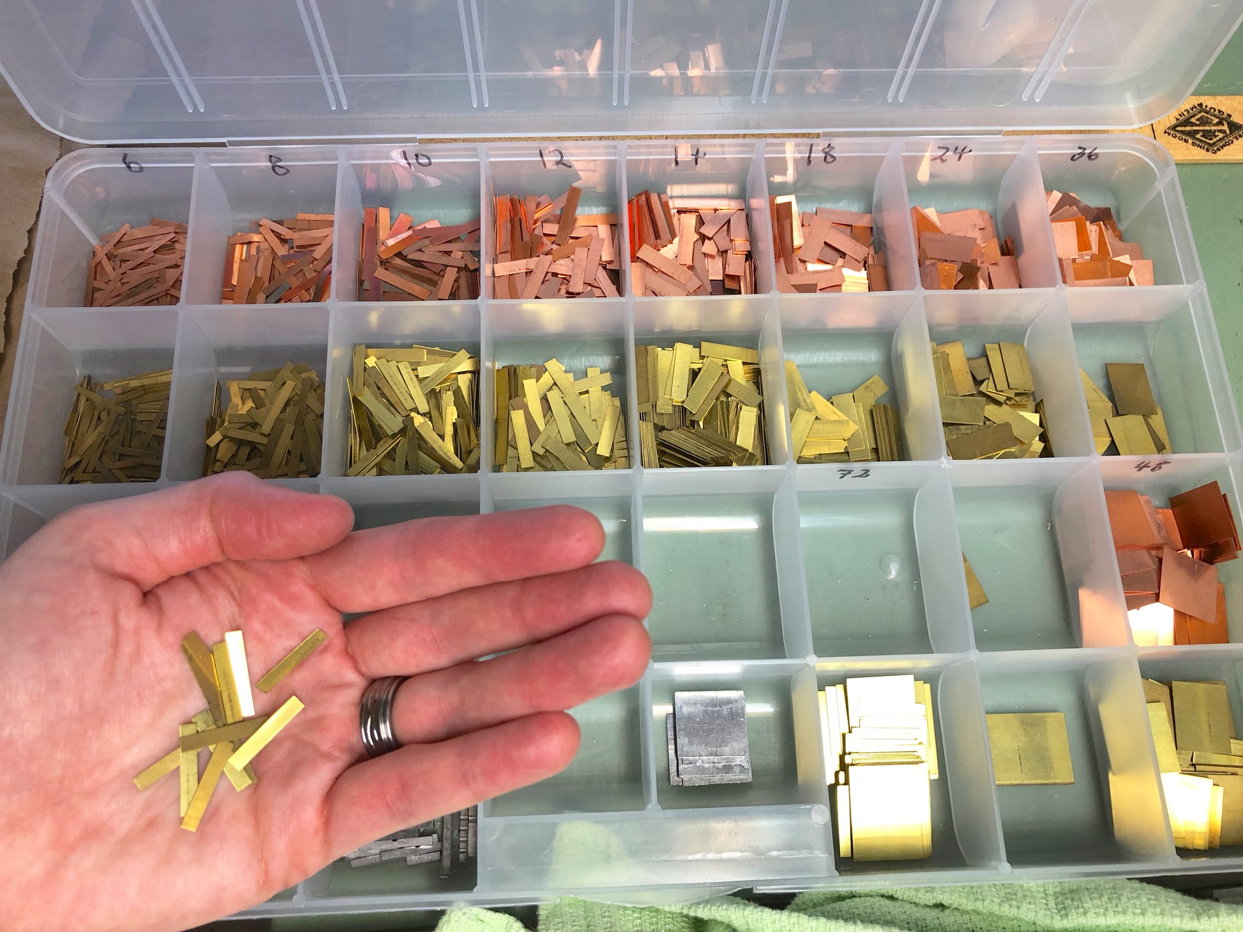
The spacing material is cast to a point-size matching the size of the type body being set ~ from tiny 6-point to giant (and heavy!) 72-point in our shop. Spacing is also cast in various standard widths, so the typesetter can put larger or smaller spaces between words, as desired. These widths range from multiples of an "em" (the square of the type body; for example, a 12-point-by-12-point square) to "thins" (brass and copper slivers to fill in the smallest gaps in a line).

In addition to letter spacing, strips of metal also need to be correctly sized and set between lines of type ("leading" or "linespacing"). This strip material comes in various widths and can be cut to various lengths (also called "slugs") ~ all tailored to ordering the printed page. 

The whole point of spacing is to surround the letters and lines as snug as possible. A loose letter can print unevenly, and even become damaged. 

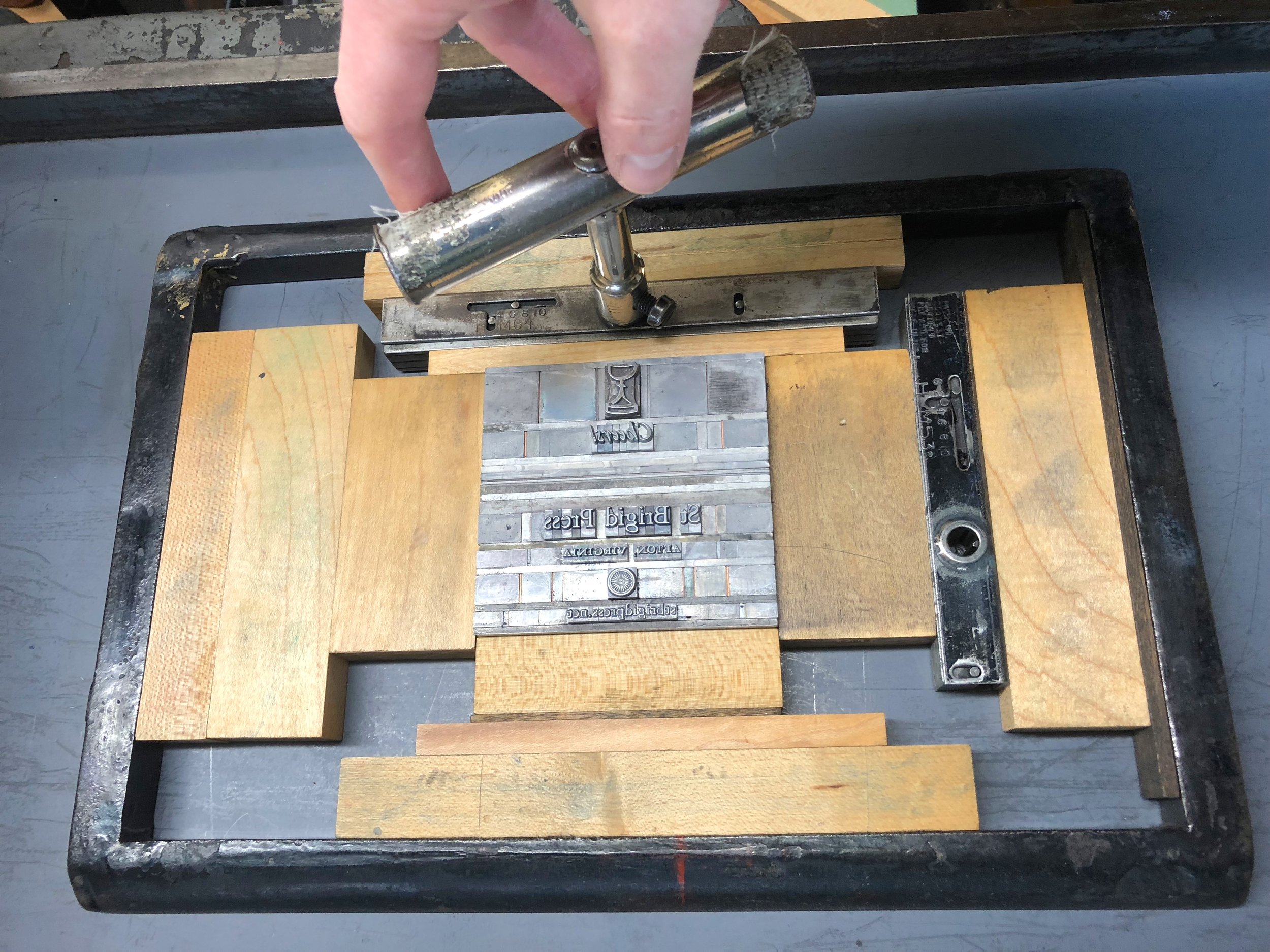
The final step before printing is to surround the whole forme (the letters and spaces) with "furniture" ~ blocks of wood (sometimes metal) in various standard sizes that fill out the chase. Two quoins (a kind of lock) are placed in as well, and when turned with a key the quoins tighten everything together. 

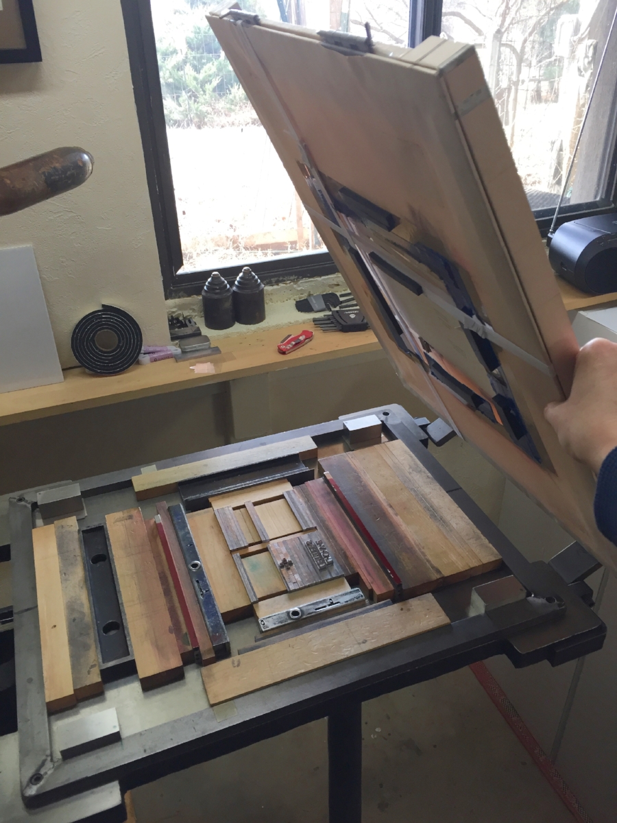
When the forme to be printed is locked up tight, I can lift it off the table and into the press without fear of everything collapsing onto the floor.

IMG_7134.jpg

The printer:

Emily, holding a tightly locked forme in mid-air. If the spacing material has been set correctly, the whole thing can be transferred easily to the printing press. If it has NOT been set correctly... well.. catastrophe can ensue. 

IMG_4595.JPG

The printed page:

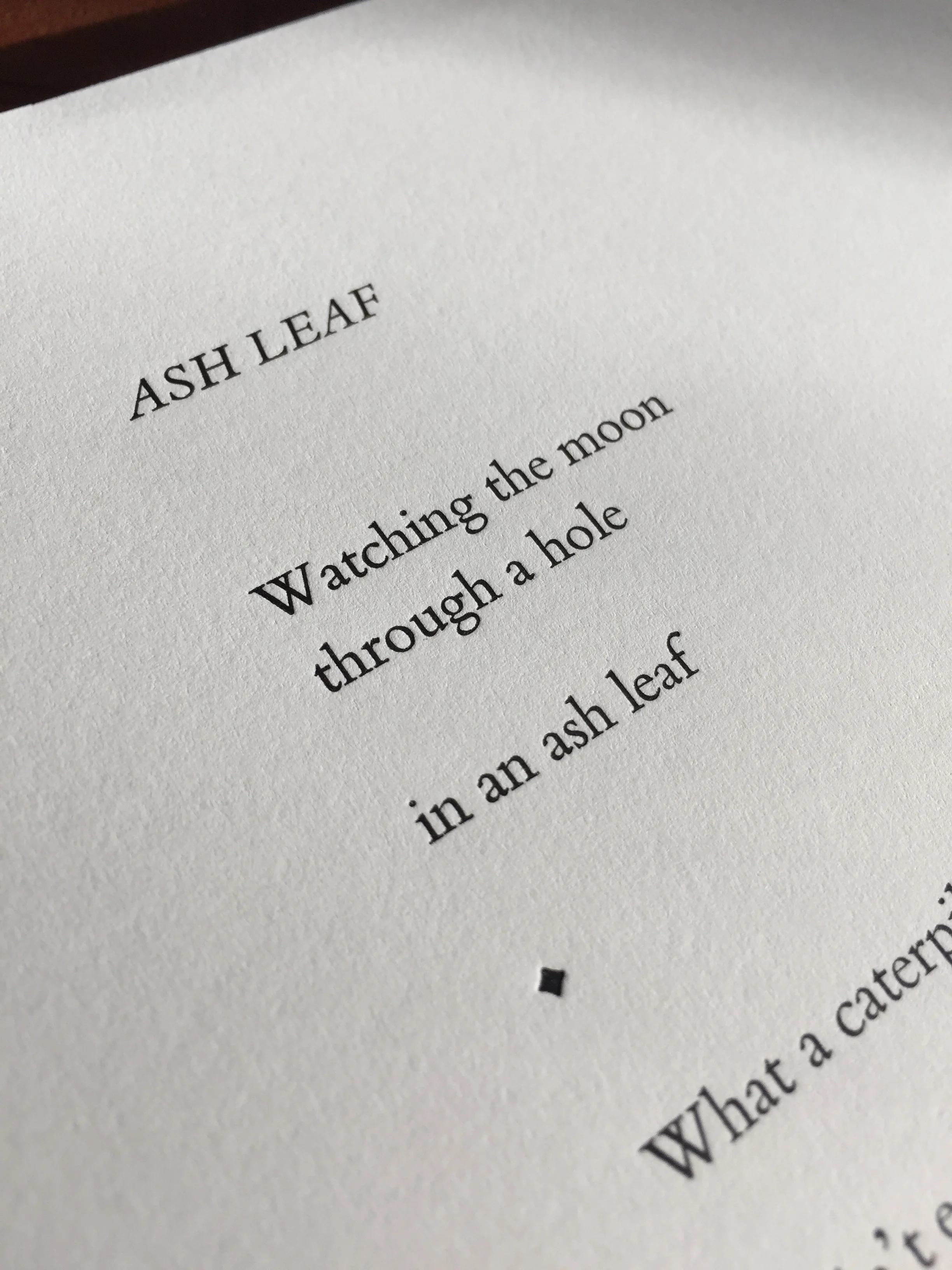
Now, when you see a printed page, you'll think of the actual mass and work of all that "white space"! Shown here, a leaf from Jeff Schwaner's Wind Intervals.

So, that's the story of SPACE at St Brigid Press! 

Thanks for spacing out with us for a few minutes ;-)

6 Comments

Printing, Circa 1776

4 Comments

Printing, Circa 1776

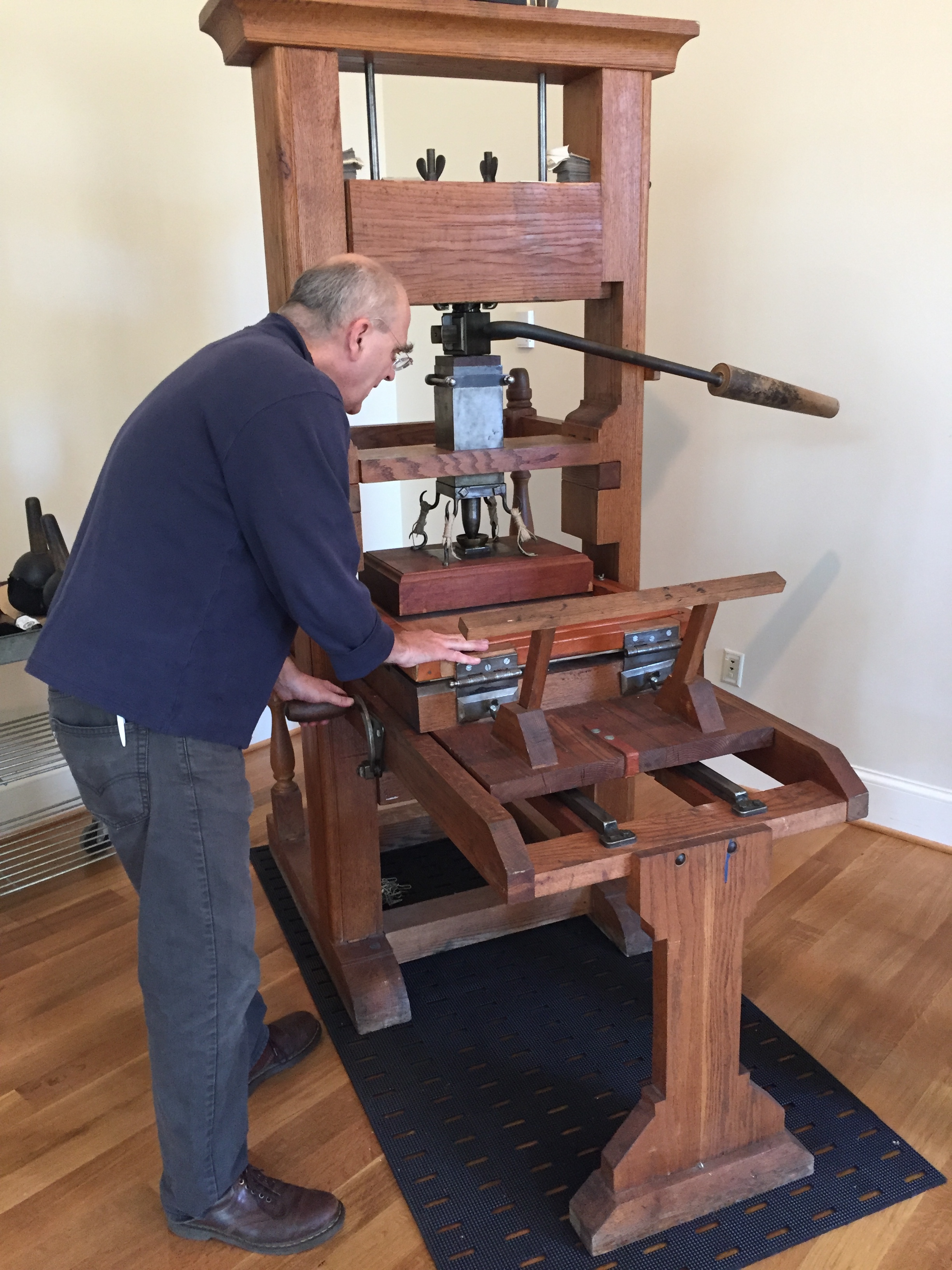
Last week I had the pleasure of attending a demonstration of the University of Virginia’s replica wooden common press:

The common press at the University of Virginia.

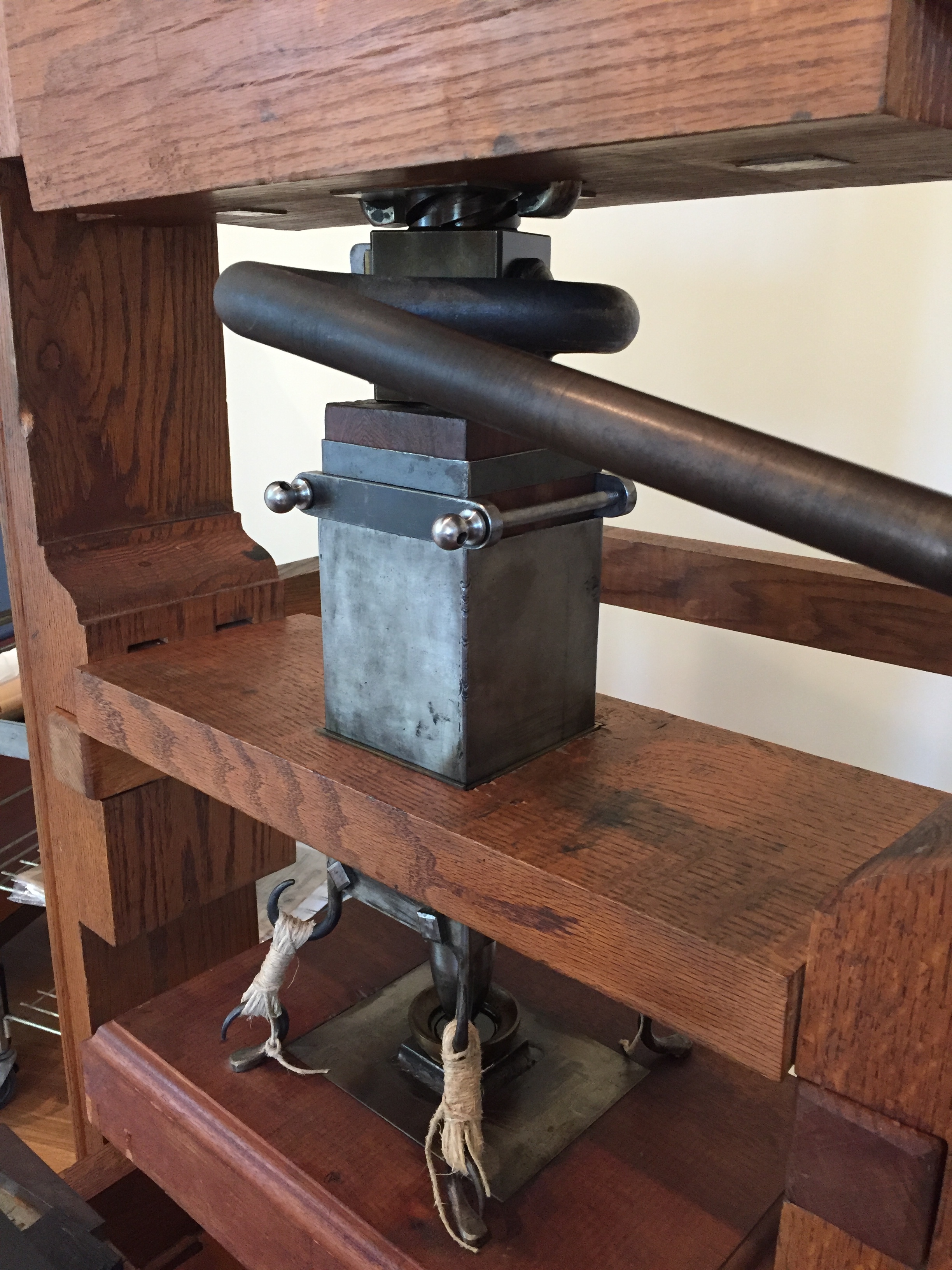
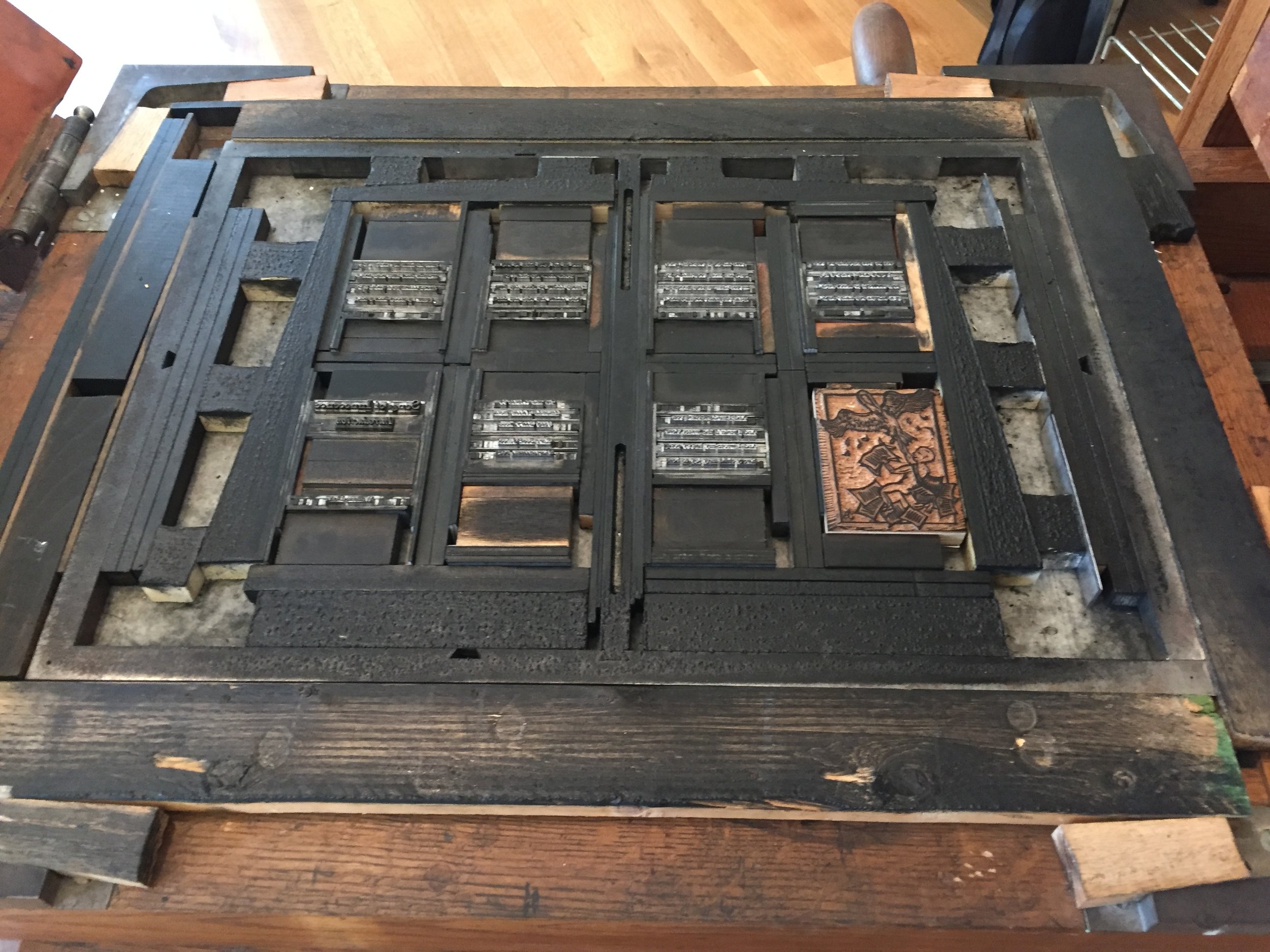
The earliest printing presses in Europe, from the time of Johannes Gutenberg and his associates Peter Schöffer and Johann Fust, were constructed primarily out of wood. Using similar technologies as contemporary agricultural presses (for winemaking, papermaking, olive oil extraction, and linen pressing), these 15th century printing presses used a wooden screw to lower a heavy wooden plate onto a bed holding cast metal type. The screw was turned by pulling a lever, or "bar" (also called the Devil's Tail ;-). Wooden common presses remained in use until the early 1800s, when iron handpresses and new types of cylinder and platen presses were developed.

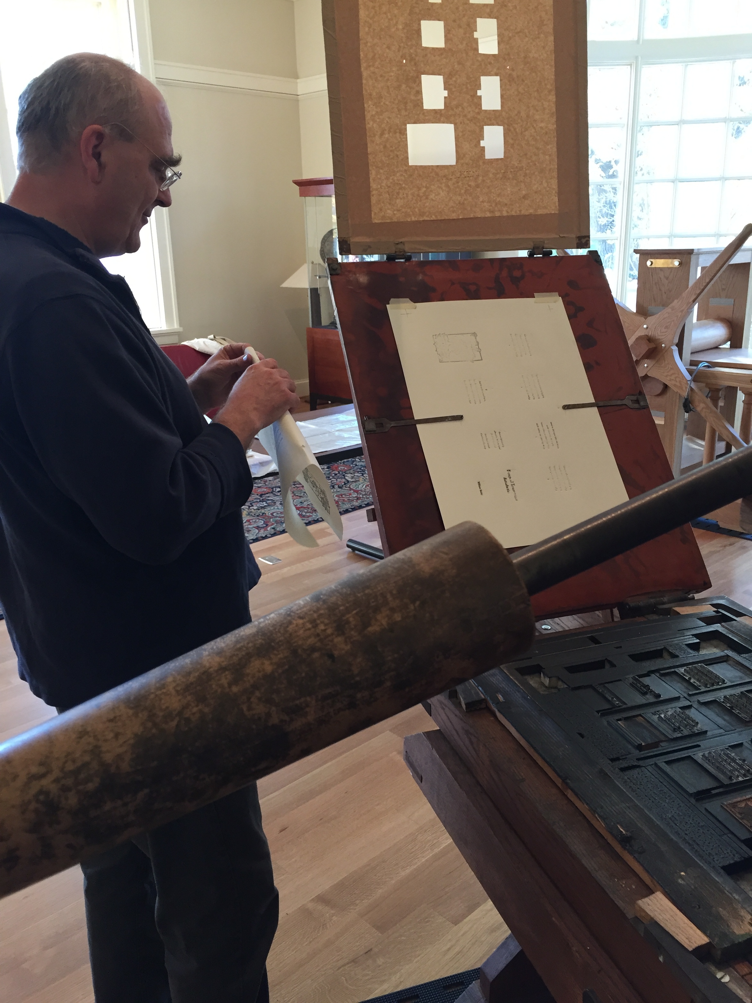
Josef Beery demonstrating UVA's wooden common press.

UVA’s common press was constructed in the 1970s, as a result of research at the Smithsonian Institution on the "Franklin" common press. It is on display in the Harrison Small Building’s South Gallery. Though the bar is kept locked for safety most of the time, you can still walk right up to the press and examine much of its design and function. Occasionally, folks associated with UVA’s Rare Book School offer working demonstrations.

The session I attended last week was lead by Josef Beery ~ book designer, letterpress printer, woodcut artist, papermaker, educator, and cofounder of the Virginia Arts of the Book Center in Charlottesville. A practitioner of the printing arts for many decades, Beery is a perfect guide to the history and use of this fascinating press.

When you finish marveling at the wooden common press, head downstairs to the Albert & Shirley Small Special Collections Library. A highlight of the Library’s wonderful collection of rare books and manuscripts (including significant holdings in the history of books and printing) is a rare first-printing of the Declaration of Independence, printed the night of July 4th by John Dunlap. It’s on permanent display along with many other early printings of the document (the world’s most comprehensive collection of these) near the Library’s entrance.

If you're ever in the vicinity of Charlottesville, Virginia, don't miss this chance to see the common press, the Declaration of Independence, and many other artifacts of printing-circa-1776!

* For more information on early American printing history, visit the American Printing History Association (APHA) website.

* To follow the fascinating process of reconstructing a wooden common press, visit Seth Gottlieb's blog post series at APHA.

* Watch Josef Beery demonstrating the traditional method of using ink balls to apply ink to the type on a common press:

Josef Beery using traditional ink balls to apply ink to the type on the University of Virginia's replica wooden common press.

4 Comments

Simple Binding for Single-Section Booklets

2 Comments

Simple Binding for Single-Section Booklets

Sometimes a little bit of extra effort gives a lot of extra elegance to a project. Such is the case with this style of binding a single-signature booklet to a jacket-with-a-spine. 

I learned this from the fabulous Myrna Keliher of Expedition Press, and she learned it from the wonderful printers and binders at Stern and Faye

Below is a step-by-step outline of the binding style. But first, here's a two-minute video I took in my shop, showing the basics of affixing the pamphlet-sewn booklet to the scored-and-printed jacket:

THE BASICS: 

  • Sew your single-section booklet. In my video example, it's a five-hole pamphlet stitch pattern.
  • Prepare the jacket you wish to encase your booklet in, printing any text on the cover, and scoring the paper stock where you want the folds to be. In my video example, I determined how wide I wanted the spine to be (a quarter-inch) and how wide I wanted the flaps to be (about 3 inches), then made the scores and folds. (I use an inexpensive Martha Stewart brand "scoring board" to make accurate creases.)
  • With a narrow brush (quarter-inch or so), run a thin line of glue along the back of the last sheet (your booklet's endpaper), about a half-inch in from the sewn edge.
  • Position the booklet, back (glued) page down, on the inside back jacket cover, and press gently to adhere the page to the jacket.
  • Fold in any flaps, and close the jacket over the booklet.
  • Voila! A sweet, simple, smart-looking book!

All the best to you in your own creative adventures!

St Brigid Press

*** For more information about the book shown above, A Handbook for Creative Protest: Thoreau, Gandhi, & King in Conversation, please see our post HERE.

2 Comments

Printing with Nature

10 Comments

Printing with Nature

Hello Friends of the Press,

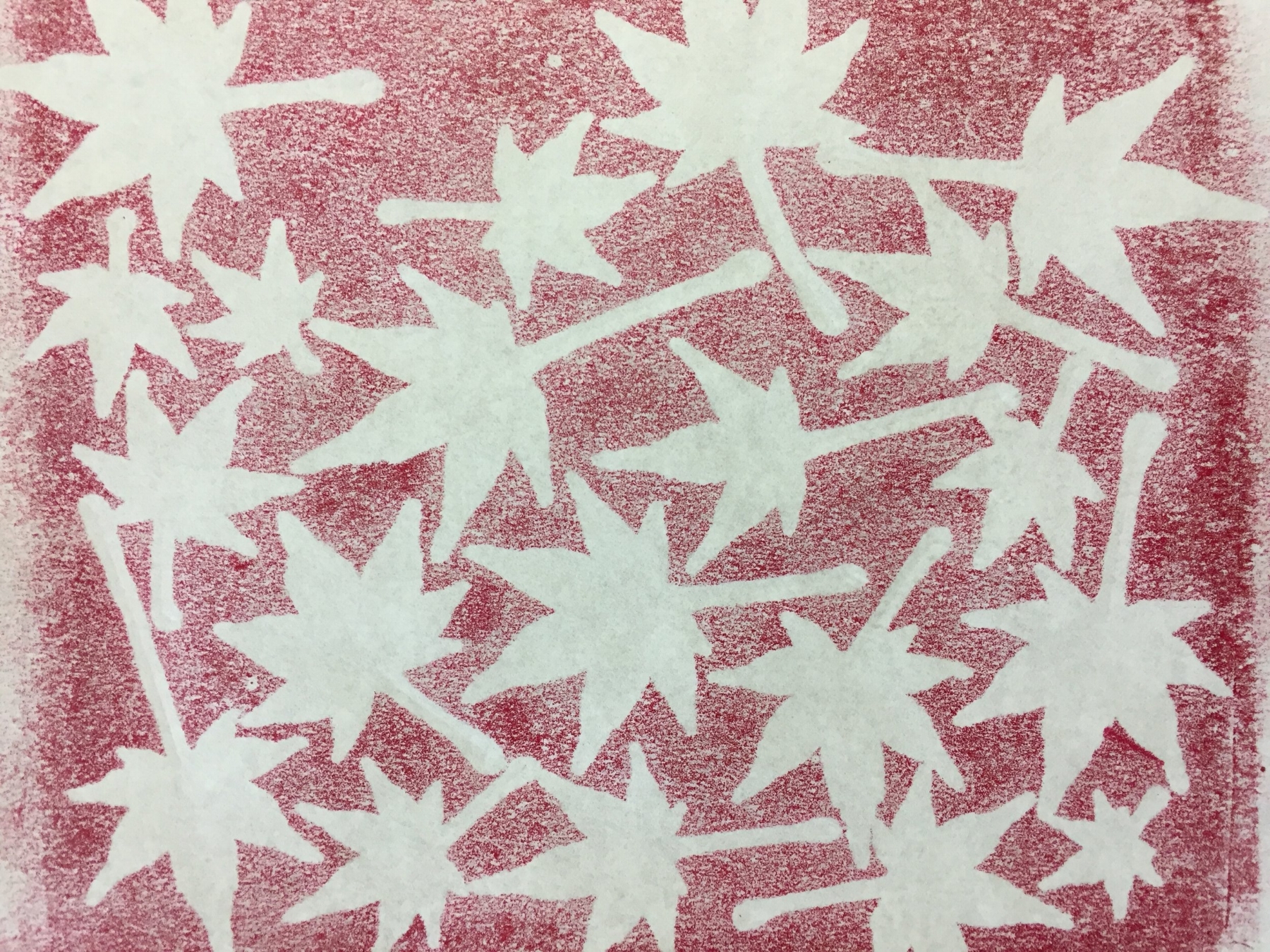
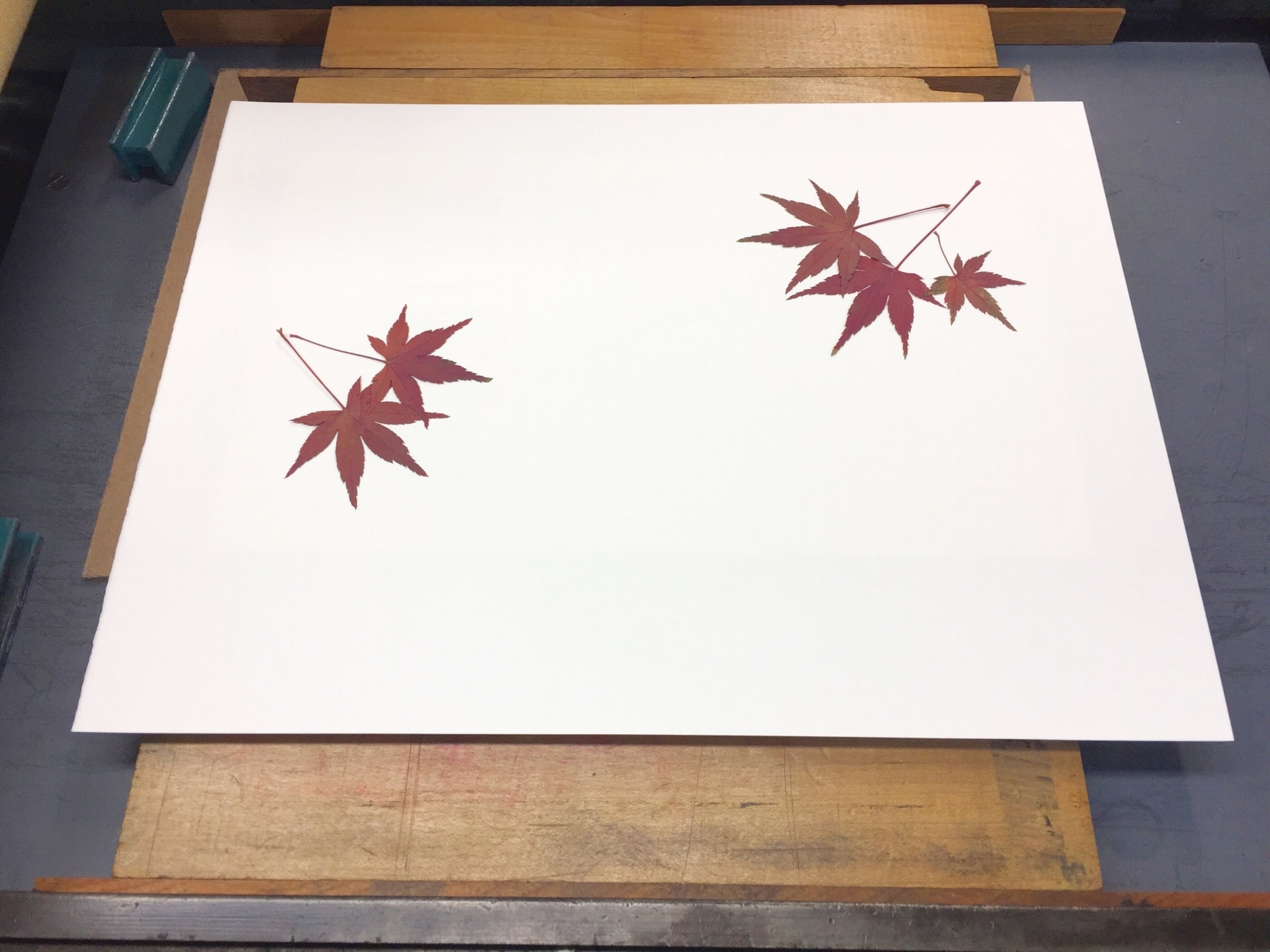
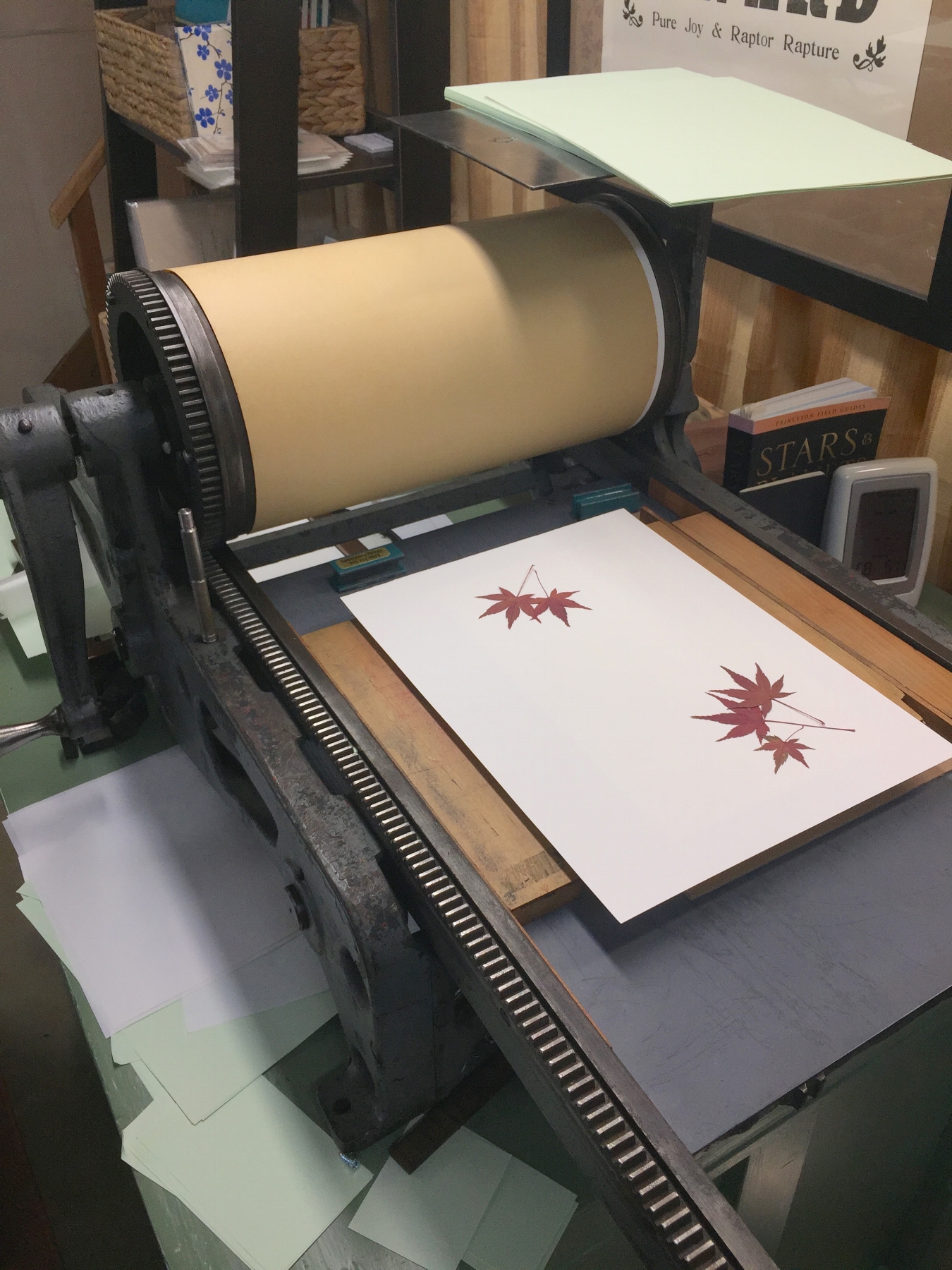
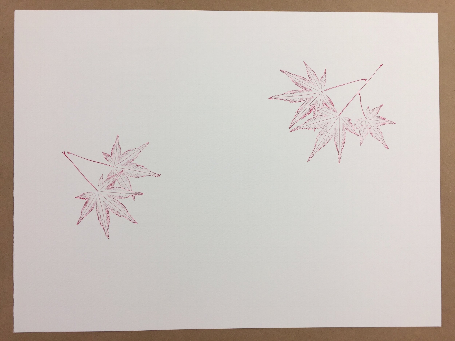
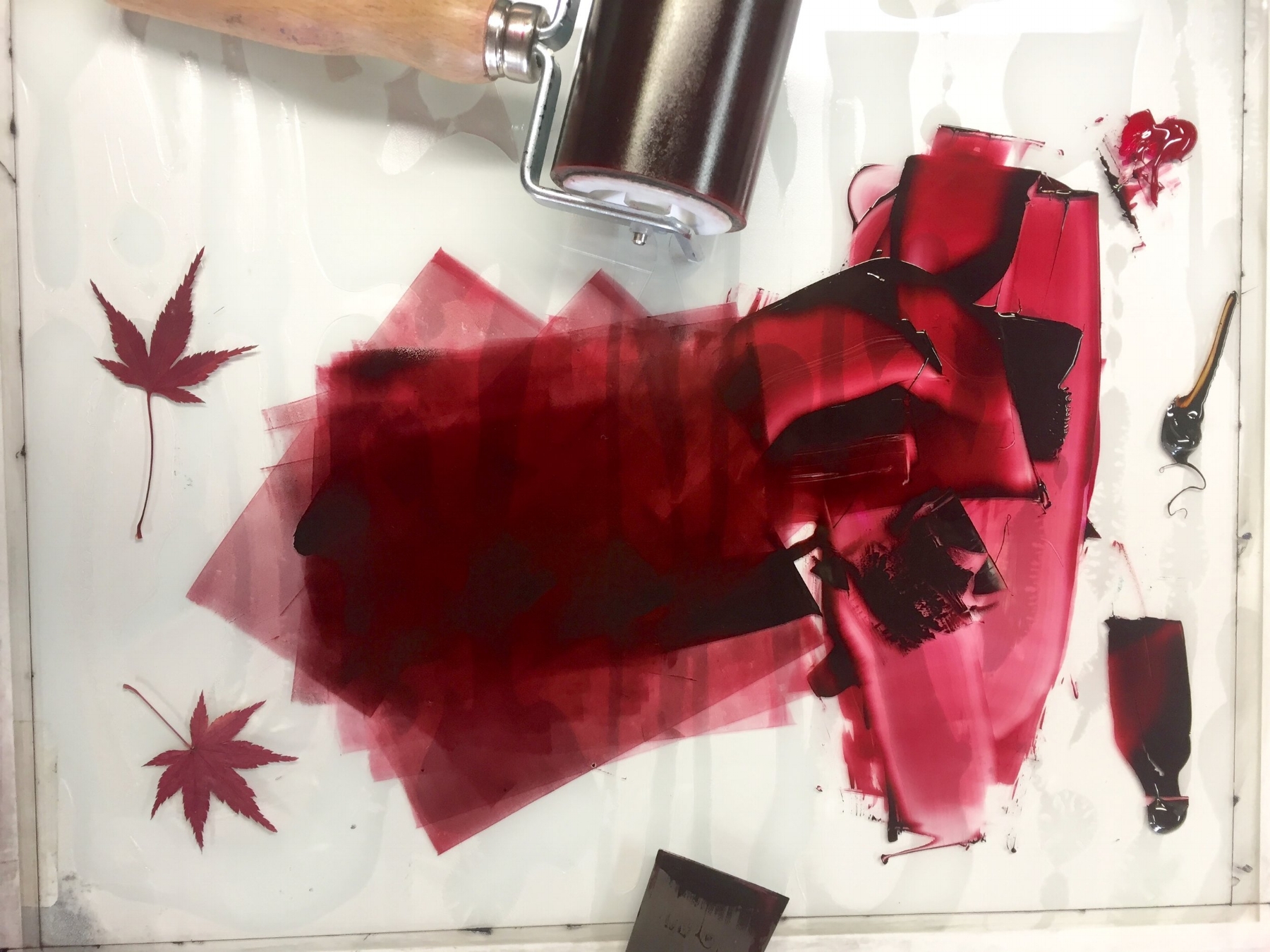
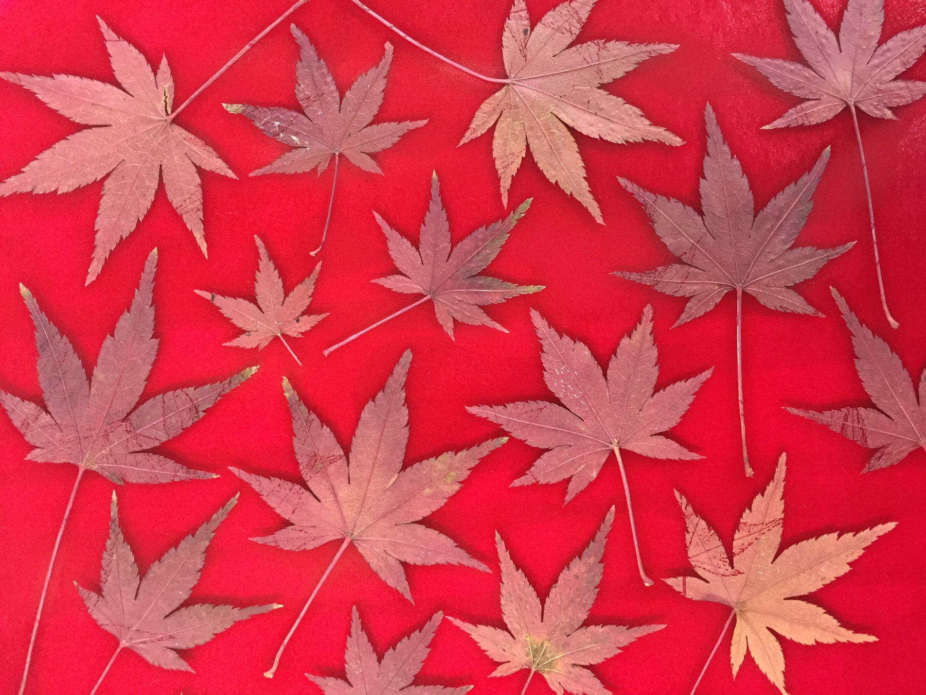
Last year we published Reverie, a little book poems that featured illustrations printed from grasses growing in our field. I loved the process and the look of these nature prints (which I first learned about from John Ryder's wonderful book Printing for Pleasure), and they came immediately to mind when I began to think about what illustrations might accompany our newest production ~ Wind Intervals, a chapbook of poems by Jeff Schwaner.

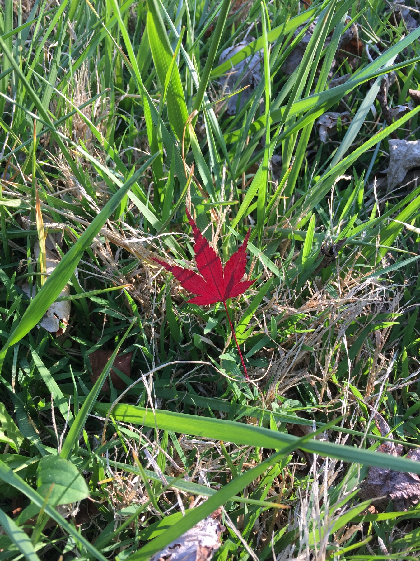
Collected and dried last autumn from the tree outside our print shop door, I had a stash of beautiful Japanese maple leaves under weights in a corner of the shop. Many of Jeff's poems include the presence and imagery of trees, including maples. It seemed like a perfect match.

So, this past week I began adding prints made directly from these dried leaves to the pages of Wind Intervals. Here's a little peek at the process ~ enjoy!

10 Comments

Diary of a Printed Page

16 Comments

Diary of a Printed Page

I must confess ~ each time a piece of paper goes into the printing press blank and emerges again filled with words, I am astonished. 

What still feels like the sudden epiphany of language out-of-nothing is not, in fact, miraculous. It is careful, collaborative craftsmanship by author and papermaker and metal-caster and printer, among others. It’s a strangely fluid movement of human and machine ~ an always-changing choreography of eye and iron, hand and fiber, thought and ink and breath. 

Joyous!

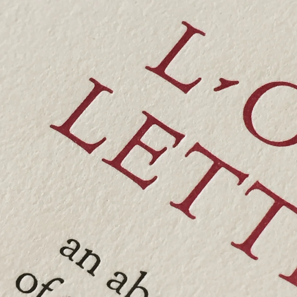
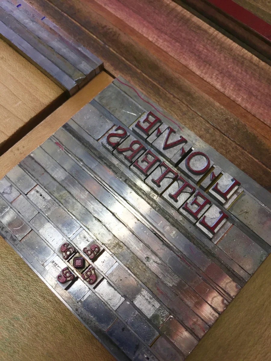
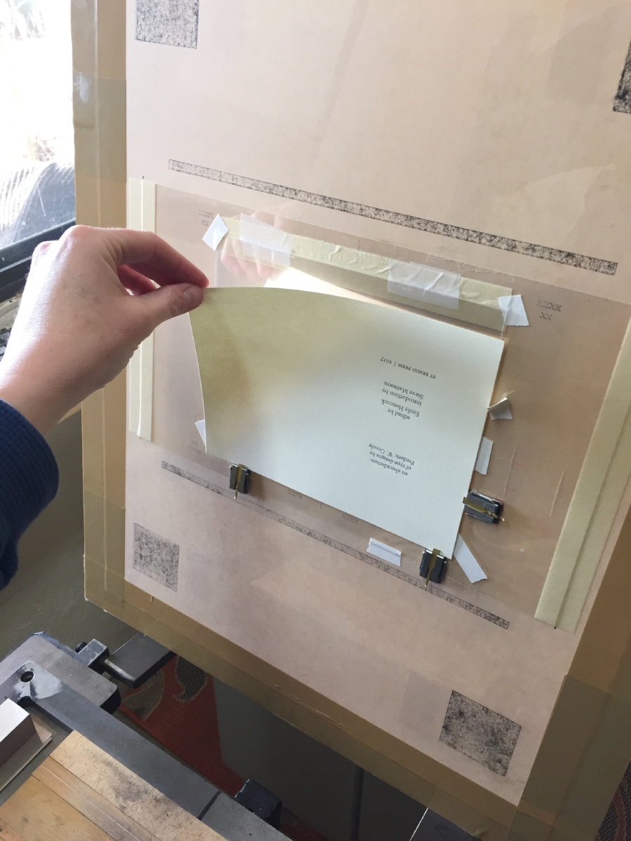
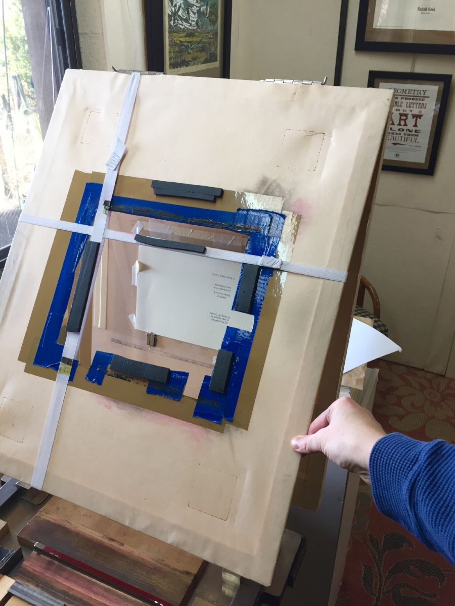
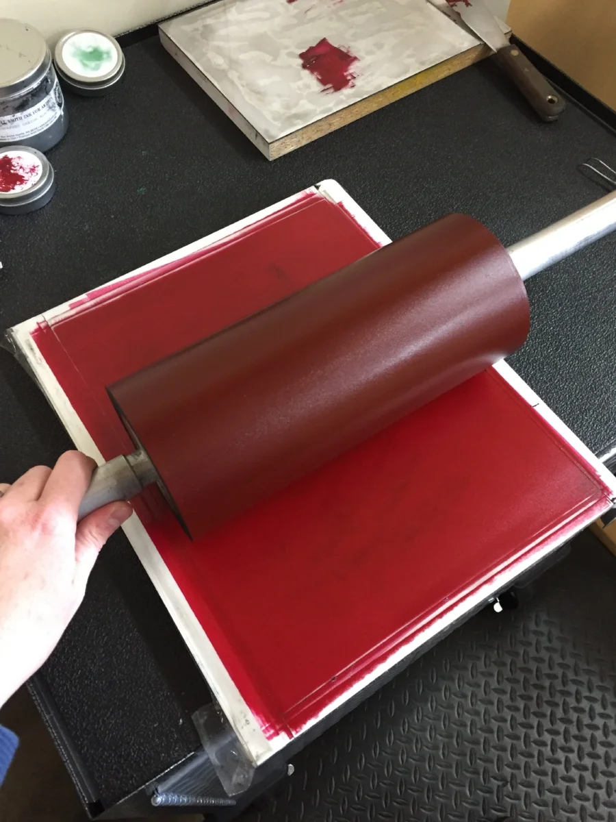
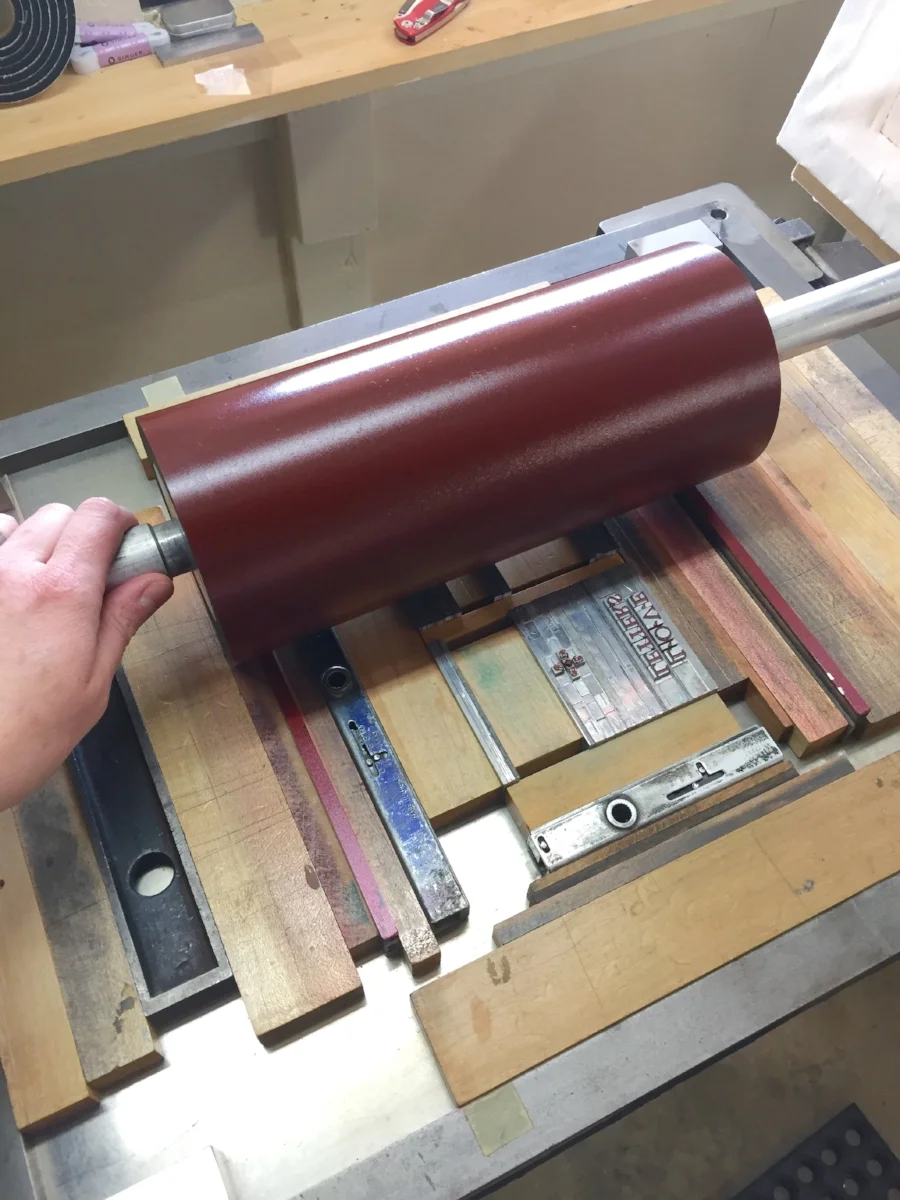
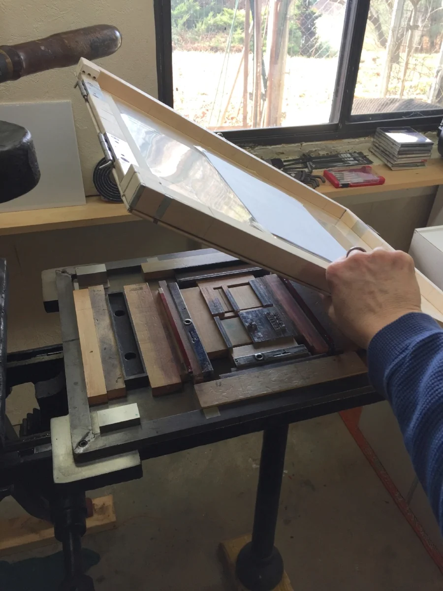
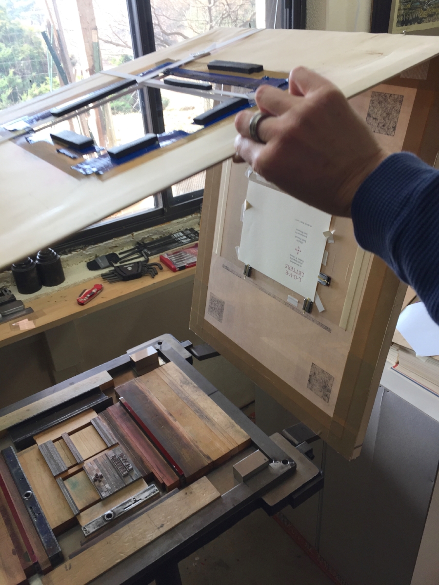
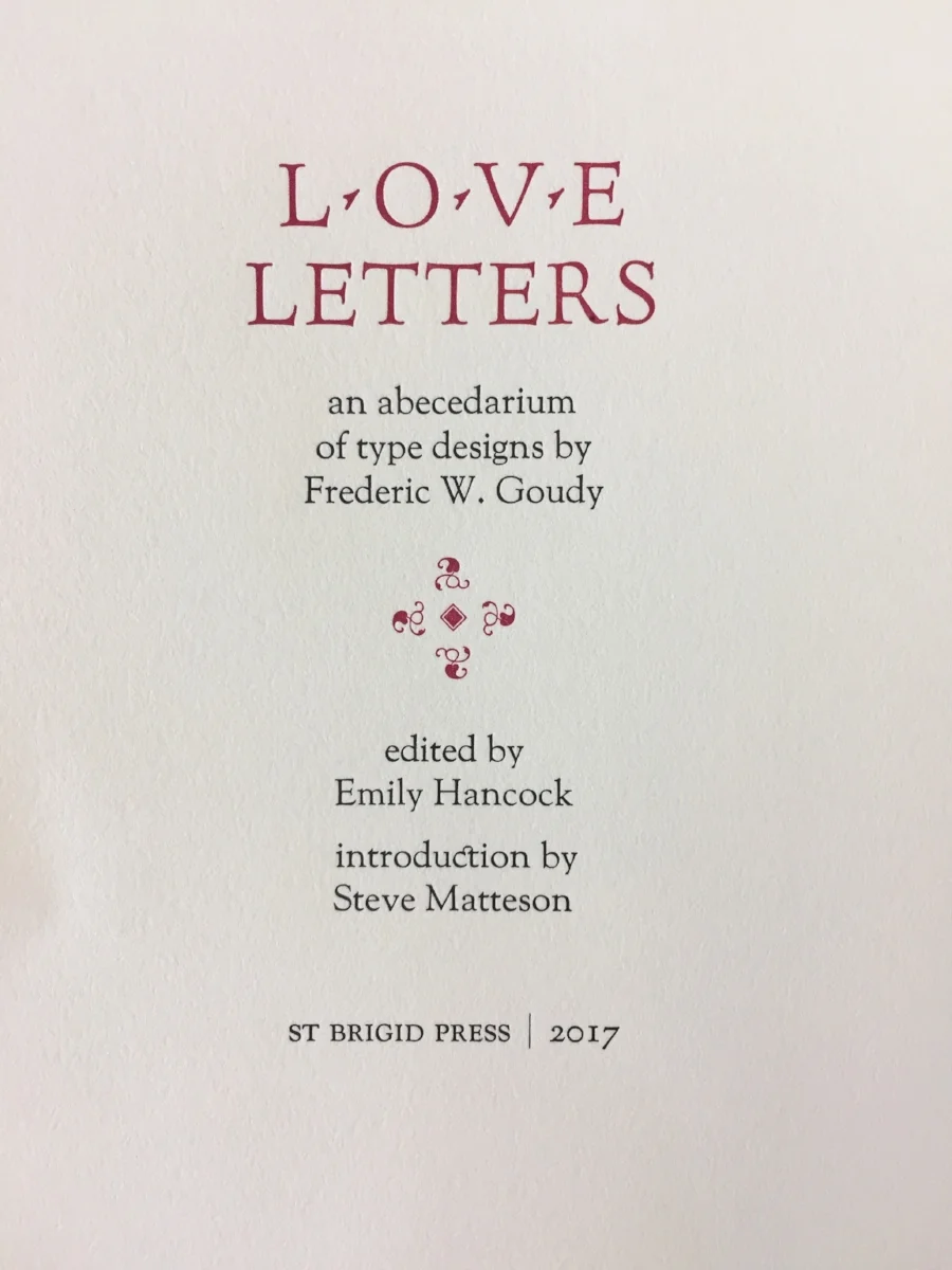
Here’s a little photo diary from today’s print run. I was printing the second color (in red) on the title page of St Brigid Press’s newest book, forthcoming in early February.

Thanks so much for joining us on this journey. All best to you all,

St Brigid Press

16 Comments

A Letterpress Lexicon, Part 3

7 Comments

A Letterpress Lexicon, Part 3

Hi, Friends of St Brigid Press!

Here is the third installment in our occasional blog series about the words and phrases that identify printing's particular tools and processes ~ A Letterpress Lexicon. Enjoy!

(If you missed Part 1, you can find it HERE. And Part 2 is HERE.)


Today's Words Are:

PIED  ~  Pronounced with a long “i”, as in "cherry pie." The term for metal type that has become all jumbled up, disarranged, mixed up.

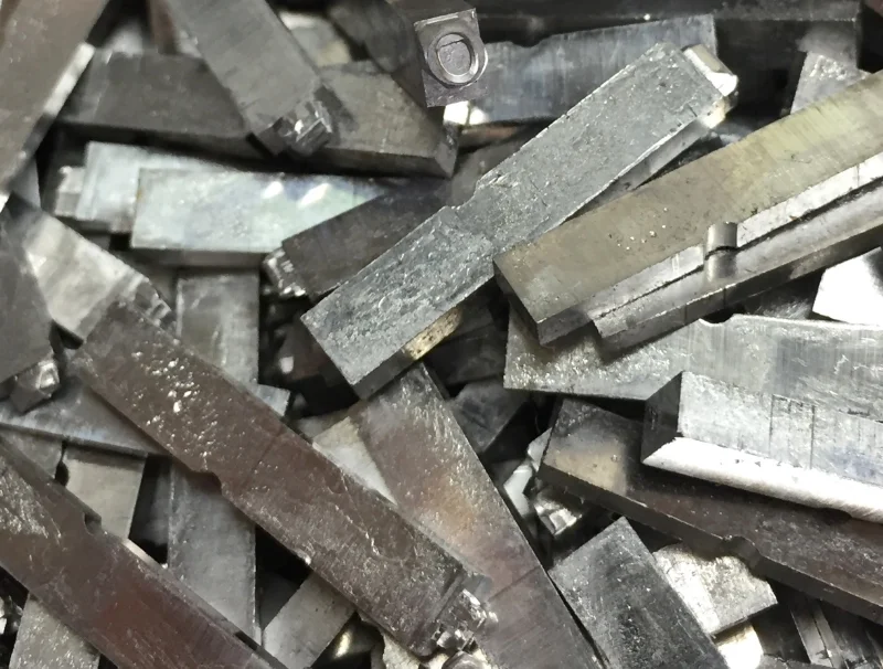
HELL BOX  ~  The box or bucket into which is thrown metal type that is too worn or damaged to print well.

PRINTER'S DEVIL  ~  An old term for the young assistant in a printing shop who was given menial tasks or errands, such as sweeping floors or sorting type.


I had a completely different set of interesting words from the printing trade ready to share with you all. And then this happened:

Pied type on the floor at St Brigid Press.

I allowed myself to get in a hurry recently, while looking for a particular dash in the back of a typecase. I pulled the case out too far, without pulling the case below it out slightly (a safety measure, to prevent what happened from happening), and CRASH — a small tsunami of metal letters fell to the floor. The concrete floor. ARGH. There they stayed for a few days, until I could face the mess again and gently scoop up the pied type.

A 12pt letter "m" from the pile of pied type. It is, unfortunately, damaged and bound for the hell box.

Much of the type is salvageable, thank goodness. But there are still many letters, numbers, and punctuation pieces that were damaged. Type metal is soft enough to scratch or dent easily if dropped. Those pieces that are too damaged to print correctly will be weeded out and relegated to the hell box. When the box is full, a type foundry can melt down the metal and cast new letters with it.

The St Brigid Press hell box, into which we pitch metal letters that are broken, scratched, dented, or otherwise rendered unprintable. Grateful acknowledgement goes to the Shop Dog, Mira, for generously donating an empty biscuit tub for the task.

Obviously, sorting pied type is a time-consuming job. One that is at once drudgery and exacting — each letter must be inspected to see if its face is dented or scratched, or if it survived the ordeal unscathed. Since we are in the full swing of book production here at the Press, we decided to call upon our own printer’s devil, Julia Grammer, to help out. Julia is a student of typography and graphic design at an area college. Not only is she knowledgable about type, but she brings the kind of care, curiosity, and intelligent attention that are guiding principles at the Press. Here’s a case of type after Julia was let loose on it:

Ahhhh.... Order, wrought from chaos, thanks to the Press printer's devil, Julia Grammer.

Thanks, as always, for joining us on this journey, Friends! 

All best to all,

The Pied Typer of Afton

7 Comments

How Type is Made, Part 2

4 Comments

How Type is Made, Part 2

Traditional letterpress printing requires physical letters, cast from metal or carved from wood, which get inked and pressed into paper to make a print. In the last post, we took a look at the process of making type from metal (if you missed it, click here). In this installment, we’ll see how it’s created from wood.

Civil War recruitment poster.
From the International Printing Museum website.
http://www.printmuseum.org/museum/wood-type-2/

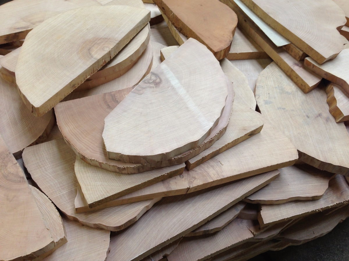
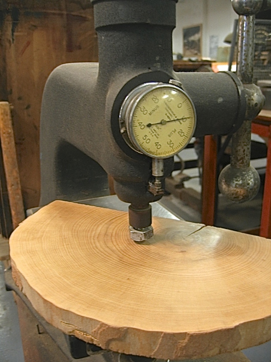
Wood came to be used as a material for making letters for printing primarily in the 1800s, when the printing and advertising industry became more widespread. Imagine trying to lift a big “Wanted”-poster-sized chase of metal type — pretty darn heavy! (See the photo of a Civil War recruitment poster.) Letters carved and routed from holly or maple were MUCH lighter, and could be made MUCH larger than their metal counterparts. 

Here at the Press, we’re fortunate to care for and print with a nice selection of wood type, most of which was made between 1875 and 1910. If used with plenty of TLC, it’ll outlast us (just like our presses)!

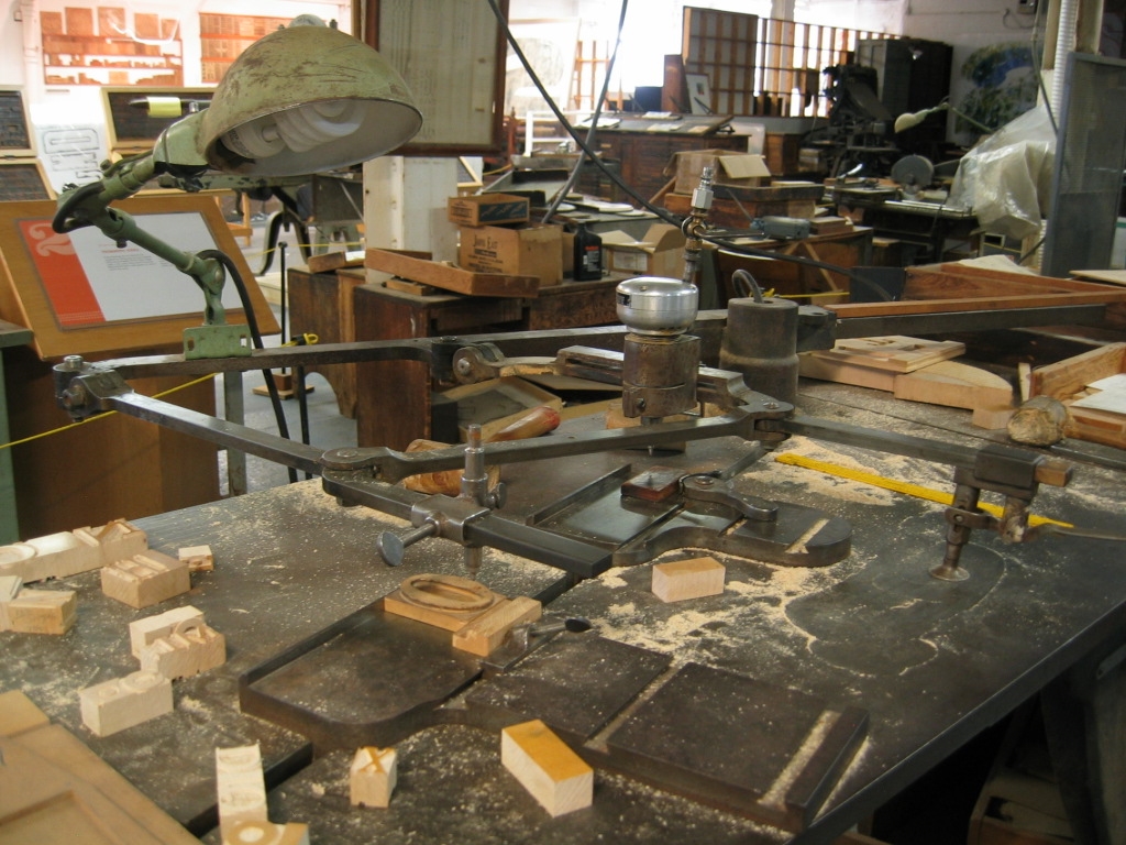
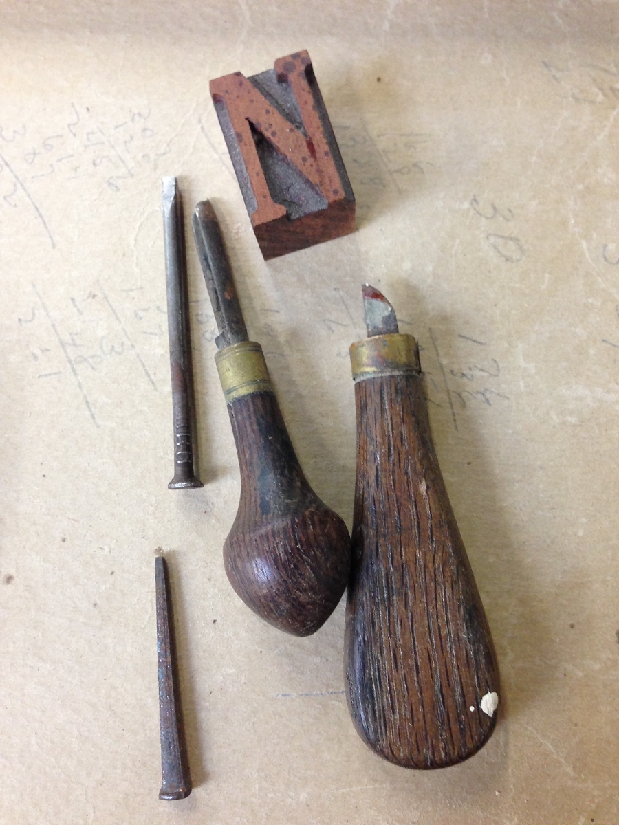
Here's a slide-show of some of the materials and tools used to create wood type, along with some of the type in our collection here at the Press:

A lot of vintage type, however, either went to the scrap heap decades ago, is just too damaged to print well anymore, or is too scarce and expensive for most printers to purchase. Thankfully, there are a few excellent folks who are making brand new type from wood today!

Here is a great interview (4 mins) of Geri McCormick of Virgin Wood Type (Rochester, NY), by Frank Romano.

And another great short (1 min) video of Scott Moore, of Moore Wood Type (in Ohio), making new wood type:

Want to know more about the wonderful world of wood type?

Here are some great resources ~


Thanks for joining us on this journey into type! Please sign up below for more occasional dispatches from letterpress land!

St Brigid Press

4 Comments

How Type is Made, Part 1

Comment

How Type is Made, Part 1

Traditional letterpress printing requires physical letters, cast from metal or carved from wood, which get inked and pressed into paper to make a print. In the next two blog posts, we’ll take an introductory look into how these letters get made.

First up, metal type!

A typecaster of centuries past, pouring molten metal into a mould to cast new letters. (Courtesy of the The University of Manchester Library.)

A typecaster of centuries past, pouring molten metal into a mould to cast new letters. (Courtesy of the The University of Manchester Library.)

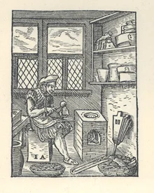
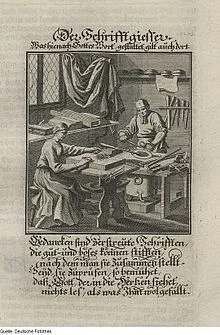
Johann Gutenberg’s big Ah-HA! moment in the 15th century was figuring out how to create multiple letters with which to print, and print again and again — a system of “movable type,” where each piece is cast in a mould from an alloy of metals (lead, tin, and antimony). These pieces, all the letters and numbers and punctuation, etc., of the alphabet, could be used and reused — a huge savings of time, effort, and expense compared to the work of scribes!

Metal type wears down over time, because it is relatively soft, and gets scratched or dinged easily. Thankfully for us 21st century printers, some hardy folks are still casting brand new metal type!

Here's a short (1:58), awesome little video by Dave Keyes of Michael Curry casting 48pt Garamond ampersands on his caster in New Zealand:

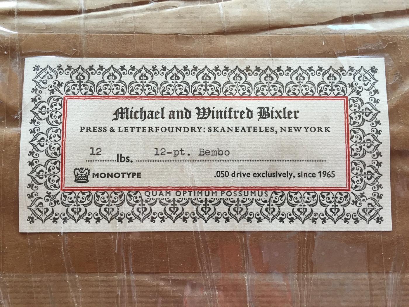
And here’s another little window into the world of typecasting, courtesy of Michael and Winifred Bixler, who operate their Bixler Letterfoundry in upstate New York, and who have cast much of the new type we have here at St Brigid Press. This beautiful 2-minute video was done by Mary M Jones:

Some of our type comes from a wonderful foundry in Germany, run by the renowned Herr Rainer Gerstenberg. Click the photo below to see an excellent photo-tour of Gerstenberg's foundry, taken by letterpress printer and teacher Thomas Gravemaker.

The beautiful Koch-Antiqua typeface, cast for us by Rainer Gerstenberg in Germany, here printed for the colophon of our limited edition book of poems, Soundings. Click the photo for more about Gerstenberg's foundry.

The beautiful Koch-Antiqua typeface, cast for us by Rainer Gerstenberg in Germany, here printed for the colophon of our limited edition book of poems, Soundings. Click the photo for more about Gerstenberg's foundry.

So, would YOU like to order some shiny new type?? Here's a list of foundries ready to take your order!

List of Type Foundries in the US and Abroad

Thanks for joining us, friends! We'll see you again soon,

St Brigid Press

Comment

Printing With Plants

3 Comments

Printing With Plants

Hi Friends of St Brigid Press!

We're rolling along in our production of our new chapbook, Reverie, which launches next Sunday the 20th at Black Swan Books (3pm to 5pm, if you're in the neighborhood!). At the moment, we are enjoying illustrating the pages with original nature prints from the grasses that grow in the meadow at the Press.

Here's a sneak peek at today's print process, working with the lovely little meadow flower, Pennsylvania Bittercress.

Just last week, our field began to bloom with the tiny white petals of Cardamine pensylvanica, Pennsylvania Bittercress. 

We decided the Bittercress would make a delightful accompaniment to the first poem in the book.

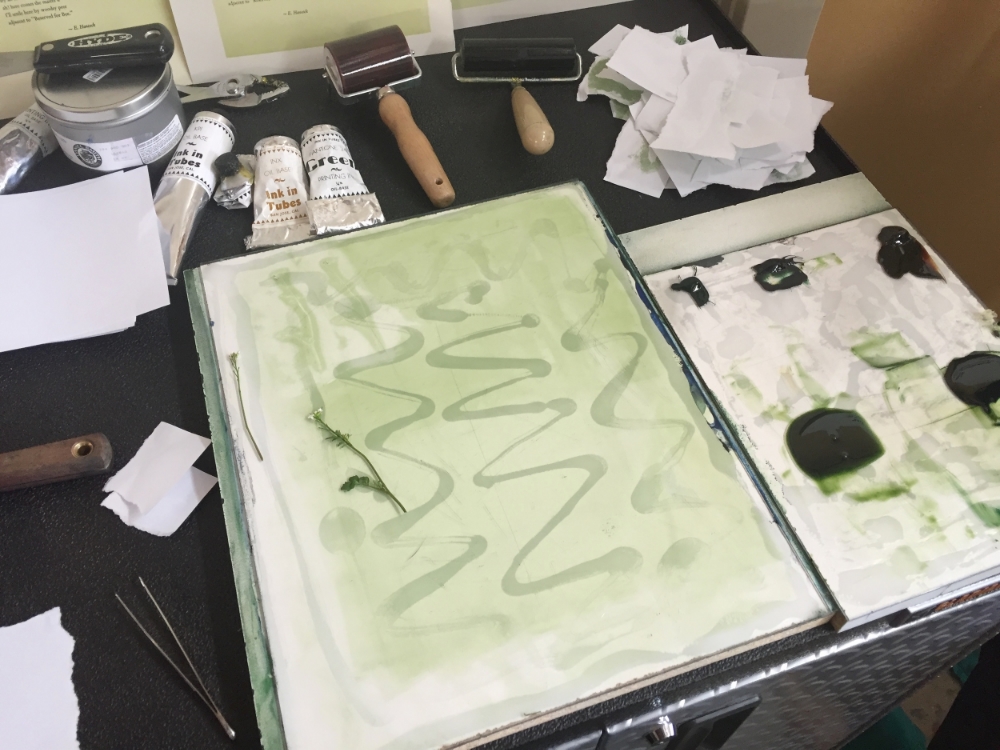
Next we hand-mixed a sweet spring green color, gently pressed the Bittercress into the ink, and carefully transferred the inked cutting to the page of poetry.

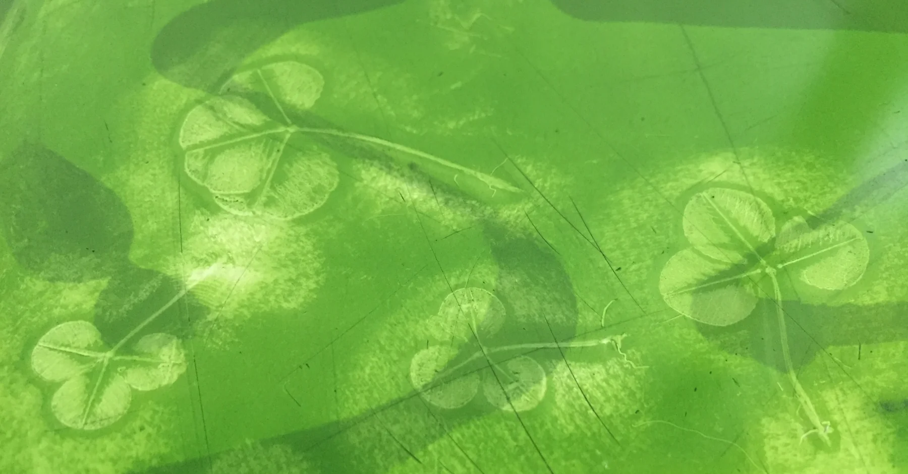
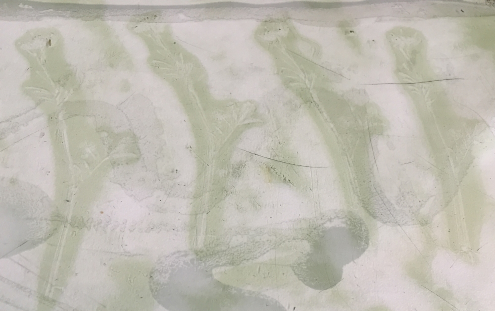
Lifting off the Bittercress, reveals its subtle image. Next up: clover and wild onion!


Thanks for joining us!

If you can't make it to the look launch on March 20th, but are interested in purchasing this limited edition book, please see HERE.

3 Comments